3 Findings
3.1 Gold Standard Survey: Baseline Prevalence Estimates
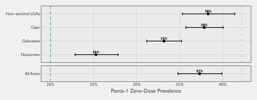
This methodological report evaluates five alternative estimation approaches for measuring zero-dose coverage (the proportion of children aged 12–23 months who have not received the first dose of pentavalent vaccine, comparing each against a gold-standard multistage cluster probability-based survey conducted in Kano State). The latter employs a stratified, probability-proportional-to-size sampling design across four study areas—Nassarawa, Gabasawa, Gaya Local Government Areas (LGAs), and non-sentinel areas—providing design-weighted estimates with confidence intervals that represent the true population zero-dose prevalence.
Figure 3.1 presents the zero-dose prevalence estimates by study area, each with its 95% confidence interval. The yellow dashed reference line at 42.2% (FMoHSW, NPC, and ICF 2024) marks the 2023–24 Nigeria Demographic and Health Survey (NDHS) estimate for Kano State, providing a key benchmark for comparison. The green dashed reference line at 20% represents the aspirational target corresponding to 80% Penta-1 coverage. Our survey findings reveal substantial geographic variation: Nassarawa (25%) falls closest to the 20% target, while Gabasawa (33%) and Gaya (38%) show progressively higher zero-dose prevalence. The non-sentinel areas (38%) show the highest zero-dose prevalence, reflecting the broader immunization challenges in areas outside the three sentinel LGAs.
These baseline estimates represent the gold standard against which each of the other estimation methods will be evaluated.1 Subsequent sections present each method’s results and performance characteristics.
3.1.1 Precision at Sub-State Geographic Levels
The gold-standard survey in this study was powered to detect small changes in prevalence over time within each sentinel LGA, producing unusually precise estimates relative to typical coverage surveys. To help readers calibrate what precision to expect from a probability survey at different geographic scales, Table 3.1 compares the margin of error (Margin of Error (MOE)) achieved in this study with the MOE expected under a hypothetical Expanded Programme on Immunization (EPI) \(30 \times 7\) design (30 clusters of 7 children per stratum). The EPI scenario uses the non-sentinel gridded-Enumeration Area (EA) Intraclass Correlation Coefficient (ICC) from the stratum-specific baseline ICC analysis (see the Intraclass Correlation annex) to derive the design effect, since the non-sentinel stratum used conventional first-stage cluster sampling of gridded enumeration areas.
Gold standard (this study) | EPI 30×7 (hypothetical) | |||
|---|---|---|---|---|
Geographic level | n | MOE | n | MOE |
Ward (median, sentinel) | ~222 | ±7.1 pp | 21a | ±27.8 pp |
Sentinel LGA (median) | ~2,912 | ±2.2 pp | 210 | ±8.8 pp |
Combined non-sentinel | 3,608 | ±3.0 pp | 210 | ±8.8 pp |
aThe EPI 30×7 design allocates 30 clusters per stratum (LGA), not per ward. Assuming 10 wards per LGA, each ward receives roughly 3 clusters (21 children), which is insufficient for reliable ward-level inference. | ||||
Ward-level values are medians across the 32 sentinel wards; LGA-level values are medians across 3 sentinel LGAs. MOE = margin of error (half-width of a 95% confidence interval), expressed in percentage points. EPI 30×7 calculations assume gridded-EA ICC = 0.152 (non-sentinel), DEFF = 1.91, and prevalence = 33.2%. | ||||
The table illustrates two points relevant to interpreting the method comparisons that follow. First, even the gold-standard design in this study–which was considerably larger than a typical coverage survey–produces ward-level margins of error that are nontrivial. Second, under a more typical EPI \(30 \times 7\) design, LGA-level precision would widen substantially and ward-level inference would not be viable. The EPI scenario in the table assumes the LGA is the stratum, so that all 210 children fall within a single LGA. When a survey is instead designed at the state level, each LGA receives only a fraction of the state-level allocation; with 44 LGAs in Kano State, for example, a state-level \(30 \times 7\) design would yield fewer than five children per LGA on average, rendering LGA-level inference infeasible as well.
3.2 Network Scale-Up Method
3.2.1 Overview
The Network Scale-Up Method (NSUM) pairs a survey and estimation strategy that uses respondents’ reports about people in their personal networks to estimate the prevalence of a characteristic that is difficult to enumerate directly, such as zero-dose status among children. The variant used in the Kano Zero-Dose Baseline Study is the Summation Network Scale-Up Method (S-NSUM) (McCarty et al. 2001). In S-NSUM, a probability sample is drawn from the general population and each respondent (the ego) is asked about the number of people in their personal network, typically defined over specific relationship types such as family members, friends, coworkers, neighbors, and acquaintances. These network members are commonly referred to as alters and are usually defined as people with whom the respondent has had frequent and recent face-to-face contact. Respondents are then asked how many of their alters have the characteristic of interest — in our case, whether they have an unvaccinated child. An extrapolation formula scales these alter counts to the full population to produce a prevalence estimate. A further practical advantage is that NSUM collects only aggregate counts of alters rather than names or other identifying information, which makes it well suited to settings where the characteristic of interest is not directly observable by the interviewer — such as the vaccination status of children in other households. This indirect structure can also reduce social desirability pressure when respondents might otherwise underreport the trait of interest.
The NSUM literature includes a long history of empirical applications. For example, it has been used to estimate the size of child sex-trafficking populations in Maharashtra, India (IST Research, University of California, Los Angeles, and Global Fund to End Modern Slavery 2020), and child trafficking populations in Sierra Leone (Yi et al. 2023). In the Sierra Leone study, adults reported on children because children could not be interviewed directly, a structure that parallels our setting in which information about zero-dose children must be reported indirectly through adults. We draw on the lessons from that work in the design and interpretation of this study. To our knowledge, NSUM has not previously been applied to vaccination coverage or zero-dose estimation, either in the published literature or in documented operational use, making this application novel.
In its simplest form, the NSUM model assumes a binomial distribution so that the proportion of people in a person’s network that belong to the population of interest is approximately equal to that population’s proportion of the general population (Killworth et al. 1998). The intuition is that if a respondent reports a network of size 100 and two of these people have the characteristic of interest, then an estimate for its prevalence is \(2\%\) of the general population. In mathematical terms, one can start with
\[ \frac{m}{c}\approx\frac{h}{t} \tag{3.1}\]
where \(m\) is the mean number of people known in the population of interest, \(c\) is the mean personal social network size, \(h\) is the size of the population of interest, \(t\) is the total population size, and \(q=h/t\) is the prevalence of the population of interest. For our applications, the estimand \(q\) could be either a particular vaccine coverage rate, or the zero-dose rate.
Conveniently indexing the sample respondents as \(1,2,\dots,n\), and writing \((m_j,c_j)\) for respondent \(j\)’s reported target-population count and network size, a natural estimator for the prevalence is the ratio
\[ \widehat{q} = \frac{\sum_{j=1}^n m_j}{\sum_{j=1}^n c_j}. \tag{3.2}\]
Given a known total population size \(t\), the corresponding estimator for the size of the population of interest is
\[ \widehat{h} = t\cdot \widehat{q} = t \cdot \frac{\sum_{j=1}^n m_j}{\sum_{j=1}^n c_j}. \tag{3.3}\]
Equation 3.2 and Equation 3.3 are most naturally motivated under a Simple Random Sample (SRS), where unweighted sample totals approximate population totals. In many real-world applications, however, respondents are selected under a complex sampling design that integrates elements such as multistage sampling, so we use a weighted ratio estimator.2
One of the main appeals of NSUM is that, when its assumptions hold, it can deliver large gains in statistical efficiency. Equivalently, a given level of precision can be achieved with substantially smaller respondent samples. The intuition is straightforward: rather than extracting a single binary data point from each respondent, NSUM leverages information about the respondent’s network, effectively increasing the amount of information collected per interview.
Figure 3.2 illustrates these theoretical gains by comparing margins of error for a direct estimator of a simple proportion (green) with those for the NSUM prevalence estimator (yellow). The comparison is intentionally idealized3 and abstracts away from the biases and complications that arise in practice. Under these assumptions, the NSUM estimator reaches useful precision much more quickly, which is especially attractive when estimating rare populations. For example, with an average network size of 30, achieving an absolute margin of error of approximately \(\pm 0.03\) under the conservative maximum-variance planning assumption (\(q = 0.5\), the standard worst case used in sample-size planning even when a prior estimate is available) requires on the order of \(36\) respondents under NSUM, compared to roughly \(1067\) respondents for direct estimation from a simple random sample. These figures are not operational targets. Their purpose is to illustrate that, at least in theory, the efficiency gains from NSUM can be substantial when its underlying assumptions are met.
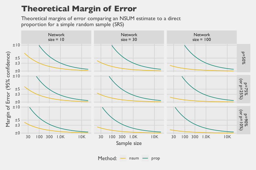
As Figure 3.2 makes clear, for proportions, the efficiency gains from NSUM are most pronounced when respondents’ effective network sizes are large, because each interview contributes information on many alters rather than a single observation. In contexts where denominators reflect broad adult contact networks (e.g., \(\gt 100\)), precision improves rapidly, but the chart also shows that meaningful gains can persist even with much smaller networks. This distinction matters for our application: unlike many NSUM studies that use an individual’s full adult contact network as the denominator, our denominator is restricted to adult contacts who have age-eligible children, yielding a substantially smaller effective network (\(\approx 11\) alters per respondent).
3.2.2 Implementation Details
The NSUM is an attractive procedure as it can be appended to virtually any probability-based survey since it only requires an additional module of questions to be asked of the respondents. Hence, the NSUM can provide an alternative prevalence estimate at only a marginal cost. Further, the NSUM is particularly useful when the characteristic of interest cannot be directly verified at interview — for example, a respondent may know that a neighbor has young children but not know their vaccination status. Because respondents report only aggregate counts rather than identifying specific individuals, the method can also reduce social desirability pressure and may yield less biased estimates than direct self-report in sensitive contexts. NSUM can likewise be useful in some settings when certain types of respondents are simply hard to include in a conventional sample — for example, mobile, transient, or otherwise hard-to-reach groups — because their characteristics may still be observable to other respondents through the network even when those individuals themselves are not interviewed.
NSUM estimates have the potential to suffer from three adverse effects, each of which can have implications on the NSUM’s ability to provide efficient and unbiased estimates. First, barrier effects exist when people are not equally likely to know those with the characteristic of interest. When this is the case, the underlying assumption of the binomial distribution is violated. A helpful way to think about barrier effects is heterogeneity in exposure to the group of interest: some respondents are systematically more likely to know group members than others, so the probability that an alter belongs to the group is not constant across egos and the binomial mixing assumption is violated. For example, if households with unvaccinated children are concentrated in specific communities or social networks, respondents outside those circles will know few or none, while those inside may know several, creating overdispersion. When the sample overrepresents less-connected respondents — those with little exposure to the group of interest — the result is likely underestimation. Conversely, if the group is highly visible within certain circles, such as community mobilizers or popular market traders, overrepresentation of these high-exposure respondents can inflate estimates.
Some researchers have proposed strategies to reduce the impact of barrier effects. For example, Maltiel et al. (2016) argues that bias from differential mixing can be limited, in part, by designing the sample to be as balanced as possible across key covariates that predict social contact patterns, since NSUM estimates effectively pool network reports across respondents at the estimation stage. They also propose modeling heterogeneity in personal network size (degree) using random effects, which can help stabilize inference when degrees vary widely. These steps can improve robustness, but they do not eliminate barrier effects, because the core problem is not only geographic clustering: it is systematic heterogeneity in who knows whom that can cut across geography through social stratification, institutions, and network topology.
NoteSources of Bias in NSUM Studies
There are three main sources of bias in NSUM studies:
Barrier effects exist when people are not equally likely to know those with the characteristic of interest (a violation of the assumption of the binomial distribution)
Recall effects occur when at the time of interview a respondent is unable to recall the number of individuals in their personal network that belong to the population of interest.
Transmission effects occur when the respondent is unaware of the number of people in their personal network that are part of the population of interest.
Second, recall effects occur when, at the time of interview, a respondent cannot accurately recall either (i) who belongs in their personal network in the first place (the denominator) or (ii) which network members belong to the population of interest (the numerator). Both matter, but errors in the numerator are often more consequential for accuracy. If a respondent forgets an alter entirely, that person is effectively missing from both the denominator and the numerator, which can introduce error but may partially cancel in the ratio when omissions are not systematically related to membership in the population of interest.
By contrast, recalling an alter but misidentifying whether they belong to the population of interest directly perturbs the numerator conditional on the denominator, which tends to translate more directly into bias in the estimated prevalence. Such effects can be mitigated through enumerator probing and by asking respondents to review and reconcile their counts at the end of the NSUM module. A practical design choice is to structure the module around mutually exclusive and collectively exhaustive alter categories, prompting respondents to enumerate their network in sub-communities such as close family, extended family, colleagues, friends, neighbors, and an “anyone else not previously reported” category. This decomposition reduces cognitive burden by providing concrete retrieval cues, increases the likelihood that respondents enumerate their networks comprehensively, and helps standardize the concept of “who counts” as an alter across respondents.
In international development contexts, an additional challenge is that a child’s exact age may not be known even to immediate family, because birthdates are not always recorded and numeracy can be limited in lower-education settings. As a result, respondents may struggle to identify which contacts have age-eligible children (for example, 12–23 months), and this uncertainty can introduce error both by omitting eligible alters from the network denominator and by misclassifying eligibility when determining membership in the population of interest.
Third, transmission effects arise when respondents cannot report membership in the population of interest even in principle, because they do not actually know the relevant status of their alters. In our application, this is a central and arguably the strongest assumption: respondents may not reliably know the vaccination status of parents’ (guardians’) children, even when they know those households well. Transmission error is therefore distinct from recall error, which concerns failures of memory given information that was once known; here the information may never have been available to the respondent.
A common way to address this limitation is through a Visibility Factor (VF) adjustment, which represents the probability that an alter’s true status is visible to the respondent. In practice, information to estimate a VF is often collected in a separate survey that interviews members of the population of interest (or their households), rather than through the NSUM instrument itself, which is typically administered to a general-population sample of adults. In our setting, this aligns closely with the role of the gold-standard household survey, so we incorporated an additional question asking caregivers to approximate what proportion of people in their own social networks would know the vaccination status of their children. This caregiver-reported visibility information can then be used as an inflation factor to adjust NSUM counts for transmission error. Because VF is itself uncertain and may vary across respondents and subgroups, it is best paired with validation work, such as re-interviews or targeted follow-up on a subsample, to quantify reporting error and support an adjustment model that reduces bias in the final NSUM estimates.
3.2.2.1 The S-NSUM Module for this Study
The S-NSUM application for this study focused on estimating the number of zero-dose children. To avoid double counting within respondent’s networks, the NSUM module was set up to ask male respondents only about males in their personal network and similarly to ask female respondents only about females in their personal network; for example, a respondent could report knowing a married couple that have children together and each person would contribute the same counts of children towards the NSUM response.
Upon selecting a household for observation, the questionnaire was first administered to a caregiver of an age-eligible child, if one was available. Regardless of whether this was the case, one adult was selected then subsequently from household through a pseudo-random procedure based on asking for the adult resident in the household who most recently had a birthday. By random chance, this could happen to be the same caregiver, or (more frequently) could be someone completely different. The NSUM module commenced with asking the respondent a series of relation-type questions, such as the number of men/women they know that are family members, friends, coworkers, etc. The sum of responses over these questions was used to approximate their personal network size of known adults of the same sex. For each category of relational type, the NSUM module then asked for counts in the respondent’s network on the number of people that have a child aged 12-23 months (the actual denominator for our NSUM study), and then asked the number of such children that did not receive any vaccinations out of those counts.
There are several implementation details worth noting. First, the NSUM estimand in this study differs slightly from what is commonly targeted in the literature. Specifically, we estimate the proportion of households with a child aged 12–23 months that include at least one unvaccinated child, rather than the proportion of 12–23-month-old children who are unvaccinated. In practice, the gap between the two definitions is small in our setting because most eligible households contain only one age-eligible child: in the gold-standard household screener, an estimated 91.1% (95% Confidence Interval (CI) 90.4–91.8) of households with a child aged 12–23 months contain exactly one such child, 7.6% contain two, and the rest contain three or more, averaging 1.10 such children per eligible household.4 Second, respondents were asked more generally whether their contacts had any unvaccinated children, rather than being prompted specifically about Penta-1 (the Gavi proxy indicator).5 These choices remain comparable to the gold-standard survey because we can re-express the probability-sample data to match the same household-level and vaccine-specific definitions. They do, however, require some nuance when interpreting head-to-head comparisons, since the NSUM target is closely related to but not identical to the estimands used by other methods.
3.2.2.2 Estimation
Several quality safeguards were implemented to strengthen data integrity. First, the Computer-Assisted Personal Interviewing (CAPI) instrument enforced logical constraints within each alter category, preventing respondents from reporting numerator counts that exceeded the corresponding denominators. Second, the CAPI program automatically summed alter-category totals and prompted enumerators to read back the implied network size for respondent confirmation, creating an opportunity to correct clerical errors and other implausible entries in real time. Third, during estimation we applied an additional round of quality assurance checks to identify and resolve remaining inconsistencies and apparent recording errors in the NSUM responses. Because some respondents did not answer all NSUM items (about 4.8% of respondents had at least one missing item), missing values were imputed using predictive mean matching with a model that included the NSUM items and key demographic covariates (for example, age, education, and marital status). Finally, we top-coded reported network sizes at 150 to limit the influence of implausibly large networks on estimation, consistent with evidence on typical upper bounds for stable human social network size (Hill and Dunbar 2003).
Several software packages exist to analyze NSUM data. With the R statistical language (R Core Team 2025), the NSUM package (Maltiel and Baraff 2015) can fit Bayesian models that explicitly accommodate barrier and recall effects.6 The networkreporting R package (Feehan and Salganik 2014), while still under development, supports survey-weighted estimation for classic summation NSUM estimators, bootstrap-based standard errors, and top-coding strategies to limit the influence of unusually large reported network sizes (Zheng, Salganik, and Gelman 2006). In this study, however, final estimation was implemented using the R survey and srvyr packages (Gao, Schneider, and Kolenkikov 2026; Freedman Ellis and Schneider 2026) to fully account for the complex sampling design. We expressed NSUM prevalence as a survey ratio and implemented derived quantities (including the estimated number of unvaccinated children, with or without VF adjustments) as survey contrasts. This formulation allowed complex design features to be propagated directly into variance estimation and uncertainty intervals.
We initially explored sex-specific estimation as a sensitivity analysis. Specifically, we estimated NSUM quantities separately for female respondents reporting about mothers in their networks (“NSUM-F”) and male respondents reporting about fathers in their networks (“NSUM-M”), treating respondent sex as a stratification variable. One design consideration for an immunization-focused application is that women — frequently the primary caregivers of young children — may have more accurate knowledge of children’s vaccination status in their personal networks, which would make restricting NSUM data collection to female respondents a natural choice in principle. In our data, however, this expectation is not borne out: as shown in Figure 3.3, the NSUM-F and NSUM-M point estimates are very similar to each other across strata, and neither tracks the gold standard appreciably better than the other; to the extent that bias affects NSUM in this setting, it appears to affect male and female respondents to a comparable degree. At the same time, the number of male respondents was substantially smaller than expected under equal selection probabilities. This imbalance likely reflects differential availability or participation, with men less likely to be at home at the time of interview, and less likely to agree to be interviewed, rather than a difference in respondent knowledge of vaccination status; it also accounts for the wider uncertainty intervals around the male-based estimates.
Given the negligible differences in results and the loss of precision from analyzing the smaller male stratum on its own, we adopted a single combined analysis under the full complex survey design. Operationally, this pools female-to-mother reports and male-to-father reports into one estimator, while retaining design-based weighting and variance estimation. This approach also aligns more closely with standard NSUM practice, which typically does not constrain network measurement by respondent demographics, and avoids over-interpreting sex differences that our data are not well powered to detect.
3.2.3 Results
We begin the results by presenting sex-disaggregated NSUM estimates in Figure 3.3. These results compare estimates derived from female respondents reporting about mothers in their networks with estimates derived from male respondents reporting about fathers. Across strata, there are no particularly discernible differences in the point estimates reported by men versus women. However, men were less likely to participate in the NSUM module, resulting in substantially smaller effective sample sizes and correspondingly wider uncertainty intervals around the male-based estimates.
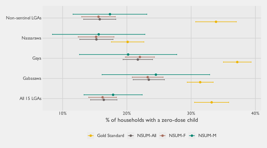
Given the similarity in point estimates and the reduced precision of the male-disaggregated results, the remainder of the analysis focuses on combined estimates. In the sections that follow, we pool female-to-mother and male-to-father reports within a single complex-survey framework, using the full design weights and variance estimation to obtain our primary NSUM results. Table 3.2 summarizes these combined findings, reporting the average network size (the mean number of same-sex contacts who have age-eligible children) and the corresponding survey ratio that estimates the prevalence of households with unvaccinated children. For completeness, the table also reports the estimated standard error of the prevalence, its coefficient of variation, and the associated design effect (\(\text{deff}\)).
Stratum | # of HH interviews | Average network size | NSUM Zero-Dose prevalence | Coefficient of Variation | Design Effect | Margin of Error |
|---|---|---|---|---|---|---|
Gabasawa | 3,177 | 13.6 | 26.7% | 3.6% | 1.2 | ±1.9 |
Gaya | 3,144 | 11.5 | 24.8% | 4.0% | 1.2 | ±1.9 |
Nassarawa | 2,762 | 9.9 | 19.2% | 6.4% | 0.9 | ±2.4 |
Non-sentinel LGAs | 6,833 | 10.7 | 17.7% | 8.2% | 6.4 | ±2.8 |
All 15 LGAs | 15,916 | 10.8 | 18.7% | 6.3% | 9.0 | ±2.3 |
Table 3.2 indicates that respondents reported relatively small effective networks of same-sex contacts with age-eligible children, averaging about 10–14 alters across strata (overall mean: 10.8). On this basis, the estimated prevalence of households with at least one unvaccinated child is highest in the sentinel LGAs Gabasawa (26.7%) and Gaya (24.8%), lower in Nassarawa (19.2%), and lowest in the combined non-sentinel stratum (17.7%), yielding an overall estimate of 18.7% across all 15 LGAs. Despite the modest network sizes, uncertainty is fairly tight in absolute terms, with 95% margins of error ranging from approximately ±1.9 to ±2.8 percentage points, and coefficients of variation between 3.6% and 8.2%. At the same time, the design effects are notably elevated for the non-sentinel stratum (6.4) and for the pooled 15-LGA estimate (9.0), underscoring that complex-design features materially inflate variance relative to simple random sampling, even with large respondent samples.
We next place these survey-ratio NSUM estimates in context by comparing them directly to the gold-standard probability survey in Figure 3.4. The figure reproduces the same NSUM prevalence estimates while varying the operational definition of the personal network, ranging from the full set of eligible alters to narrower, tighter networks such as close family only. The rationale is a classic tradeoff: restricting to closer alters reduces the effective network size (and therefore statistical power), but it may improve data quality by limiting recall and transmission errors, since respondents are more likely to know the vaccination status of close contacts’ children. In this application, however, the NSUM variants tend to under-estimate zero-dose prevalence relative to the gold standard, with the magnitude of under-estimation varying by stratum. Nassarawa is comparatively close to the gold-standard estimate, whereas Gabasawa and especially Gaya show larger gaps. Taken together, this pattern is consistent with respondents undercounting the number of zero-dose households in their networks, motivating an explicit adjustment for imperfect visibility of vaccination status.
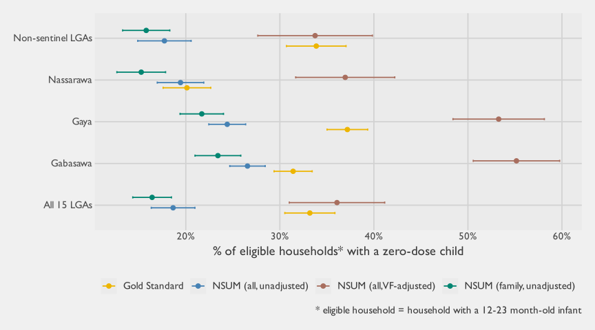
To explore transmission error directly, Figure 3.4 also includes a VF-adjusted variant of the full-network NSUM estimator. As described earlier, we estimate the VF from the gold-standard household survey by asking caregivers of age-eligible children what percentage of people in their social networks they would expect to know the vaccination status of their children (see Table 3.3). Because this VF question was asked at the caregiver level and not disaggregated by alter category, the adjustment can only be applied to the full network NSUM variant; we cannot compute separate VFs for restricted networks such as close family only. Empirically, the VF-adjusted estimator substantially increases the implied zero-dose prevalence and tends to over-estimate the gold-standard rate in the sentinel LGAs, with the non-sentinel stratum as the main exception where the adjustment brings estimates closer.
area | mean_visibility | mean_visibility_se | mean_visibility_low | mean_visibility_upp |
|---|---|---|---|---|
Gabasawa | 20.1% | 0.7% | 18.7% | 21.6% |
Gaya | 15.5% | 0.6% | 14.4% | 16.7% |
Nassarawa | 14.0% | 0.7% | 12.6% | 15.4% |
Non-sentinel LGAs | 9.9% | 0.6% | 8.6% | 11.1% |
All 15 LGAs | 10.9% | 0.5% | 9.9% | 11.9% |
Full computational details are provided below. Table 3.4 reports the design-based survey totals that serve as inputs to the NSUM estimators (for example, weighted sums of network sizes and reported zero-dose acquaintances under alternative network definitions, along with the components used to construct the VF). Table 3.5 then shows how these totals are combined into the specific NSUM variants, defining the corresponding ratios and survey contrasts, along with their associated standard errors and confidence intervals.7 This including the VF itself, prevalence estimates under different network definitions, and the derived estimates of totals.
var | description | Gabasawa | Gaya | Nassarawa | Non-sentinel LGAs | All 15 LGAs |
|---|---|---|---|---|---|---|
a | Weighted sum of network sizes (immediate family) | 807,553 | 682,342 | 1,324,456 | 12,328,527 | 15,142,878 |
b | Weighted sum of reported unvaccinated acquaintances (immediate family) | 189,055 | 148,045 | 202,087 | 1,946,516 | 2,485,703 |
c | Weighted sum of acquaintances with an infant 12-23 mo | 85,524 | 68,660 | 75,602 | 830,657 | 1,060,443 |
d | Weighted sum of visibility estimates | 60,853 | 49,587 | 88,941 | 581,439 | 780,820 |
e | Estimated total visibility reporters | 126,390 | 108,243 | 169,089 | 1,106,995 | 1,510,717 |
f | Weighted sum of conditional individual selection probabilities | 107,474 | 114,965 | 200,757 | 1,998,664 | 2,421,859 |
g | Weighted sum of network sizes (full network) | 4,096,779 | 3,588,767 | 6,184,390 | 62,939,427 | 76,809,363 |
h | Weighted sum of reported unvaccinated acquaintances (full network) | 1,088,002 | 875,764 | 1,202,012 | 11,156,177 | 14,321,955 |
Description | Contrast | Estimate | SE | degf | CV | 95% CI | ||
|---|---|---|---|---|---|---|---|---|
Lower bound | Upper bound | |||||||
Gabasawa | ||||||||
1 | Visibility factor (VF) | d / e | 48.1% | 1.1% | 499 | 2.3% | 45.9% | 50.4% |
2 | Proportion of households with a ZD child (family network, no VF adjustment) | b / a | 23.4% | 1.2% | 499 | 5.3% | 21.0% | 25.8% |
3 | Proportion of households with a ZD child (full network, no VF adjustment) | h / g | 26.6% | 1.0% | 499 | 3.6% | 24.7% | 28.4% |
4 | Proportion of households with a ZD child (full network, with VF adjustment) | h / (g * (d / e)) | 55.2% | 2.3% | 499 | 4.2% | 50.6% | 59.8% |
5 | Number of households with children 12-23 (method 1) | f / 2 | 53,737 | 1,177 | 499 | 2.2% | 51,430 | 56,044 |
6 | Number of households with children 12-23 (method 2) | c | 85,524 | 3,565 | 499 | 4.2% | 78,537 | 92,510 |
7 | Number of zero-dose children, no VF adjustment | (h / g) * c | 22,713 | 1,350 | 499 | 5.9% | 20,066 | 25,360 |
8 | Number of zero-dose children, with VF adjustment | (h / (g * (d / e))) * c | 47,174 | 2,913 | 499 | 6.2% | 41,464 | 52,884 |
Gaya | ||||||||
1 | Visibility factor (VF) | d / e | 45.8% | 1.1% | 499 | 2.4% | 43.7% | 47.9% |
2 | Proportion of households with a ZD child (family network, no VF adjustment) | b / a | 21.7% | 1.2% | 499 | 5.4% | 19.4% | 24.0% |
3 | Proportion of households with a ZD child (full network, no VF adjustment) | h / g | 24.4% | 1.0% | 499 | 4.1% | 22.4% | 26.4% |
4 | Proportion of households with a ZD child (full network, with VF adjustment) | h / (g * (d / e)) | 53.3% | 2.5% | 499 | 4.7% | 48.4% | 58.1% |
5 | Number of households with children 12-23 (method 1) | f / 2 | 57,482 | 1,346 | 499 | 2.3% | 54,844 | 60,121 |
6 | Number of households with children 12-23 (method 2) | c | 68,660 | 3,306 | 499 | 4.8% | 62,180 | 75,141 |
7 | Number of zero-dose children, no VF adjustment | (h / g) * c | 16,755 | 1,096 | 499 | 6.5% | 14,607 | 18,903 |
8 | Number of zero-dose children, with VF adjustment | (h / (g * (d / e))) * c | 36,575 | 2,555 | 499 | 7.0% | 31,566 | 41,583 |
Nassarawa | ||||||||
1 | Visibility factor (VF) | d / e | 52.6% | 1.6% | 499 | 3.0% | 49.5% | 55.7% |
2 | Proportion of households with a ZD child (family network, no VF adjustment) | b / a | 15.3% | 1.3% | 499 | 8.7% | 12.7% | 17.8% |
3 | Proportion of households with a ZD child (full network, no VF adjustment) | h / g | 19.4% | 1.3% | 499 | 6.5% | 17.0% | 21.9% |
4 | Proportion of households with a ZD child (full network, with VF adjustment) | h / (g * (d / e)) | 37.0% | 2.7% | 499 | 7.3% | 31.7% | 42.2% |
5 | Number of households with children 12-23 (method 1) | f / 2 | 100,378 | 2,480 | 499 | 2.5% | 95,517 | 105,240 |
6 | Number of households with children 12-23 (method 2) | c | 75,602 | 5,634 | 499 | 7.5% | 64,561 | 86,644 |
7 | Number of zero-dose children, no VF adjustment | (h / g) * c | 14,694 | 1,490 | 499 | 10.1% | 11,774 | 17,615 |
8 | Number of zero-dose children, with VF adjustment | (h / (g * (d / e))) * c | 27,936 | 2,981 | 499 | 10.7% | 22,093 | 33,779 |
Non-sentinel LGAs | ||||||||
1 | Visibility factor (VF) | d / e | 52.5% | 1.6% | 499 | 3.1% | 49.3% | 55.7% |
2 | Proportion of households with a ZD child (family network, no VF adjustment) | b / a | 15.8% | 1.3% | 499 | 8.1% | 13.3% | 18.3% |
3 | Proportion of households with a ZD child (full network, no VF adjustment) | h / g | 17.7% | 1.4% | 499 | 8.2% | 14.9% | 20.6% |
4 | Proportion of households with a ZD child (full network, with VF adjustment) | h / (g * (d / e)) | 33.7% | 3.1% | 499 | 9.2% | 27.7% | 39.8% |
5 | Number of households with children 12-23 (method 1) | f / 2 | 999,332 | 39,385 | 499 | 3.9% | 922,138 | 1,076,525 |
6 | Number of households with children 12-23 (method 2) | c | 830,657 | 72,077 | 499 | 8.7% | 689,389 | 971,926 |
7 | Number of zero-dose children, no VF adjustment | (h / g) * c | 147,236 | 17,468 | 499 | 11.9% | 112,999 | 181,473 |
8 | Number of zero-dose children, with VF adjustment | (h / (g * (d / e))) * c | 280,321 | 33,485 | 499 | 11.9% | 214,691 | 345,951 |
All 15 LGAs | ||||||||
1 | Visibility factor (VF) | d / e | 51.7% | 1.2% | 499 | 2.4% | 49.3% | 54.1% |
2 | Proportion of households with a ZD child (family network, no VF adjustment) | b / a | 16.4% | 1.0% | 499 | 6.4% | 14.4% | 18.5% |
3 | Proportion of households with a ZD child (full network, no VF adjustment) | h / g | 18.6% | 1.2% | 499 | 6.4% | 16.3% | 21.0% |
4 | Proportion of households with a ZD child (full network, with VF adjustment) | h / (g * (d / e)) | 36.1% | 2.6% | 499 | 7.2% | 31.0% | 41.1% |
5 | Number of households with children 12-23 (method 1) | f / 2 | 1,210,930 | 39,624 | 499 | 3.3% | 1,133,268 | 1,288,591 |
6 | Number of households with children 12-23 (method 2) | c | 1,060,443 | 72,608 | 499 | 6.8% | 918,135 | 1,202,752 |
7 | Number of zero-dose children, no VF adjustment | (h / g) * c | 197,731 | 18,210 | 499 | 9.2% | 162,040 | 233,423 |
8 | Number of zero-dose children, with VF adjustment | (h / (g * (d / e))) * c | 382,567 | 35,418 | 499 | 9.3% | 313,150 | 451,984 |
As part of our diagnostic checks, we examined whether the NSUM prevalence estimate (implemented as a survey ratio) varied systematically with respondents’ reported network size (the denominator). Such a relationship could indicate differential reporting behavior or other measurement artifacts, for example if respondents with larger networks systematically under- or over-report zero-dose households. Reassuringly, we did not find compelling evidence of a consistent pattern: the estimated zero-dose prevalence was broadly similar across network-size levels, within sampling uncertainty. A design-based regression Wald test corroborates this, finding no evidence of a statistically significant linear association between network size and the estimated prevalence \((F_{(1, 498)}=0.0\), \(p=.987)\).
Table 3.6 summarizes agreement between the NSUM variants and the gold-standard estimates of zero-dose prevalence across the four NSUM analysis areas. For each variant, we report the mean signed difference (interpreted as average bias), the mean absolute difference, and the root mean square error to characterize the typical magnitude of discrepancies. We also report the ICC and its \(p\)-value as a summary measure of concordance in area-level patterns, indicating whether NSUM and the gold standard tend to rank areas similarly even when point estimates differ.8
Estimate | Number of estimates (areas) | Mean Signed Difference (Bias) | Mean Absolute Difference | Root Mean Square Error | Intraclass Correlation Coefficient (ICC) | ICC p-value |
|---|---|---|---|---|---|---|
NSUM estimate, family network, unadjusted | 4 | 11.61 | 11.61 | 12.79 | -0.22 | 0.627 |
NSUM estimate, full network, unadjusted | 4 | 8.61 | 8.61 | 10.58 | -0.09 | 0.541 |
NSUM estimate, full network, VF-adjusted | 4 | -14.14 | 14.20 | 16.63 | -0.05 | 0.515 |
Note: Bias, MAD, and RMSE are expressed in percentage points. ICC is on the 0–1 scale. | ||||||
Taken together, these metrics quantify the degree of divergence across the four area-level estimates and indicate substantial disagreement: even the least poor-performing variant (full network, unadjusted) has a mean absolute difference of about 9 percentage points, which is too large for the method to be considered reliable for prevalence estimation in this setting.
3.2.4 Discussion
Overall, the head-to-head results suggest that NSUM, as implemented here, does not reproduce the gold-standard estimates in a way that would support routine operational use for zero-dose prevalence measurement. Across strata and across network definitions, the NSUM variants diverge meaningfully from the benchmark, and the discrepancies do not behave like a stable offset that could be removed through simple calibration. This matters because the appeal of NSUM is not only lower cost, but also the prospect of decision-relevant accuracy; in this application, that second condition does not appear to be met.
Several aspects of this setting likely make NSUM less forgiving than in many published applications. First, our effective network definition is narrow, with an average network size of about 10.8 (same-sex contacts who have age-eligible children), rather than the much larger adult-contact networks often used elsewhere (commonly >100). This mechanically reduces the theoretical efficiency gains that motivate NSUM and increases the role of sampling variability. More importantly, it introduces additional layers of uncertainty because respondents must determine not only whether an alter has an unvaccinated child, but also whether an alter has a child in the 12–23 month age band at all. In contexts where birthdates are not reliably recorded or remembered, respondents may have limited ability to screen alters by child age, meaning the denominator can be noisy in a way that is atypical for NSUM studies that rely on more stable network definitions.
The observed pattern of divergence is also consistent with a combination of barrier and transmission effects whose magnitude varies by stratum. Barrier effects need not produce a constant bias across LGAs: if the social mixing processes that shape who knows whom differ across urban and rural settings, across service environments, or across community structures, then the induced bias can change direction and magnitude across strata. Transmission effects are particularly salient for vaccination status, where knowledge is often indirect and unevenly distributed across relationship types, and where respondents may infer status based on cues (clinic attendance, attitudes, rumors) rather than direct confirmation. This helps explain why tightening the network definition (for example, close-family-only) does not reliably move estimates toward the gold standard: restricting to closer alters may increase confidence in responses, but it does not guarantee correct classification, and it reduces the effective network size at the same time.
The VF-adjusted variant provides an instructive diagnostic. In principle, inflating by VF should correct undercounting due to incomplete visibility of vaccination status (transmission error). In practice, the VF-adjusted estimates tend to overshoot substantially in the sentinel LGAs, suggesting that the adjustment is compensating for the wrong mechanism or that the VF being applied is not commensurate with the way respondents actually generate their counts. One plausible explanation is that respondents do not interpret the NSUM numerator as children they know for a fact are unvaccinated, but instead give an impressionistic answer that implicitly imputes status for uncertain alters based on perceived norms in their community. If respondents are already internally adjusting their counts for unknown status, then applying an external VF inflation can double-correct and lead to systematic overestimation, which aligns with what we observe. A second issue is that we can only apply a single, overall VF to the full-network definition, because caregiver-reported visibility was not collected separately by alter category; if visibility differs sharply between close family, friends, neighbors, and more distant ties, then a single pooled VF will be a blunt instrument.
Taken together, these findings point to a core limitation for this use case: the NSUM denominator and numerator both require respondents to make compound judgments about other households’ composition and vaccination behavior, and those judgments are likely heterogeneous, partially inferred, and socially patterned. With a small effective network size and multiple opportunities for misclassification, even modest departures from the ideal assumptions can translate into large discrepancies relative to a probability-based benchmark.
Based on the present evidence, therefore, a standard summation NSUM approach does not appear to be a dependable substitute for probability-based coverage surveys when the objective is accurate estimation of zero-dose prevalence.
3.2.5 Recommendations
Based on the evidence from this study, we do not recommend using NSUM for vaccination coverage or zero-dose prevalence estimation as implemented here.
Unfortunately, it is difficult to diagnose the precise source of the discrepancies. While we discuss plausible mechanisms (for example, barrier and transmission effects), these explanations remain partly speculative, and the available data do not allow us to attribute error cleanly to any single cause. However, the patterns observed do point to concrete design changes that could be tested in future work. Priority avenues include stronger elicitation and validation, such as collecting VF by alter category, incorporating re-interviews or follow-ups that verify a subsample of reported alters, and using modeling approaches that allow heterogeneous mixing and differential visibility. In addition, the questionnaire could more explicitly separate known from unknown vaccination status through structured probing and response options, reducing the risk that respondents provide impressionistic counts that blend confirmed information with assumptions about uncertain alters.
Even if some of these deficiencies can be addressed, our effective networks remain relatively small (mean 10.8 alters). This limits how much information each interview can contribute and therefore caps the achievable efficiency gains. As a result, even in an improved implementation, the reductions in required respondent sample size would likely be less dramatic than in many published NSUM applications that rely on much larger adult contact networks (often >100 alters).
3.2.6 Conclusions
Overall, this head-to-head comparison finds that NSUM, as implemented in the Kano Zero-Dose Baseline Study, does not produce zero-dose prevalence estimates that are consistently compatible with the gold-standard probability survey. Across strata and across alternative network definitions, NSUM estimates diverge meaningfully from the benchmark, and the differences do not behave like a stable offset that could be corrected by simple calibration. The VF-adjusted variant illustrates the difficulty: while intended to correct for incomplete visibility of vaccination status, it tends to overcorrect in the sentinel LGAs and does not yield a uniformly improved match to the gold standard. Taken together, the evidence suggests that a standard summation NSUM approach is not a dependable substitute for probability-based coverage measurement when the objective is accurate estimation of zero-dose prevalence.
These results are plausibly explained by the same mechanisms highlighted earlier, with barrier and transmission effects likely playing a central role, alongside unusually strong measurement challenges in both the numerator and denominator. Relative to many published NSUM applications, our effective network definition is narrow and small (mean network size of roughly 10.8 alters), which reduces theoretical efficiency gains and increases sensitivity to reporting error. In addition, respondents must identify which contacts have age-eligible children and assess vaccination status that may not be directly known, making both eligibility screening and status classification prone to uncertainty, inference, and social-patterned visibility. Future work could test whether NSUM can be made more reliable for immunization measurement through improved elicitation and validation, including VF measures by alter category, re-interviews or verification studies, modeling approaches that explicitly allow heterogeneous mixing and differential visibility, and questionnaire designs that separate confirmed from unknown vaccination statuses to avoid impressionistic reporting.
3.3 Adaptive Sampling
3.3.1 Overview
Adaptive sampling lets the sample respond to what field teams learn as data collection unfolds (Thompson and Seber 1996; Thompson 2006). If early observations suggest that a rare outcome is concentrated in particular places, the design can add nearby units instead of continuing as if every location were equally informative. The intuition is straightforward, but the design and estimation theory are demanding, which has limited its use in routine coverage surveys.
Zero-dose measurement has that structure in principle. If zero-dose children cluster across neighboring Primary Sampling Units (PSUs), an adaptive design may recover more information per PSU than a conventional Probability Proportional-to-Size (PPS) survey. The version evaluated here is an adaptive web sampling design (Thompson 2006).9
Two evidence sources matter for interpreting the results. The non-sentinel field implementation shows what happened when Adaptive Sampling (AS) was used in the study. A simplified resampling simulation on sentinel data then asks whether, at the same total PSU budget, this version of AS would usually beat a conventional PPS sample.
3.3.2 Implementation Details
3.3.2.1 Sampling
The adaptive sampling design was applied independently within each LGA. It first selected a preliminary set of PSUs by PPS, using PSU population size as the measure of size. After those preliminary PSUs were visited, the team estimated the total number of zero-dose children in each selected PSU. Those PSU-level zero-dose counts then guided the adaptive selections.
The adaptive phase then gave higher selection probabilities to unvisited neighbors of preliminary PSUs with high zero-dose counts, and sampled from those updated measures using PPS.10 This made the design more likely to visit places near observed zero-dose concentrations, while avoiding reselection of PSUs already visited in the preliminary phase.
3.3.2.2 Estimation
Both phases assigned every PSU a positive probability of selection. With the correct weights, the preliminary selections alone can therefore support a valid design-based estimate. This preliminary-only estimate is the baseline against which the adaptive sampling estimator is evaluated.11
The adaptive sampling estimator uses Rao-Blackwellization (Thompson 2006). In plain terms, it averages over the different ways the final set of selected PSUs could have been split into preliminary and adaptive selections. This keeps the same target quantity but can reduce variance. The intuition is that the observed final set of PSUs is the same regardless of which preliminary/adaptive split produced it, so averaging over the splits that could have arisen removes arbitrary variation without changing what is being estimated.
For an adaptive design, Rao-Blackwellization requires estimates for all sample reorderings: all possible assignments of selected PSUs to the preliminary and adaptive components that could have produced the observed final sample.12 The adaptive sampling estimate is the probability-weighted average of the estimates from those reorderings.
The mathematical details are in Section A.1.
3.3.3 Results
The field implementation evidence comes from the non-sentinel LGAs. These results compare the preliminary and adaptive sampling estimates produced by the implemented adaptive design. They do not compare AS with a conventional PPS survey of the same total size; that comparison is addressed later using a simplified resampling simulation on sentinel LGA data.
Adaptive selections were based on estimates of the total number of zero-dose children per selected PSU. Because the adaptive rule targeted high zero-dose counts, its clearest gains should be for population totals, not necessarily for prevalence or every secondary outcome. The technical appendix provides the mathematical details required for evaluating the point and variance estimates.
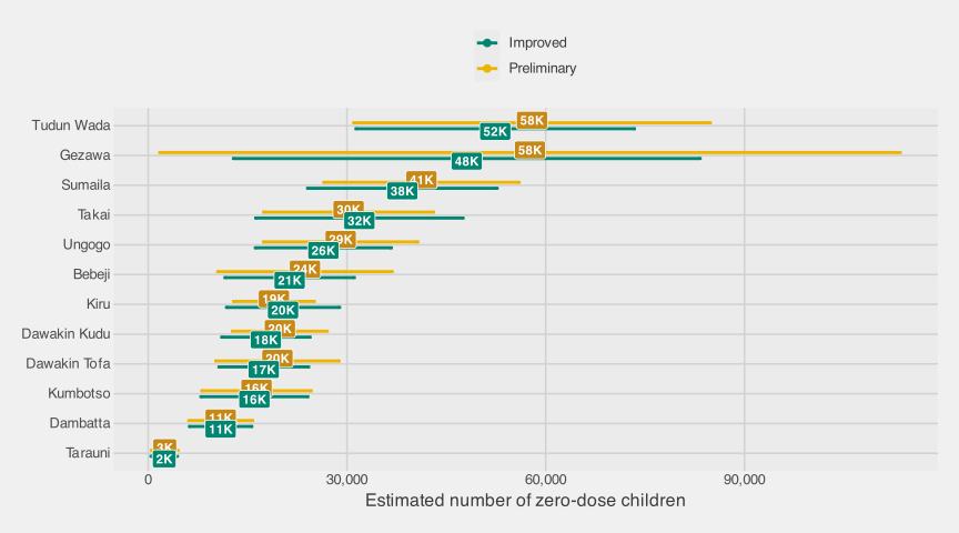
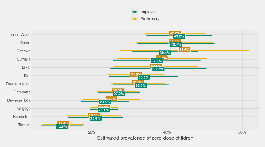
The first two tables report the preliminary and adaptive sampling point estimates, variance estimates, and 95% confidence intervals for the total number and prevalence of zero-dose children. All variance estimates returned strictly positive values; no negative-variance cells arise here.
The numbers in Table 3.7 and Table 3.8 use two methodological safeguards. First, the Rao-Blackwell calculation preserves the alignment between each sampled PSU and its inclusion probability across all reorderings.13 Second, uncertainty is estimated at the PSU level rather than treating children as independent first-stage sampling units.14
LGA | Preliminary | Improved | ||||
|---|---|---|---|---|---|---|
# | Variance | 95% CI | # | Variance | 95% CI | |
Gezawa | 57,629 | 812,740,436 | (1,753; 113,505) | 48,084 | 322,769,171 | (12,872; 83,297) |
Ungogo | 29,057 | 35,260,705 | (17,419; 40,695) | 26,439 | 27,398,177 | (16,180; 36,698) |
Bebeji | 23,674 | 45,083,813 | (10,514; 36,834) | 21,354 | 24,824,386 | (11,588; 31,119) |
Dambatta | 10,948 | 6,041,113 | (6,131; 15,766) | 10,938 | 5,760,075 | (6,234; 15,642) |
Dawakin Kudu | 19,874 | 13,308,366 | (12,724; 27,024) | 17,770 | 11,570,443 | (11,103; 24,437) |
Dawakin Tofa | 19,511 | 22,529,840 | (10,208; 28,814) | 17,453 | 11,929,297 | (10,684; 24,223) |
Kiru | 18,987 | 9,681,584 | (12,888; 25,085) | 20,358 | 18,946,254 | (11,827; 28,889) |
Kumbotso | 16,353 | 17,742,545 | (8,098; 24,609) | 16,033 | 16,942,947 | (7,966; 24,101) |
Sumaila | 41,252 | 56,532,550 | (26,515; 55,988) | 38,367 | 53,257,724 | (24,063; 52,670) |
Takai | 30,247 | 42,778,510 | (17,427; 43,066) | 31,881 | 63,677,070 | (16,241; 47,522) |
Tarauni | 2,508 | 1,042,474 | (506; 4,509) | 2,423 | 1,021,317 | (443; 4,404) |
Tudun Wada | 57,926 | 188,569,574 | (31,012; 84,841) | 52,381 | 114,933,865 | (31,369; 73,394) |
LGA | Preliminary | Improved | ||||
|---|---|---|---|---|---|---|
% | Variance | 95% CI | % | Variance | 95% CI | |
Gezawa | 44.6% | 76.1 | (27.5; 61.7) | 39.4% | 19.7 | (30.7; 48.1) |
Ungogo | 23.3% | 3.3 | (19.8; 26.8) | 23.1% | 3.5 | (19.5; 26.8) |
Bebeji | 42.0% | 26.5 | (31.9; 52.1) | 42.4% | 26.8 | (32.2; 52.5) |
Dambatta | 26.9% | 8.0 | (21.4; 32.5) | 27.2% | 7.9 | (21.7; 32.7) |
Dawakin Kudu | 32.3% | 13.2 | (25.1; 39.4) | 33.0% | 14.1 | (25.6; 40.3) |
Dawakin Tofa | 25.2% | 14.9 | (17.6; 32.7) | 23.5% | 10.5 | (17.1; 29.8) |
Kiru | 31.8% | 14.3 | (24.4; 39.2) | 33.8% | 21.0 | (24.8; 42.7) |
Kumbotso | 20.5% | 13.0 | (13.5; 27.6) | 20.9% | 13.5 | (13.7; 28.2) |
Sumaila | 38.5% | 36.6 | (26.7; 50.4) | 37.2% | 34.7 | (25.7; 48.8) |
Takai | 37.1% | 32.3 | (25.9; 48.2) | 37.7% | 41.7 | (25.1; 50.4) |
Tarauni | 12.4% | 7.7 | (7.0; 17.8) | 12.0% | 7.6 | (6.6; 17.4) |
Tudun Wada | 42.2% | 16.7 | (34.2; 50.2) | 43.2% | 19.3 | (34.6; 51.8) |
3.3.4 Findings
Two questions need separate answers. The field data show whether the adaptive step improved the AS estimator that was actually fielded. The sentinel simulation tests whether that design family usually beats conventional PPS at the same PSU budget.
3.3.4.1 Field Implementation
The non-sentinel field data show that the adaptive step can materially change the precision of the implemented AS estimator. Most preliminary estimates, based only on the preliminary selections, were close to the adaptive sampling estimates, based on the full set of preliminary and adaptive selections. That agreement is reassuring for the non-sentinel field estimates themselves.
The field results answer a narrow question: given the AS design that was actually fielded, how did the adaptive sampling estimator’s estimated uncertainty compare with the preliminary estimator’s? They do not answer the policy question that a survey planner usually faces: whether the same total budget would have been better spent on a conventional PPS survey. The non-sentinel field sample cannot answer that question directly because we did not observe all PSUs that alternative adaptive or conventional samples might have selected.
For zero-dose totals, the adaptive sampling estimator had a lower estimated standard error than the preliminary one in 10 of the 12 non-sentinel LGAs. Across all 12 LGAs, the average estimated standard-error reduction was about 6%; among the 10 LGAs where the adaptive sampling estimator had lower estimated standard error, the average reduction was about 14%. For prevalence, the two estimators were close on average: the adaptive sampling estimator had a lower estimated standard error in a handful of LGAs but had moderately higher estimated variance than the preliminary estimator in a few others, consistent with the adaptive rule targeting totals rather than ratios. These estimates show that the adaptive reordering step carried information in the field implementation. They should not be interpreted as evidence that AS would necessarily beat a same-size conventional survey.
Operationally, the adaptive sampling design was feasible but not simple. The main challenge was timing: the field team had to pause while analysts estimated selected survey variables, evaluated selection probabilities, computed calibrated weights, and chose the adaptive PSUs. Future implementations could reduce that pause by routing on raw PSU-level zero-dose counts. Those counts are likely to be highly correlated with the weighted PSU-level totals that drive the adaptive rule, and they are much faster to compute during fieldwork.
The adaptive rule used PSU-level zero-dose totals as its signal, so variables strongly correlated with zero-dose counts should see the largest precision gains. Outcomes weakly correlated with zero-dose counts are unlikely to benefit as much. Future implementations with several priority outcomes should balance adaptive effort across those outcomes rather than optimize only for zero-dose counts.
3.3.4.2 Simulation Study
The field implementation leaves two useful methodological questions unresolved. First, if a survey team redirected the same total PSU budget to a conventional PPS design, would AS still improve precision? Second, how effective and efficient would the adaptive design be at smaller budgets that more closely resemble a routine survey?
The non-sentinel AS data cannot answer those questions cleanly. They contain one realized adaptive sample, not the counterfactual PSUs that a conventional design or another adaptive draw would have selected. A stage-1 PPS sample also cannot be downsampled into a smaller adaptive experiment after the fact, because each adaptive draw depends on the zero-dose counts observed in its own preliminary PSUs. Once the field design is fixed, we also cannot know how thousands of other adaptive designs would have behaved under different preliminary fractions or total budgets.
The sentinel LGAs provide the needed workaround. In Gabasawa, Gaya, and Nassarawa, the gold-standard survey covered the full set of gridded EAs used as analytic PSUs across each LGA. These gridded EAs were created for the study with geospatial algorithms, because the study did not have access to an National Population Commission (NPC) frame of official EAs. We can therefore treat the observed sentinel sample as a fixed geographic universe, repeatedly redraw simplified conventional and adaptive designs, and compare what those designs recover from the same underlying zero-dose pattern. The simulation helps answer planning comparisons that the single non-sentinel AS realization cannot fully answer.
This fixed-universe assumption is deliberately modest, but it preserves the feature that matters most for AS. The spatial pattern among sentinel PSUs determines whether preliminary selections point to useful neighboring PSUs, so the simulation tests whether the adaptive rule has signal to exploit.
The simulation varies two choices a planner controls:
- Total PSU budget \(B \in \{30, 40, 50, 60\}\);
- Preliminary fraction \(\phi \in \{0.5, 0.6, 0.7, 0.8, 0.9, 1.0\}\) (the preliminary share of \(B\); \(\phi = 1\) collapses to a pure conventional design with no adaptive supplement; this is the comparison anchor).15
Table 3.9 translates the grid into the number of PSUs assigned to the preliminary and adaptive phases. Each cell reports preliminary/adaptive PSUs; for example, 32/8 means 32 preliminary PSUs and 8 adaptive PSUs.
Preliminary fraction | B = 30 | B = 40 | B = 50 | B = 60 |
|---|---|---|---|---|
0.5 | 15/15 | 20/20 | 25/25 | 30/30 |
0.6 | 18/12 | 24/16 | 30/20 | 36/24 |
0.7 | 21/9 | 28/12 | 35/15 | 42/18 |
0.8 | 24/6 | 32/8 | 40/10 | 48/12 |
0.9 | 27/3 | 36/4 | 45/5 | 54/6 |
1.0 | 30/0 | 40/0 | 50/0 | 60/0 |
For each design, the preliminary PSUs are drawn by PPS, and any remaining PSUs are selected by the same adaptive rule used in the field implementation. Within each selected PSU, the simulation samples up to \(30\) observed children, mimicking an EPI-style second stage.16
The main outcome is operational: does the adaptive sampling estimator produce a smaller standard error than a conventional PPS design with the same total PSU budget? Detailed bias and variance diagnostics are reported in Section A.1.3.
Figure 3.7 plots the relative standard error (mean Standard Error (SE) divided by the universe-truth total) as a function of \(\phi\), with one line per total budget \(B\) and LGA. The diamond at \(\phi = 1\) is the conventional PPS benchmark at that budget. Points to the left show the adaptive sampling estimator for different splits between the preliminary and adaptive phases.
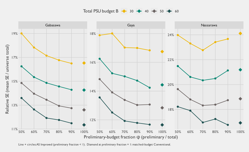
The main result is easy to state. Across most of the grid, the adaptive sampling estimator sits close to the same-budget conventional benchmark. The adaptive-sampling-to-conventional relative-SE ratios run from about 0.94 to 1.20 across cells, with a median of about 1.02. In practical terms, AS often did about as well as a same-size conventional PPS sample, but the grid leans slightly toward conventional rather than showing broad adaptive gains.
Nassarawa is the clearest exception. At \(B = 30\) and \(B = 40\), the adaptive sampling curve dips below the conventional benchmark around \(\phi \approx 0.6\)–\(0.9\). At \(B = 50\) and \(B = 60\), the best Nassarawa cells also fall slightly below the conventional benchmark, but by narrower margins. This is the clearest coherent evidence in the simulation that AS can help when the zero-dose outcome is clustered enough for the adaptive rule to find signal.
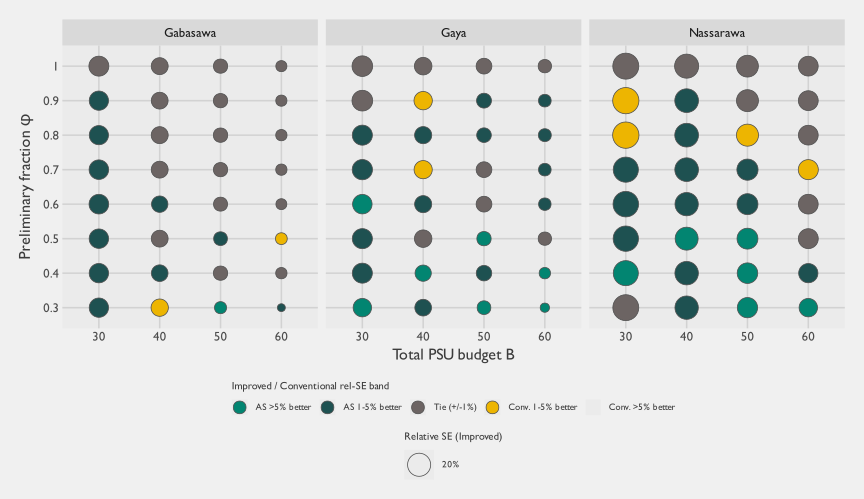
Figure 3.8 recasts the same information as a matrix: each cell is one \((B, \phi)\) combination, the fill encodes the adaptive-sampling-to-conventional relative SE ratio band at the same total budget (so values \(< 1\) mean AS beats matched-budget conventional, and values \(> 1\) mean it loses), and the size encodes the absolute relative SE of the adaptive sampling estimator (bigger circle = more uncertainty). The \(\phi = 1\) row is the conventional baseline, shown at ratio = \(1\) by construction.
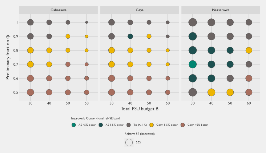
Two patterns stand out in the matrix view. First, most cells fall in the near-tie or conventional-better bands, so AS roughly ties the conventional design across much of the grid while underperforming most clearly when the preliminary fraction is low. Second, the clearest coherent zone where the adaptive sampling estimator beats matched-budget conventional is the mid-to-high-\(\phi\) band in Nassarawa (\(\phi \approx 0.6\)–\(0.9\)): the small-budget cells (\(B = 30\) and \(B = 40\)) fall in the AS-better bands (adaptive-sampling-to-conventional ratio between 0.94 and 0.99), with margins narrowing or vanishing at \(B = 50\) and \(B = 60\). One Gabasawa cell and a few Gaya cells also fall below \(1\), but they do not form as stable a pattern across neighboring budgets and preliminary fractions. This is the highest-prevalence, sparsest-coverage LGA. The pattern is exactly where adaptive sampling should help: the target outcome is clustered enough for the preliminary sample to identify useful neighboring PSUs. Across the rest of the grid the ratio is often close to \(1.0\), so at coverage-survey-scale budgets the adaptive sampling estimator and same-budget conventional produce broadly similar precision, with conventional more often ahead when too much of the budget is reserved for the adaptive phase.
The reason is a budget tradeoff. Every PSU reserved for the adaptive phase is a PSU not included in the preliminary PPS sample. AS wins only if the adaptive step recovers more precision than it loses by shrinking that preliminary foundation. The formal break-even rule makes the tradeoff explicit. Let \(\phi\) be the preliminary share of the total PSU budget, and let \(R\) be the within-design Rao-Blackwell variance reduction produced by the adaptive sampling estimator. Under the leading-order no-Finite Population Correction (FPC) approximation derived in Section A.1.2, the adaptive sampling estimator beats matched-budget conventional only when:
\[ R > 1 - \phi. \tag{3.7}\]
The larger the adaptive share, the larger the variance reduction required to break even. At \(\phi = 0.8\), for example, the adaptive step must remove more than \(20\%\) of the preliminary-estimator variance before AS can beat a conventional design that spends all \(B\) PSUs on the first-stage sample. For policy readers, the practical implication is twofold. First, unless the adaptive signal is strong, the safer allocation is preliminary-heavy. Second, small-budget studies make the tradeoff sharper because PSUs are discrete. Once most of a small budget is reserved for the preliminary sample, the adaptive supplement may contain only a handful of PSUs. The analytic and operational complexity of AS is largely fixed, so that overhead becomes harder to justify when it buys only a few adaptive selections.
Matched-budget PPS is also a strong comparator because it already uses the Measure of Size (MOS) to allocate first-stage effort. When the MOS is a useful proxy for the number of eligible children, conventional PPS naturally scales sample allocation toward PSUs where the expected number of zero-dose children is larger. The adaptive rule evaluated here used the estimated zero-dose count from each neighboring preliminary PSU as the signal for nearby candidate PSUs, but it did not combine that local zero-dose signal with the MOS for each candidate PSU. A natural extension is to treat the adaptive step as a mid-course update to the MOS, rather than as a purely local neighborhood rule.
The ingredients of that extension are not new. Classical adaptive cluster sampling (Thompson 1990, 1050) and adaptive web sampling (Thompson 2006, 1224) established the design family for rare, clustered outcomes, with later work adding auxiliary variables and unequal-probability or PPS initial samples (Chao and Thompson 2001, 517; Felix-Medina and Thompson 2004, 877; Roesch 1993, 655; Wang and Yang 2024, 1668 and Section 3.2). Model-based and Bayesian variants use prior or accumulating data to guide later sampling and inference for rare, spatially clustered populations (Rapley and Welsh 2008, 717; Chipeta et al. 2016, 70–71), and the Malawi rolling malaria surveys give a public-health analogue: later household samples were chosen using prevalence predictions from earlier rounds, with Bayesian spatial models producing updated prevalence and high-risk maps (Kabaghe et al. 2017, “Household sampling” and “Statistical analysis” sections). What is less common is the operational comparison that matters for vaccination surveys: whether a fixed-budget adaptive design beats a same-budget conventional PPS cluster survey that already uses a population MOS. Our version below keeps the machinery lighter and closer to coverage-survey practice: a simple empirical Bayes shrinkage estimate updates the second-phase PPS size measure, and we then evaluate the resulting design against the conventional PPS alternative a vaccination survey team would otherwise field.
3.3.4.2.1 Empirical Bayes Adaptive Sampling
We therefore ran an exploratory extension, Empirical Bayes Adaptive Sampling, that treats the adaptive step as an update to the PPS size measure. This was not the design fielded in Kano, and it should not replace the main comparison above. It tests whether AS becomes more competitive when the adaptive rule preserves the main advantage of conventional PPS: sampling effort remains proportional to expected population size.
The empirical Bayes rule uses the preliminary sample to estimate a pooled zero-dose risk across sampled PSUs. Every unsampled candidate PSU receives a baseline size measure equal to this pooled risk multiplied by its original MOS. For candidates adjacent to preliminary PSUs, the rule sets the candidate’s zero-dose risk to a weighted average of the local zero-dose rate from its preliminary neighbors and the pooled preliminary risk, leaning toward the pooled risk when the local evidence is thin:
\[ \widehat{p}_{i,\text{EB}} = \frac{y_{\text{local}, i} + \tau \widehat{p}_{\text{global}}} {n_{\text{local}, i} + \tau}, \qquad \text{size}_i = \text{MOS}_i \times \widehat{p}_{i,\text{EB}}. \tag{3.8}\]
Here \(y_{\text{local}, i}\) and \(n_{\text{local}, i}\) pool the zero-dose count and observed child denominator from preliminary PSUs adjacent to candidate PSU \(i\). When a candidate has no adjacent preliminary PSU, \(\widehat{p}_{i,\text{EB}}\) equals the pooled preliminary risk. We set \(\tau = 30\), matching the intended child quota per PSU, so weak local evidence stays close to the global preliminary risk while stronger adjacent evidence can move the candidate’s size measure up or down.
The expanded empirical Bayes grid used the same budgets \(B \in \{30, 40, 50, 60\}\), extended the preliminary fraction to \(\phi \in \{0.3, 0.4, \ldots, 1.0\}\), and repeated each cell \(50\) times. Table 3.10 summarizes the best empirical Bayes adaptive cell against the matched-budget conventional benchmark for each LGA, budget, outcome, and metric.
Outcome | Metric | AS wins | Mean AS / Conv | Median AS / Conv | Lowest AS / Conv | Highest AS / Conv |
|---|---|---|---|---|---|---|
Zero-dose prevalence | Mean model SE | 12/12 | 0.81 | 0.80 | 0.71 | 0.90 |
Zero-dose prevalence | Empirical point-estimate SD | 11/12 | 0.86 | 0.85 | 0.65 | 1.01 |
Zero-dose total | Mean model SE | 12/12 | 0.93 | 0.94 | 0.89 | 0.97 |
Zero-dose total | Empirical point-estimate SD | 12/12 | 0.88 | 0.88 | 0.78 | 0.95 |
The empirical Bayes results were much stronger than the original adaptive rule. For zero-dose prevalence, the best empirical Bayes adaptive cell beat matched-budget conventional PPS in all 12 LGA-by-budget comparisons for model-based mean SE, with an average adaptive-to-conventional ratio of 0.81. It also beat conventional in 11 of 12 comparisons for empirical replicate-to-replicate Standard Deviation (SD), with an average ratio of 0.86. For zero-dose totals, the best empirical Bayes adaptive cell beat conventional in 12 of 12 comparisons for model-based mean SE and 12 of 12 for empirical SD; the average ratios were 0.93 and 0.88, respectively. The gains are therefore broad but not uniform, with the strongest improvement for prevalence model-based SE and total empirical stability.
Figure 3.9 shows where those gains occur in the expanded tuning grid. Lower preliminary fractions, especially \(\phi = 0.3\) and \(\phi = 0.4\), often performed well for prevalence mean SE; total estimates favored a more mixed set of preliminary fractions. This makes practical sense: once the adaptive rule keeps a population-scaled baseline for all unsampled PSUs and smooths local evidence toward the pooled preliminary risk, a larger adaptive supplement no longer discards the core logic of PPS in the way the original local-neighbor rule did.
These results change the interpretation of the adaptive-family evidence. The fielded rule did not broadly beat a matched-budget conventional PPS design, but Empirical Bayes Adaptive Sampling was much more competitive in this fixed sentinel universe. That does not prove that the empirical Bayes rule would outperform conventional PPS in the field; it was tested retrospectively on the sentinel universe and would need simulation specified in advance, along with operational validation, before deployment. It does show that the weaker performance of the fielded rule should not be read as a rejection of adaptive sampling as a class. An adaptive design that updates PPS size measures using preliminary zero-dose risk appears much more competitive than a rule that assigns all neighboring candidates the same local zero-dose count regardless of their population size.
Table 3.11 surfaces the operational comparison numerically: at each \(B\), the best-performing \(\phi\) for the adaptive sampling estimator alongside the pure-conventional (\(\phi = 1\)) baseline.
LGA | Budget B | Conv rel-SE (phi = 1) | Best AS Improved phi | Best AS Improved rel-SE | Improved / Conv |
|---|---|---|---|---|---|
Gabasawa | 30 | 16.5% | 90% | 16.5% | 1.00 |
40 | 14.3% | 90% | 14.3% | 1.00 | |
50 | 12.6% | 90% | 12.7% | 1.01 | |
60 | 11.3% | 90% | 11.5% | 1.01 | |
Gaya | 30 | 16.7% | 90% | 16.8% | 1.01 |
40 | 14.4% | 90% | 14.2% | 0.99 | |
50 | 12.8% | 80% | 13.0% | 1.02 | |
60 | 11.7% | 90% | 11.7% | 1.00 | |
Nassarawa | 30 | 24.1% | 70% | 22.8% | 0.94 |
40 | 21.2% | 70% | 20.3% | 0.96 | |
50 | 18.9% | 70% | 18.3% | 0.97 | |
60 | 16.9% | 90% | 16.8% | 0.99 |
3.3.4.2.2 Extension to prevalence estimation
The main comparison above focuses on the total number of zero-dose children, because the adaptive rule was built around PSU-level zero-dose counts. We also repeated the comparison for zero-dose prevalence, which is often the more familiar program indicator. For prevalence, Table 3.12 uses the empirical replicate-to-replicate SD as the precision measure. That choice avoids relying on a model-based variance estimator that was unstable when the preliminary phase was very small.
LGA | Budget B | Conv rel-SD (phi = 1) | Best AS Improved phi | Best AS Improved rel-SD | Improved / Conv |
|---|---|---|---|---|---|
Gabasawa | 30 | 11.5% | 90% | 11.6% | 1.01 |
40 | 9.4% | 70% | 9.4% | 1.00 | |
50 | 9.3% | 90% | 8.1% | 0.86 | |
60 | 8.3% | 70% | 7.5% | 0.91 | |
Gaya | 30 | 12.3% | 80% | 11.9% | 0.97 |
40 | 10.5% | 70% | 10.5% | 1.00 | |
50 | 9.9% | 90% | 9.6% | 0.97 | |
60 | 8.6% | 90% | 8.2% | 0.96 | |
Nassarawa | 30 | 20.6% | 70% | 18.5% | 0.90 |
40 | 17.7% | 50% | 15.4% | 0.87 | |
50 | 15.2% | 90% | 14.0% | 0.92 | |
60 | 13.5% | 90% | 12.6% | 0.93 |
The prevalence results point in the same general direction, but they are less orderly than the totals results. The adaptive sampling estimator and matched-budget conventional often remain close, with Nassarawa showing the most consistent wins and some Gabasawa and Gaya cells also improving. This suggests that, in these sentinel data, the PSU-level zero-dose count signal could also be informative for prevalence, even though prevalence was not the quantity the adaptive rule directly optimized.
A few caveats specific to this grid should temper the interpretation.17
3.3.5 Recommendations
Do not treat this adaptive design as the default replacement for conventional PPS sampling. The fixed-budget simulations show that this version of AS can work: Nassarawa provides a concrete example where the adaptive sampling estimator beat a matched-budget conventional design in several low-budget, mid-\(\phi\) cells. Across the other sentinel simulation cells, however, those gains were not the dominant pattern. The adaptive sampling estimator more often tied or underperformed a conventional PPS sample with the same total PSU budget, with narrower wins scattered outside the main Nassarawa pattern. Empirical Bayes Adaptive Sampling is more encouraging, but it was not fielded and should be treated as a candidate design for further validation rather than as a settled recommendation.
Use adaptive sampling only when there is prior evidence of useful spatial clustering at the PSU scale. The adaptive step pays off only if the preliminary sample reveals enough signal about where high-yield neighboring PSUs are likely to be. That signal depends on the spatial correlation structure of the outcome, which survey planners rarely know well before fieldwork begins. Without credible prior data, pilot evidence, or a strong geographic mechanism for clustering, the expected efficiency gain is too uncertain to justify the design as a routine choice.
Choose the preliminary/adaptive split jointly with the adaptive size-measure rule. At fixed total budget, the adaptive design starts with a sample-size handicap because only \(\phi B\) PSUs are selected in the preliminary phase. The Rao-Blackwell improvement must overcome that handicap. The break-even rule above shows that the adaptive design needs \(R > 1 - \phi\) before it can beat a matched-budget conventional design. For the fielded local-neighbor rule, practical allocations should be preliminary-heavy unless strong prior evidence supports a larger adaptive supplement. For Empirical Bayes Adaptive Sampling, lower preliminary fractions sometimes performed well because the adaptive draw retained a population-scaled PPS baseline and smoothed local evidence toward pooled preliminary risk. This finding argues for design-specific simulation before fieldwork rather than for a universal default split.
Be explicit about the estimand the adaptive rule is optimizing. The design evaluated here used PSU-level zero-dose counts as its signal, so it is best suited to estimating zero-dose totals and outcomes strongly correlated with those totals. It should not be expected to improve every outcome collected on the survey instrument. If prevalence, subgroup estimates, or multiple outcomes carry equal decision weight, a conventional design or a different adaptive rule may be the better choice.
Budget for the analytic and operational complexity. This design requires timely preliminary estimation, correct weights, a well-defined adjacency structure, Rao-Blackwell reordering, and careful variance reporting while fieldwork is still active. Those requirements create a real complexity penalty relative to a conventional PPS survey of the same size. Where the expected precision gain is modest, that penalty can outweigh the benefit.
Do not generalize these results to every adaptive design. The evidence here covers one fixed-budget, two-phase PSU-level adaptive design. Other adaptive designs, or different implementations of adaptive web sampling, may behave differently. Empirical Bayes Adaptive Sampling illustrates the point: combining observed neighboring zero-dose risk with candidate-level MOS was much more competitive with matched-budget PPS than the fielded local-neighbor rule in this simulation. Programs interested in adaptive sampling should simulate the specific design they intend to field, using the best available information about geography, outcome clustering, population size, and operational constraints.
3.3.6 Conclusions
Taken together, the field implementation and sentinel resampling results are a proof of possibility, not a general recommendation. The non-sentinel implementation shows that this design was feasible and that the adaptive sampling estimator could gain precision over the preliminary estimator. The sentinel simulation asks the sharper planning question: whether the same total PSU budget would have been better spent on AS or on a conventional PPS sample. AS can improve precision when the target outcome is spatially clustered in a way that the preliminary sample can detect. The sentinel simulation shows this most clearly in Nassarawa: for several small-budget, mid-\(\phi\) designs, the adaptive sampling estimator outperformed a matched-budget conventional PPS sample.
The broader simulation pattern is more restrained. For zero-dose estimation in this simplified sentinel universe, the adaptive sampling estimator often did not do much better than a conventional PPS sample with the same total number of PSUs. The main reason is structural. Adaptive sampling reallocates part of a fixed budget away from the preliminary sample and into an adaptive supplement. That supplement helps only if the adaptive step yields enough variance reduction to offset the smaller preliminary foundation. The break-even condition makes the tradeoff explicit: using the notation above, the leading-order no-FPC condition is \(R > 1 - \phi\) (Equation 3.7). The larger the adaptive share, the larger the required adaptive gain.
Empirical Bayes Adaptive Sampling shows that this tradeoff is not fixed by adaptivity alone. When the adaptive draw retained a population-scaled PPS baseline and smoothed local adjacent risk toward the pooled preliminary risk, the best adaptive cells beat matched-budget conventional PPS in 12 of 12 prevalence mean-SE comparisons and 12 of 12 total mean-SE comparisons. Empirical replicate-to-replicate SD gains were also generally favorable but not universal. The result remains exploratory because the rule was tested retrospectively rather than fielded. Still, it materially changes the methodological lesson: the weaker results for the original rule appear to reflect how that rule used the preliminary signal, not a general failure of adaptive sampling.
The tradeoff remains hard to manage prospectively because \(R\) depends on the spatial correlation of the outcome at the scale of neighboring PSUs, the quality of the MOS, and the way the adaptive size measure combines those two sources of information. Survey teams usually do not know that correlation structure before the survey, and weak or uneven clustering can leave the adaptive supplement with little signal to exploit. This uncertainty changes the practical interpretation of the method. Adaptive sampling should be considered when prior data, pilot work, or strong contextual knowledge suggest clustered zero-dose pockets, especially if the design can update a credible PPS MOS rather than replace it with a purely local rule. Absent that evidence and design work, a conventional PPS design of the same size will often be simpler and similarly precise.
The complexity penalty is substantial. This version of AS requires real-time estimation, adaptive field routing, specialized reordering calculations, and careful variance diagnostics. Those requirements may be worthwhile in settings like Nassarawa, where the adaptive signal is strong enough to produce clear gains. Across the sentinel simulation as a whole, however, the modest and uneven gains do not generally justify the additional operational and analytic burden.
These conclusions apply to the fixed-budget, two-phase PSU-level design evaluated in this study, using the gridded EA frame and zero-dose outcome observed in Kano. They should not be read as a rejection of adaptive sampling as a class of methods. Other variants may produce different tradeoffs. The empirical Bayes results suggest one promising direction: let the adaptive size measure combine local zero-dose risk from adjacent hotspot PSUs with candidate-level MOS, so the design adapts toward both higher-risk and larger-population neighbors while allowing weak local evidence to shrink toward the preliminary global risk. Adaptive web sampling, for example, can run multiple adaptive waves rather than the single adaptive supplement evaluated here; that design could exploit spatial signal differently, but we did not evaluate it. Other PSU frames could also change the result. Official NPC EAs might not behave like the gridded EAs used in this study, and a design that adapts directly over building footprints would operate at a much finer spatial resolution. The lesson from this study is narrower but useful: at this gridded PSU resolution, for this outcome in Kano, the fielded local-neighbor rule probably does not justify its added complexity unless the team has strong prior evidence of useful spatial clustering, while Empirical Bayes Adaptive Sampling is promising enough to warrant prospective testing.
3.4 Lot Quality Assurance Sampling
3.4.1 Overview
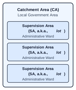
In routine immunization settings, Lot Quality Assurance Sampling (LQAS) uses hypothesis testing to classify randomly selected Supervision Areas (SAs)—also known as lots—as having acceptable or potentially unacceptable vaccination coverage. It is mainly used as a monitoring approach to classify SAs rather than to generate point estimates. As a secondary objective, data from individual SAs can be pooled to estimate vaccination coverage rates at the aggregate level of a Catchment Area (CA), but this is only valid when the included lots are exhaustive or selected to represent that aggregate area. If lots are chosen for convenience, selected because interventions are being delivered there, or purposively targeted because low coverage is suspected, pooled estimates will generally be biased for the full CA. Because it uses a smaller sample size than multistage vaccine coverage cluster surveys, LQAS is often considered a rapid, cost-efficient method to identify areas with low vaccination rates (Hora et al. 2024).
Parameter | Value |
|---|---|
Element-wise Type I error rate (upper bound) | α < 0.1 |
Element-wise Type II error rate (upper bound) | β < 0.1 |
Lower threshold | P0 = 50% |
Upper threshold | P1 = 80% |
Catchment Area (CA): LGAs | 3 |
Supervision Area (SA) / Lots: Wards | 32 |
Targeted sample size per SA | n = 19 |
Total targeted sample size | 608 |
Decision rule | d* = 13 |
LQAS studies are often characterized by their lot sample size \(n\) and decision threshold \(d^*\) (Robertson et al. 1997). Based on other organizations that have run LQAS assessments in Nigeria using the popular “\(n=19, d^*=13\)” design (Attahiru et al. 2025), Mindset adopted the same approach, targeting 19 children aged 12-23 months per ward.
The study design was based on a lower threshold of \(P_0=0.5\). In other words, if the research team could confidently conclude that more than 50 percent of children in a given lot (ward) had received the Penta-1 vaccine, the lot was classified as acceptable; otherwise, the lot was rejected and classified as potentially unacceptable.18 Since 19 children were sampled per ward, cases where exactly 10, 11, or 12 children were vaccinated still led to rejection, even though \(\frac{10}{19}\), \(\frac{11}{19}\), and \(\frac{12}{19}\) all exceed 50 percent. This occurred because those results did not provide sufficient statistical evidence to confidently conclude that the true coverage in those wards as at least 50 percent.
Formally, the null19 and alternative hypotheses in the LQAS study are expressed as:
\[ \begin{equation} H_0: P_d = 0.5 \quad \text{vs} \quad H_a: P_d \gt 0.5 \end{equation} \tag{3.9}\]
This formulation applies a protective null hypothesis: it assumes all wards have unacceptable coverage unless there is strong enough evidence to conclude otherwise (Rhoda et al. 2010). In the “\(n=19, d^*=13\)” design, the decision rule \(d^* = 13\) means that any ward with at least 13 vaccinated children passes the statistical test and is classified as acceptable based on the 50 percent cutoff. This requisite sample size and decision rule can also be found in the widely used LQAS table published by Valadez et al. (2002, 25).
NoteType I and Type II error
If we frame our LQAS problem using a protective null hypothesis, then:
A Type I error (\(\alpha\)) occurs when a lot is accepted as having adequate coverage even though true coverage is unacceptable. It represents community risk, as it may result in withholding resources from communities that truly need them.
A Type II error (\(\beta\)) occurs if a lot is rejected for having potentially unacceptably low coverage even though true coverage is acceptable. It represents implementer risk, as it may cause implementers to allocate resources to areas that already meet acceptable coverage standards.
The frequentist hypothesis testing framework is characterized by its ability to control different types of sampling errors. Here, a Type I error means classifying a ward as acceptable when true coverage is below 50 percent; a Type II error means rejecting a ward as potentially unacceptable when coverage is actually adequate. If we require both Type I and Type II errors to be below 10 percent20 for any standalone test (i.e., \(\alpha < 0.1\) and \(\beta < 0.1\)), then with a true simple random sample of 19 households, the test would falsely reject the null less than 10 percent of time.21 Similarly, under the “\(n=19, d^*=13\)” design, if true coverage is 80 percent, the test would misclassify the ward as unacceptable less than 10 percent of the time.
This study implemented LQAS within the three sentinel LGAs of Gaya, Gabasawa, and Nassarawa. Using typical LQAS terminology, each LGA served as a CA, and the 32 administrative wards within these areas represented the SAs. Following a popular design, the team aimed to complete 19 interviews in each ward, for a total intended sample of \(32 \times 19 = 608\) household interviews.
3.4.2 Implementation Details
Following the LQAS design used in Nigeria by The African Field Epidemiology Network (AFENET) under the Decentralized Immunization Monitoring (DIM) approach (Attahiru et al. 2025), Mindset adopted a multistage sampling design. Within each ward, 19 interview locations — each one a Government Enumeration Area (GEA) drawn via systematic PPS without replacement — were sampled to anchor the subsequent within-cluster selection of buildings, households, and an eligible child. The stage-one sampling frame was the list of GEAs maintained by the NPC and based on the 2006 census. As this sampling frame is not publicly available, the PPS sampling was carried out directly by government counterparts, who then provided the selected sample to the research team.
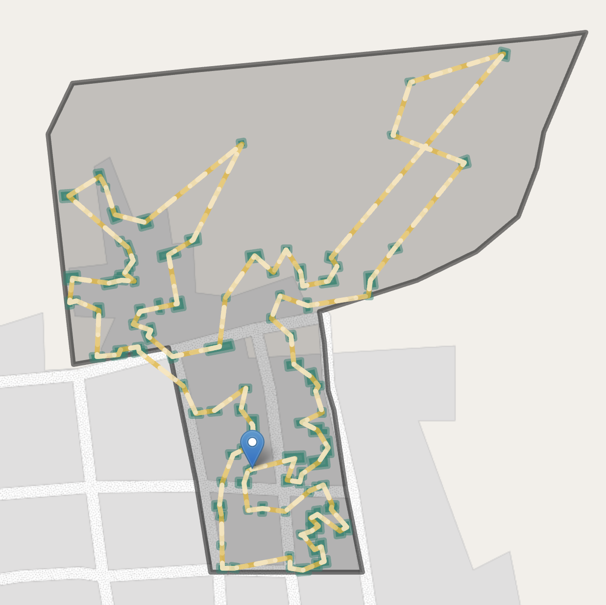
For the following sampling stages, Mindset used the NPC PDF maps of the GEAs, along with building footprint data from Google, to list and number all buildings within each GEA (Sirko et al. 2021). The research team then used computer programs to create a directed cycle connecting all enumerated buildings. This predetermined route served as a visitation path for enumerators, minimizing the risk of bias from selectively choosing convenient buildings and avoiding distant ones. Although the route was not necessarily the shortest possible path, it was designed to be practical for fieldwork. One building was randomly selected as the starting point for data collection.
Upon visiting a building, enumerators used CAPI tools to enumerate the number of residential addresses. If a building contained more than one household, the CAPI tools randomly determined the order in which households were approached. Field teams then interviewed available households in this random order, until they completed one successful interview with a caregiver of an infant aged 12-23 months. If an eligible household had more than one child aged 0-23 months, vaccination histories were collected for all children. If no household met the screening criteria, enumerators moved to the next building in the predetermined building visitation cycle, continuing until one successful interview was achieved in the GEA (or until all buildings in the GEA had been exhausted). Although the LQAS analysis focused on classification based on the Penta-1 vaccine, enumerators collected full vaccination histories for each eligible child, following the same questionnaire used for the gold standard sample.
CAPI tools required field enumerators to enter the serial number of the building into tablet software before attempting an interview. Geofencing techniques that use GPS coordinates from the tablet prevented enumerators from initiating the interview unless they were within 30 meters of the target point, and the tablet required a GPS accuracy of 5 meters or better before the distance check could be evaluated. If an enumerator was outside the 30-meter radius, the tablet displayed their live distance to the target and a map pointer to the correct location, and would not advance to the interview module until they were within range. Building serial numbers also helped identify whether a household had already been contacted through the gold-standard multistage sample, ensuring enumerators skipped those addresses to avoid duplicate interviews. Quality Assurance (QA) teams monitored compliance to confirm enumerators were following the prescribed path of visitation. Together, the predetermined visitation cycle, geofenced start points, and compliance monitoring substantially reduced scope for enumerators to substitute more accessible households at the selection stage.
A separate concern remains: because the second-stage protocol stops at the first successful interview without revisiting non-responding households, the realized sample can still be biased toward caregivers who are more often at home—a feature of the design rather than of enumerator behaviour. This non-response dimension is taken up further below, both in the interpretation of LGA-level differences from the gold standard and in the discussion of design effects for aggregate coverage.
Although field teams captured information on all children aged 12-23 months within the first eligible household found per GEA, only one child per household was randomly retained for analysis. Since each SA includes only 19 children, and vaccination status tends to be highly correlated within households, including multiple children from the same home would have inflated the test error. In practice this convention affected a small share of visits and added little to LQAS fieldwork cost, which is dominated by travel to each GEA and the door-to-door screening required to secure one successful interview per lot rather than by the time spent administering the questionnaire once an eligible household is found.22
In a small number of cases, field teams visited all buildings in a sampled GEA without finding any eligible households. This resulted in missing data, leaving some wards with fewer than 19 observations. Different valid approaches could be devised to overcome this problem. One option is to accept the smaller sample and adjust the decision threshold to match the achieved sample size. Other potential strategies include sampling reserve clusters or imputing values from the main survey. Because the research team did not control the stage-one sampling, the reserve-cluster approach was not feasible. The team therefore accepted a smaller sample size for affected wards and adjusted the decision threshold accordingly.
3.4.3 Results
A simple LQAS approach assumes that a SRS can be drawn from each SA. Under this assumption, a simple decision threshold such as \(d^*=13\) can be used to classify each SA. This cutoff mitigates the need for complex statistical calculations and makes the classification of accepted and rejected lots easy to implement.
However, these assumptions are rarely satisfied in routine immunization studies, where a complete sampling frame is seldom available. In such cases, multistage cluster sampling is typically the only feasible approach. That is the approach used here, modelled on the AFENET DIM design described earlier in this chapter. Such designs generally produce greater sampling error than a true SRS of the same size. In addition, non-contact and refusal cases can introduce non-response bias, further weakening the assumptions underlying SRS.
In contrast, a weighted classification approach uses Lower Confidence Bounds (LCBs) to determine whether SAs are accepted or rejected. As described in the World Health Organization (WHO)’s reference manual, this can be achieved by using survey software to obtain a 90 percent LCB by calculating the LCB of a two-sided 80 percent CI (World Health Organization 2018, 86). The advantages and limitations of each approach are summarized in Table 3.14 and further discussed below.
Simple (Unweighted) Classification | Weighted Classification | |
|---|---|---|
Classification of SAs | Decision rule d* | Classification based on constructing a lower confidence bound (LCB) in survey software |
Requires survey software? | Noa | Yes |
Impacted by repeated testing? | Yes | Yes |
Limitations | Results may understate the true error if a complex sample is used | More complex than simple LQAS. Requires an analyst familiar with survey estimation. |
aSimple classification uses only the decision rule d* and does not require survey software. | ||
Simple (Unweighted) Coverage | Weighted Coverage | |
|---|---|---|
Coverage estimate of CAs | Simple quotient (sum of vaccinated / total interviews) | Weighted average (typically using survey software) |
Asymptotically unbiased? | No (unless a sampling design is truly self-weighting) | Yes |
Requires survey software? | Yes, if CIs are neededa | Yes, if CIs are needed |
Impacted by repeated testing? | Not directly | Not directly |
Limitations | No theoretical foundation; risks being very inaccurate | More complex than simple LQAS. Requires an analyst familiar with survey estimation. |
aSimple coverage estimation uses a basic quotient (vaccinated / interviewed) and does not require survey software unless confidence intervals are needed. | ||
3.4.3.1 Simple Classification
As classification is the primary objective of LQAS, we first turn to analyzing classification results. Table 3.15 lists each SA, the number of vaccinated children observed, and the achieved sample size. 5 lots are rejected using the simple LQAS approach.
TipKey Findings
Using a simple LQAS approach, we reject 5 lots as having potentially unacceptable Penta-1 coverage rates: 4 in Gaya, 1 in Gabasawa, and 0 in Nassarawa.
Alongside this rule-based classification, Table 3.15 also presents the corresponding \(p\)-values. These \(p\)-values are simply another way of expressing the same decision: they represent the probability of observing as many (or more) vaccinated children if the true coverage rate were 50 percent. With a significance level (\(\alpha\)) of 0.1, any lot with a \(p\)-value below 0.1 would be classified as acceptable.
The unadjusted \(p\)-values treat each lot in isolation as though it was the only test performed. By comparison, the adjusted \(p\)-value column applies a correction for repeated testing, ensuring that the expected proportion of lots falsely classified as acceptable remains below 10 percent (the pre-specified False Discovery Rate (FDR) threshold for this study, discussed further in Section 3.4.4.2).
Vaccinated | Sample | Decision | Determination | p-value | ||
|---|---|---|---|---|---|---|
Unadjusted | Adjusted | |||||
Gabasawa LGA | ||||||
Mekiya | 9 | 19 | 13 | Rejected lot | .676 | .721 |
Yautar Kudu | 13 | 19 | 13 | Accepted lot | .084 | .099 |
Tarauni | 13 | 19 | 13 | Accepted lot | .084 | .099 |
Zakirai | 13 | 19 | 13 | Accepted lot | .084 | .099 |
Joda | 13 | 19 | 13 | Accepted lot | .084 | .099 |
Yumbu | 14 | 19 | 13 | Accepted lot | .032 | .048 |
Zugachi | 14 | 19 | 13 | Accepted lot | .032 | .048 |
Yautar Arewa | 15 | 19 | 13 | Accepted lot | .010 | .019 |
Garun Danga | 16 | 19 | 13 | Accepted lot | .002 | .006 |
Gabasawa | 17 | 19 | 13 | Accepted lot | <.001 | .002 |
Karmami | 17 | 19 | 13 | Accepted lot | <.001 | .002 |
Gaya LGA | ||||||
Gamarya | 7 | 19 | 13 | Rejected lot | .916 | .916 |
Balan | 7 | 19 | 13 | Rejected lot | .916 | .916 |
Shagogo | 10 | 19 | 13 | Rejected lot | .500 | .552 |
Maimakawa | 12 | 18 | 13 | Rejected lot | .119 | .136 |
Kazurawa | 13 | 19 | 13 | Accepted lot | .084 | .099 |
Gaya North | 14 | 19 | 13 | Accepted lot | .032 | .048 |
Kademi | 15 | 19 | 13 | Accepted lot | .010 | .019 |
Gamoji | 15 | 19 | 13 | Accepted lot | .010 | .019 |
Wudilawa | 16 | 19 | 13 | Accepted lot | .002 | .006 |
Gaya South | 17 | 19 | 13 | Accepted lot | <.001 | .002 |
Nassarawa LGA | ||||||
Hotoro South | 13 | 19 | 13 | Accepted lot | .084 | .099 |
Giginyu | 13 | 17 | 11 | Accepted lot | .025 | .044 |
Tudun Murtala | 14 | 18 | 13 | Accepted lot | .015 | .029 |
Gama | 15 | 19 | 13 | Accepted lot | .010 | .019 |
Dakata | 16 | 19 | 13 | Accepted lot | .002 | .006 |
Gwagwarwa | 16 | 19 | 13 | Accepted lot | .002 | .006 |
Kawaji | 16 | 18 | 13 | Accepted lot | <.001 | .003 |
Kaura Goje | 16 | 18 | 13 | Accepted lot | <.001 | .003 |
Hotoro North | 17 | 19 | 13 | Accepted lot | <.001 | .002 |
Gawuna | 17 | 18 | 13 | Accepted lot | <.001 | .002 |
Tudun Wada | 12 | 12 | 9 | Accepted lot | <.001 | .002 |
1The term 'vaccinated children' refers to those who have received a Penta-1 vaccine (card or recall), based on Gavi's operational definition of the non-zero-dose child (Gavi, 2025). | ||||||
2The decision threshold reflects the minimum number of vaccinated children needed to be observed in order to confidently conclude that a lot has acceptable vaccination coverage (50% or more for this study). | ||||||
3.4.3.2 Weighted Classification
TipKey Findings
Using a weighted LQAS approach, we reject 8 lots as having potentially unacceptable Penta-1 coverage rates: 2 in Gabasawa, 5 in Gaya, and 1 in Nassarawa.
Most operational LQAS guidance relies on simple decision rules like the one above. However, the WHO’s reference manual also describes a classification approach better aligned with complex sampling designs, using survey software to compute LCBs for SA-level proportions (World Health Organization 2018, 86).23 Because our data flow from a multistage cluster sample rather than a true SRS, we adopt this weighted approach. Having defined \(\alpha=0.1\) and \(P_0=0.5\) in Table 3.13, if the 90 percent LCB falls below 50 percent we reject the lot, otherwise, we accept it. Using this weighted approach, we reject the 8 lots highlighted in pink in Table 3.16. If we wanted additional statistical rigor, we could also reject those highlighted in yellow (more on the reasons for this in Section 3.4.4.2).
Vaccinated | 90% LCB2 | Design | Determination | p-value3 | ||
|---|---|---|---|---|---|---|
Unadjusted | Adjusted | |||||
Gabasawa LGA | ||||||
Zakirai | 60.3% | 43.4% | 1.1 | Rejected lot | .212 | .243 |
Mekiya | 60.5% | 43.6% | 1.1 | Rejected lot | .209 | .243 |
Yautar Kudu | 65.5% | 50.1% | 0.9 | Accepted lot4 | .098 | .131 |
Tarauni | 65.7% | 51.8% | 0.8 | Accepted lot4 | .075 | .115 |
Zugachi | 69.1% | 52.1% | 1.1 | Accepted lot4 | .078 | .115 |
Joda | 72.4% | 58.9% | 0.7 | Accepted lot | .024 | .045 |
Yumbu | 81.0% | 68.5% | 0.7 | Accepted lot | .005 | .015 |
Garun Danga | 83.8% | 70.6% | 0.8 | Accepted lot | .005 | .015 |
Yautar Arewa | 84.7% | 74.1% | 0.6 | Accepted lot | .001 | .012 |
Karmami | 86.2% | 70.1% | 1.2 | Accepted lot | .011 | .028 |
Gabasawa | 88.6% | 75.1% | 0.9 | Accepted lot | .005 | .015 |
Gaya LGA | ||||||
Gamarya | 30.1% | 20.1% | 0.6 | Rejected lot | .974 | .974 |
Balan | 36.4% | 22.6% | 1.1 | Rejected lot | .855 | .883 |
Shagogo | 40.6% | 26.5% | 1.0 | Rejected lot | .783 | .835 |
Kazurawa | 49.6% | 30.7% | 1.6 | Rejected lot | .511 | .564 |
Maimakawa | 66.3% | 47.4% | 1.3 | Rejected lot | .132 | .163 |
Gamoji | 67.4% | 51.6% | 1.0 | Accepted lot4 | .081 | .115 |
Gaya North | 78.8% | 62.6% | 1.1 | Accepted lot | .021 | .043 |
Kademi | 82.4% | 67.6% | 1.0 | Accepted lot | .010 | .028 |
Wudilawa | 84.4% | 72.8% | 0.7 | Accepted lot | .003 | .014 |
Gaya South | 90.2% | 77.9% | 0.8 | Accepted lot | .003 | .014 |
Nassarawa LGA | ||||||
Gwagwarwa | 67.6% | 47.8% | 1.5 | Rejected lot | .125 | .159 |
Hotoro South | 67.3% | 51.4% | 1.0 | Accepted lot4 | .083 | .115 |
Giginyu | 73.4% | 55.1% | 1.1 | Accepted lot | .057 | .095 |
Gama | 77.1% | 60.5% | 1.1 | Accepted lot | .028 | .049 |
Tudun Murtala | 81.2% | 65.4% | 1.0 | Accepted lot | .015 | .033 |
Kaura Goje | 88.3% | 70.6% | 1.3 | Accepted lot | .015 | .033 |
Hotoro North | 91.0% | 78.7% | 0.8 | Accepted lot | .003 | .014 |
Kawaji | 94.3% | 83.2% | 0.8 | Accepted lot | .003 | .014 |
Dakata | 94.4% | 86.8% | 0.5 | Accepted lot | <.001 | .005 |
Gawuna | 97.0% | 91.4% | 0.3 | Accepted lot | <.001 | .005 |
Tudun Wada | 100.0% | 73.5% | Accepted lot | <.001 | <.001 | |
1The ward-level prevalence estimates are shown here to evaluate whether they fall above or below the lower confidence bound. They are insufficiently precise at the ward-level to be used as a coverage estimate and would generally not be shown to end-users. | ||||||
2The 90% lower confidence bound (LCB) is use to classify whether we can confidently conclude that a lot has acceptable vaccination coverage. If the LCB falls below our target of p = 50%, we reject the lot. | ||||||
3The unadjusted p-value is calculated by transforming the standard error on a survey contrast calculated using survey software. We assessed whether the estimated coverage exceeded the benchmark of 50% by evaluating the contrast log(p / (1-p)) - logit(0.5), which represents the difference between the survey-weighted log-odds of coverage and the log-odds under the null hypothesis. | ||||||
4In a conventional survey-based classification approach using confidence bounds, rows in yellow would be classified as accepted lots. However, practitioners may wish to reject these lots to keep the False Discovery Rate below alpha = 0.1. | ||||||
Figure 3.12 illustrates the weighted classification approach. Gold-standard survey estimates are shown in tan, while estimates from the weighted LQAS approach are shown in green. Circles show coverage estimates for accepted lots, and triangles show those for rejected lots. The error bands around these point estimates represent the 90 percent LCB, which extend to 100 percent on the right-hand side. The dotted vertical line marks the lower threshold \(p_0 = 50%\). Classification is determined by whether a lot’s LCB — the left end of its error band — crosses this line, not by the position of the point estimate; a ward can have a point estimate well above 50 percent and still be rejected if its lower bound crosses over.
Although the gold-standard sample was sized to support LGA-level estimation rather than ward-level representativeness, in nearly every ward the gold standard still has a substantially larger effective sample size than LQAS. The reduced precision at this scale does not introduce bias, so the ward-level comparison remains informative.
A few points are worth noting. First, although the gold standard typically had much larger sample sizes than LQAS, this was not universally the case. For instance, in Gwagwarwa ward, the gold-standard estimate was very high (>90 percent), but the small sample size meant we could not confidently conclude that coverage was acceptable—even under the gold standard itself.
Second, several wards are rejected as potentially unacceptable even if their point estimate is above the 50 percent cutoff. This outcome is intentional: it reflects cases where coverage is likely acceptable but the available data do not provide enough statistical evidence to confirm that it is not unacceptably low.
Finally, it is not universally the case that the wards with the lowest coverage are rejected by LQAS. Some wards near the 50 percent mark—such as Tarauni— are not flagged by LQAS, whereas others with relatively strong coverage—such as Zakirai—are rejected.
Together, these observations underscore the variability inherent in small-sample studies such as LQAS, and serve as a reminder that its classifications are typically much less precise than those derived from larger surveys.
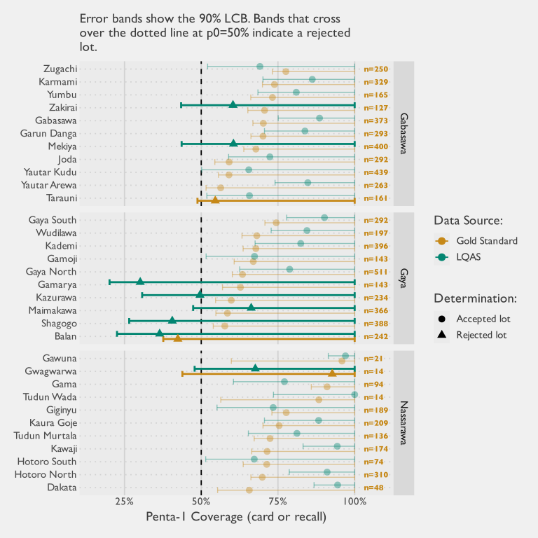
3.4.3.3 Aggregate Coverage
A secondary objective of LQAS is to aggregate lot-level data to estimate vaccination coverage at the CA level. In this study, that means estimating Penta-1 coverage for each LGA using the ward-level samples. Because this study covered all 32 of 32 wards in the sentinel LGAs, there is no between-ward sampling error within those sentinel geographies. Estimating at the LGA level by combining observations across wards yields more precise LGA-level estimates than ward-level estimates, because the estimand is now the aggregate rather than each individual ward, although each ward estimate remains noisy because of its small sample. This should not be interpreted as a universal property of LQAS: in implementations where only a subset of wards is selected, aggregate prevalence is only defensible if those selected wards are a probability sample (or otherwise credibly representative) of the wider area. Figure 3.13 shows the resulting estimates from the LQAS data using both a weighted and an unweighted approach, alongside the corresponding estimates from the larger gold-standard multistage survey for comparison.
Figure 3.13 shows two patterns that matter for interpretation. The unweighted LQAS estimates have narrower 95% CIs than the weighted estimates, but this gain in precision is artificial. The unweighted analysis ignores multistage design features and therefore understates uncertainty. Even when the ward-level design is approximately self-weighting, that property does not automatically carry to LGA-level aggregation. At the aggregate level, treating small and large wards equally induces bias, so population weighting remains necessary for valid coverage estimation. The wider weighted intervals are therefore a feature of correct design-based inference, not a weakness of the approach.
The second pattern is the gap between weighted LQAS and gold-standard point estimates. In Figure 3.13, this gap is largest in Nassarawa, moderate in Gabasawa, and small in Gaya. The visual pattern is consistent with sampling noise in Gaya but suggests additional systematic differences in Gabasawa and Nassarawa.
Area | Weighted LQAS | Gold Standard | Difference | 95% CI for Difference | p-value | FDR-adjusted p-value |
|---|---|---|---|---|---|---|
Gaya | 64.1% | 62.1% | 2.0% | (-8.4; 12.4) | 0.706 | 0.706 |
Gabasawa | 74.5% | 66.7% | 7.8% | (1.3; 14.3) | 0.018 | 0.027 |
Nassarawa | 85.6% | 74.7% | 10.8% | (4.4; 17.3) | 0.001 | 0.003 |
Table 3.17 formalizes this comparison with design-based Wald contrasts of weighted LQAS versus gold-standard estimates, under an independence assumption (zero cross-survey covariance). Estimated differences (weighted LQAS minus gold standard) are: Gaya: 2.0% (p=0.706); Gabasawa: 7.8% (p=0.027); and Nassarawa: 10.8% (p=0.003). After this formal test, Gabasawa and Nassarawa remain statistically higher than the gold standard, while Gaya does not. Despite these absolute differences, the weighted LQAS approach yields the same relative LGA-level ranking by coverage as the gold standard. Sampling variation is therefore unlikely to be the only driver of the pattern.
Several explanations are plausible. Coverage may have genuinely changed between observation periods, which were separated by roughly one to three months, if partner activity during that interval increased vaccination uptake. Repeated field contact in sentinel areas also makes community-level observer effects plausible. Mindset’s field teams reported that some gold-standard households contacted for callbacks had updated their vaccination status following earlier survey visits.
Other potential explanations concern non-response. The LQAS weights omit adjustments applied in the gold-standard analysis—such as those for non-response and differential eligibility—and aligning these steps would likely reduce at least part of the observed gap. The LQAS protocol also differed in how non-contact was handled: whereas the gold standard attempted revisits to sampled households, enumerators moved to adjacent households until completing a successful interview. Although the visitation path was pre-determined, this protocol difference likely biased the sample toward households more likely to be home at the time of the visit.
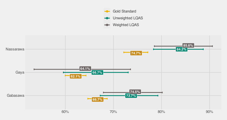
3.4.3.4 Reasons for Non-Vaccination
Because the LQAS instrument uses the same reasons-for-non-vaccination questionnaire as the gold standard, a comparison of caregiver-reported barrier profiles is possible. Table 3.18 aggregates responses to the four domains of the WHO Behavioral and Social Drivers (BeSD) framework — the coarsest grouping at which a quantitative comparison is feasible — separately for each sentinel LGA.
Even when aggregated to the LGA level from ward-level lots, the effective sample sizes for this comparison are small. Reasons questions are only asked of caregivers of unvaccinated or under-vaccinated children, so with 19 children per ward and coverage in the range of 60–70%, the denominator per ward is typically fewer than 10 children. Pooling across wards within an LGA is valid because wards are treated as strata in the LQAS design, but even after pooling, the denominators remain modest and statistical power is limited. Table 3.18 reports Wald-test p-values for the null hypothesis that each domain proportion is equal under LQAS and the gold standard; non-significant results should therefore not be read as evidence of equivalence.
Domain | LQAS (%) | LQAS (n/N) | Gold Standard (%) | Difference | p-value | |
|---|---|---|---|---|---|---|
Unadjusted | Adjusted | |||||
Gabasawa LGA | ||||||
Social processes | 43.1% | 18 / 44 | 34.7% | 8.5% | .291 | .582 |
Beliefs | 13.5% | 6 / 44 | 26.2% | -12.7% | .011 | .045 |
Access | 14.2% | 7 / 44 | 14.8% | -0.6% | .925 | .925 |
Health center | 4.0% | 2 / 44 | 5.2% | -1.2% | .601 | .801 |
Gaya LGA | ||||||
Social processes | 24.6% | 16 / 49 | 34.6% | -10.0% | .223 | .328 |
Beliefs | 17.5% | 10 / 49 | 24.8% | -7.3% | .246 | .328 |
Access | 6.8% | 4 / 49 | 18.7% | -11.9% | .004 | .015 |
Health center | 6.3% | 4 / 49 | 4.9% | 1.4% | .651 | .651 |
Nassarawa LGA | ||||||
Social processes | 37.9% | 6 / 13 | 37.2% | 0.7% | .962 | .962 |
Beliefs | 12.3% | 2 / 13 | 28.0% | -15.7% | .097 | .193 |
Access | 0.0% | 0 / 13 | 22.7% | -22.7% | <.001 | <.001 |
Health center | 5.0% | 1 / 13 | 4.5% | 0.5% | .920 | .962 |
Percentage of unvaccinated children whose caregivers reported at least one reason in each BeSD domain. LQAS proportions are survey-weighted using LQAS design weights. Gold standard proportions are survey-weighted. p-values from a Wald test (H₀: equal proportions) using design-based SE; adjusted p-values control the false discovery rate across domains. This is a select-multiple question, so domain proportions do not sum to 100%. | ||||||
The broad ranking of barriers is consistent across methods: social-process and beliefs-related barriers are the most commonly cited categories under both LQAS and the gold standard in all three LGAs. However, three of the twelve domain-level differences are statistically significant after FDR adjustment — beliefs in Gabasawa, and access in both Gaya and Nassarawa — with LQAS underestimating the domain proportion in each case.
Three significant differences out of twelve is more than would be expected if both methods were sampling the same population, and two features of the LQAS design may contribute. First, the second sampling stage relies on a door-to-door random walk that ends once a single eligible household is found in each cluster, so households whose members are more often present are over-represented relative to the gold standard, where non-responding households were revisited and sampling weights were adjusted for non-response. Second, the gold-standard survey preceded the LQAS assessment by several weeks. In the intervening period, partner interventions may have already begun, and the visibility of the gold-standard enumeration itself — hundreds of household visits per LGA — may have raised community awareness of vaccination, shifting caregiver perceptions before LQAS fieldwork took place.
In principle, LQAS-based reasons data can provide a coarse directional signal about demand-side barriers. In practice, however, immunization programme staff typically enter the field with a broad understanding of why caregivers do not vaccinate, and the LQAS denominators are too small to distinguish the local barrier profile from those prior expectations with any precision. The data are therefore unlikely to add actionable diagnostic value beyond what practitioners already know. A parallel comparison of Rapid Convenience Monitoring (RCM) and gold-standard reasons data is presented in Section 3.6.
3.4.4 Discussion
We now turn to a discussion of the study’s key methodological and practical considerations. This section examines how the sampling design influenced the findings, the implications of repeated testing, the challenges of deriving aggregate coverage estimates, the tradeoffs between statistical rigor and operational simplicity, and the efficiency of the approach relative to cost. These themes frame both the strengths and the limitations of applying LQAS in routine immunization studies and point to opportunities for refinement in future work.
3.4.4.1 Sampling Design
Because relatively precise gold-standard estimates of ward-level coverage are available, they can serve both as a benchmark to check how well LQAS classifications align with reality and as a basis for modeling how LQAS would perform under repeated sampling within the sentinel LGAs. Theory dictates that the sampling distribution on the number of rejected lots will be Poisson-Binomial.24 This distribution is illustrated in Figure 3.14.
Under vaccine coverage conditions matching those found from the gold standard, the most likely outcome (expected about 17 percent of the time) would be the rejection of 13 lots: five in Gaya, six in Gabasawa, and two in Nassarawa. This may seem surprising — the gold-standard estimates in Figure 3.12 place all but one ward above the 50 percent threshold. But it reflects the same counterintuitive asymmetry flagged at the start of this section, now in reverse: just as an observed fraction above 50 percent is not always enough to confidently conclude coverage is acceptable, a true coverage above 50 percent is not always enough for a lot to escape rejection. When the truth sits just above the threshold being tested, no small sample can reliably tell it apart from unacceptable coverage — under a SRS, a ward at 65 percent true coverage still has roughly a one-in-three chance of drawing fewer than 13 vaccinated children out of 19 and being rejected. Yet the simple classification approach rejected only five lots in total (one in Gabasawa and four in Gaya). Seeing so few rejections is not just unlikely; it is exceptionally rare if sampling variability were the only factor at play. Exact calculations show that this outcome would occur only 0.5% of the time for Gabasawa, 15.6% of the time for Gaya, and 5.7% of the time for Nassarawa of the time. The joint probability of observing only five or fewer rejections across all LGAs is even smaller: only 0.03%. Given how far these results deviate from expectation, the random chance of a ‘bad sample’ is not itself a compelling explanation. Something systematic appears to be affecting results under the simple classification approach.
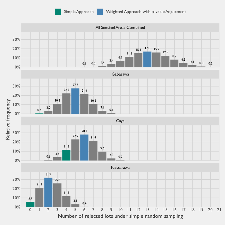
In comparison, the number of rejections under the weighted classification approach aligns much more closely with what the sampling distribution predicts. The observed number of rejections from the weighted classification is shown in blue in Figure 3.14.
It is also important to distinguish between a design being self-weighting and having the same error properties as a SRS. A self-weighting design ensures that each sampled unit contributes equally to estimation, but this does not guarantee that its variance behaves like that of an SRS. With one interview per cluster, whether the design behaves like an SRS at the child level depends entirely on how the clusters themselves are selected. If stage-one selection probabilities are exactly proportional to each cluster’s current number of eligible children, every eligible child in the ward has the same marginal inclusion probability, and the estimator is self-weighting for point estimation. Its variance, however, is not identical to that of an SRS even in this idealized case: the joint inclusion probabilities retain the stratified cluster-draw structure that SRS formulas do not anticipate.25 Any departure from that condition — clusters effectively over- or under-sampled relative to their current share of the ward’s eligible population — produces unequal inclusion probabilities across children, which must be corrected at the analysis stage with variable weights. Any sample carrying variable weights is less efficient than an equal-weight sample of the same nominal size. The LQAS sample size tables commonly used assume an SRS and therefore understate the true SE whenever stage-one selection probabilities depart from current population shares. Treating “self-weighting” as synonymous with “SRS-like” risks underestimating error and overstating the precision of results.
For the PPS+SRS design to approximate self-weighting in practice, the MOS used to select clusters must accurately reflect current population distribution. If the MOS is outdated or inconsistent with reality, then any correct weighting at the analysis stage (weighted based on the new enumeration conducted for the selected GEAs, rather than the 2006 census used to select the GEAs) will reveal substantial variation in weights across sampled units. This may help explain why the unweighted classification approach produces so few rejected lots: the stage-one EAs were selected using MOS data from the 2006 census, and the urban structure of the study area has shifted materially in the two decades since. A direct check of this shift, shown in Appendix E, extracts the Global Human Settlement Layer (GHSL) Degree-of-Urbanization class at each LQAS sample point for 2005 and 2025: roughly three in ten sampled locations now sit in a more urbanised class than they did in 2005, and Penta-1 coverage at each point tracks its 2005 classification more closely than its current one. A 2006-derived MOS therefore over-represents sampling cells that sat in the stable urban core (where zero-dose prevalence is lowest) and under-represents peri-urban cells that have urbanised in the intervening two decades (where the remaining zero-dose burden is concentrated). As a result, an unweighted analysis biases findings toward overstating coverage and underdetecting gaps, painting an overly optimistic picture of program performance.
3.4.4.2 Repeated Testing
A further challenge in applying LQAS is the issue of repeated testing. Since each SA is classified independently, multiple hypothesis tests are carried out simultaneously. The more tests conducted, the higher the probability that at least some lots will be spuriously accepted or rejected purely by chance. Statistical corrections for this problem are well established in other fields, but they are not yet common practice in LQAS applications.
In practice, these corrections are straightforward to apply whenever \(p\)-values are available as part of the test output. Several adjustment methods exist, but controlling for the FDR is a common and appropriately balanced choice (Benjamini and Hochberg 1995). Implementing such a correction does not require advanced statistical expertise: common software such as R can perform it with a single line of code. Freely available online calculators and downloadable Excel templates also automate the adjustment (“FDR Online Calculator” 2010; “Benjamini–Hochberg and Benjamini–Yekutieli Tests” n.d.). For this reason, programmes with the analytical capacity to incorporate it are encouraged to apply FDR correction, so that the error properties of LQAS remain aligned with the claims it aims to support.
A consideration of the risks of repeated testing becomes even more important when researchers test multiple antigens simultaneously using the same set of children. Because coverage for individual vaccines is highly correlated—as shown in the co-vaccination correlation matrix in Figure 3.15— the information content of these tests is not independent. Nevertheless, each additional hypothesis test still contributes to the risk of false discoveries. Running a full suite of tests across all routine immunizations therefore risks overstating the number of lots classified as acceptable or unacceptable purely by chance. To guard against this, it is preferable to select a limited set of indicators that best reflect the overall state of vaccination in the population. In practice, Penta-1 is a strong candidate because it captures access to services and is highly correlated with subsequent doses and other antigens. At most, one or two representative vaccines may be sufficient for classification purposes, avoiding redundancy while keeping error rates under control.
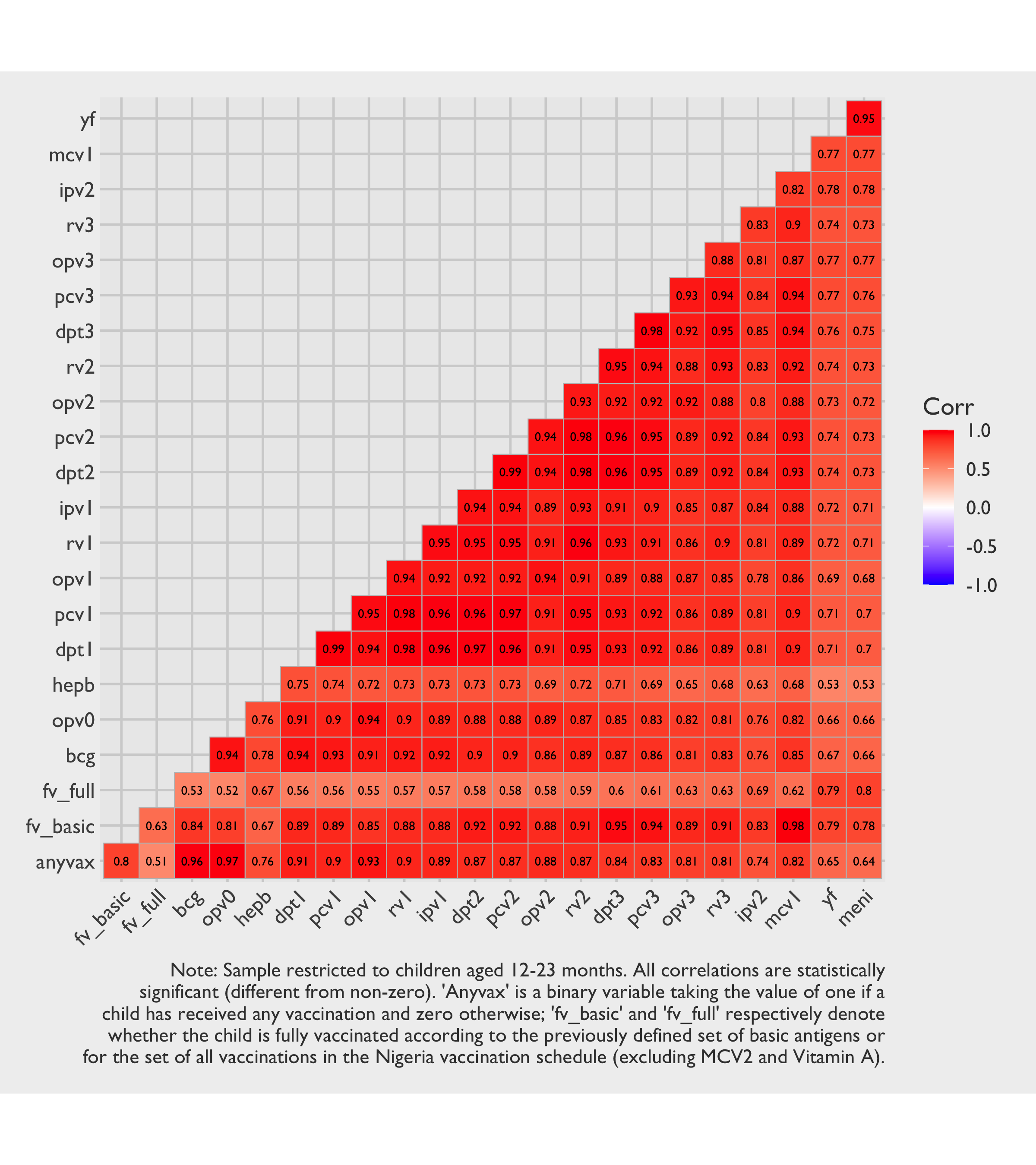
This study illustrates that risk clearly. With 32 wards/SAs and roughly 20 vaccines recommended for children aged 12 months, a full analysis across all antigens would involve \(32 \times 20 = 640\) separate hypothesis tests. Even if coverage patterns are strongly correlated across vaccines, each test still represents a separate statistical comparison and contributes to the overall FDR. Without correction, a nominal \(\alpha = 0.1\) would imply that around 64 could appear significant purely by chance. The redundancy created by the high co-vaccination correlations means that these tests are not providing 640 independent pieces of information, but the inflation of Type I error remains real. For this reason, relying on a smaller set of representative antigens—such as Penta-1, and perhaps one other indicator of completion like the first Measles-Containing Vaccine (MCV) or Penta-3—is both statistically sound and operationally efficient. This approach limits the number of formal tests while preserving the essential signal about vaccination status.
3.4.4.3 Reliance on Defaults
In applied practice, LQAS parameter selection is sometimes bypassed in favour of a small set of conventional choices: published \((P_0, P_1)\) combinations, a 30-percentage-point gap between the upper and lower thresholds, and the widely cited “\(n = 19\)” sample-size shortcut. These conventions are sometimes presented as a feature that lowers the technical barriers to entry, but the fact that in practice they are often adopted without meaningful engagement with what they imply for the survey at hand belies that framing: they are habits accumulated around the method, not features of its statistical design.
Not all defaults are equivalent. Some are reasonable working conventions that travel well across contexts: loosened error targets such as \(\alpha = \beta \approx 0.10\) reflect the classification-only ambition of LQAS and serve a similar conventional role to \(\alpha = 0.05\) in other applied settings. Others do not earn that status. The 30-percentage-point gap between \(P_0\) and \(P_1\), and the “\(n = 19\)” sample-size shortcut, are crude simplifications rather than principled conventions: the appropriate \((P_0, P_1, n, d^*)\) depend on the program’s target coverage, realistic expectations about field coverage, and the programmatic consequences of misclassification. A practitioner who adopts these without reflection is, in effect, fielding a data collection whose design cannot speak to the question being asked.
The parameters also do not all play the same role. \(P_0\), the lower threshold, is the substantive hypothesis under test — the coverage level below which an SA should be flagged for action — and is therefore a programmatic threshold, not a statistical convention. \(P_1\), the upper threshold, is the power anchor: the plausible best-case coverage against which Type II error is computed; in immunization contexts it is too often set at an aspirational ideal rather than a realistic estimate of field coverage, misaligning the resulting Type II calculations with reality. \(n\) and \(d^*\) are not free parameters at all: they follow from \((P_0, P_1, \alpha, \beta)\) once those have been chosen honestly, and the chapter’s “\(n = 19\), \(d^* = 13\)” instance is one such derivation, not a universal rule.
Published LQAS sample-size tables remain a useful resource. They remove the need for custom power calculations and let non-statistician planners map parameters to feasible designs without specialised technical support. The problem is not the tables themselves but the shortcut that skips parameter selection entirely and lands on “\(n = 19\)” without ever interrogating whether the implicit parameters match the local decision problem. This “\(n = 19\)” heuristic is, in our view, the single most common and most egregious misuse of LQAS defaults in applied practice.
The defaults warrant particular scrutiny — or outright rejection — in three settings. The first is when program realities make the default \((P_0, P_1)\) band unsuitable on either axis. A program whose actionable threshold sits well above the conventional \(P_0 = 50\%\) — for instance, one in which anything below 80% is already treated as unacceptable — ends up testing the wrong hypothesis if defaults are adopted unchanged; and a default \(P_1 \approx 80\%\) misrepresents power whenever realistic field coverage lies materially above or below it. The second is when the goal is to monitor coverage change across survey rounds: LQAS is a one-sample test against a fixed threshold, and comparing classifications across rounds is a fundamentally different, two-sample problem that requires substantially more data and lacks valid standard errors under the standard LQAS design. The third is when the post-classification action requires finer resolution than the conventional 30-percentage-point band permits.
Finally, when honest calculations imply unpalatable sample sizes, the temptation is to keep adjusting \((P_0, P_1, \alpha, \beta)\) until the required \(n\) becomes feasible. This does not solve the underlying mismatch between question and budget — it merely re-labels the test so that the nominal error rates now apply to a different substantive question, one the program may have no particular reason to ask.
3.4.4.4 Design Inefficiency for Aggregate Coverage
Another key consideration is that a sampling design must make tradeoffs between competing objectives. In the case of LQAS, the principal objective is classification: determining whether each SA meets or fails a predetermined coverage threshold. The ability to produce aggregate coverage estimates at the CA or higher level is only a secondary benefit. This priority has direct consequences for sampling efficiency of the second objective. It also has consequences for validity: pooling lots to estimate coverage is only justified when lot selection supports inference to the target geography.
A design that samples an equal number of children in every SA ensures that each lot can be classified with the same decision rules, but it does not produce the most statistically (or cost) efficient estimates when those data are later combined. From the perspective of aggregate coverage, such a design is suboptimal because it allocates the same sample size to both small and large SAs, regardless of their contribution to the total population. If the sole objective were accurate estimation of coverage at the CA or LGA level, the more conventional approach would be a stratified random sample with proportional allocation, in which the sample size in each stratum is proportional to its size. This would minimize variance in the aggregate estimates, but at the cost of undermining the equal-lot comparability that LQAS requires.
Weighted LQAS | Gold Standard | |
|---|---|---|
Gabasawa | 1.06 | 1.48 |
Gaya | 2.17 | 1.51 |
Nassarawa | 1.45 | 1.10 |
All Sentinel Areas | 1.71 | 1.45 |
The result is a design efficiency tradeoff: by prioritizing lot-level classification, the sampling design sacrifices precision in the aggregate. This inefficiency is an inherent tradeoff of the LQAS framework, and it helps explain why aggregate estimates derived from LQAS are often less precise than those from surveys explicitly designed for estimation.
That said, the inefficiency is not absolute; methods such as weighting can partially correct for population size imbalances when aggregating data. But these adjustments add complexity, and they cannot recover all of the lost efficiency compared to a proportional allocation design. Making more sophisticated weighting adjustments—such as enumerator adjustments and non-response adjustment—can also be a challenge if sample sizes are on the smaller side, as is often the case with LQAS. Recognizing these limitations is important for interpreting LQAS results: while LQAS is fast, targeted, and actionable for classification, it should not be expected to deliver aggregate estimates with the same reliability as a survey optimized for estimation.
The ward-level Design Effects (DEFFs) are shown in Table 3.15. Values above unity suggest a sampling + estimation approach that is less efficient than a SRS, whereas those below one suggest a more efficient approach. Although it is a slight simplification, a self-weighting sample will typically have lower design effects compared to complex designs with more sampling weight variability. Our observed ward-level DEFFs average at 0.96, suggesting that the stratification and approximate self-weighting design may have been slightly more efficient than a random sample when it comes to classification.26 In comparison, when the task is to aggregate data for SA-level coverage estimates, design effects will typically be larger for the aforementioned reasons. These are shown in Table 3.19 and quantify the design inefficiency of calculating coverage estimates at the SA level using data collected for CA-level classification. Here, we do indeed see values in the range of 1.1 to 2.2. This increase is attributable to unequal sampling at lower levels as well as effects from non-response.
3.4.4.5 Implementation Complexity
In proposing methodological refinements to LQAS, we recognize that each improvement—whether introducing weights, calculating one-sided confidence bounds, or adjusting for repeated testing—adds layers of complexity. These refinements strengthen the statistical properties of the approach and move the results closer to formal survey standards, but they also demand tools and expertise that may not be readily available to implementing partners. By contrast, the simple unweighted LQAS method is easy to implement, requires minimal training, and can be applied consistently in routine program settings. The challenge, then, is to balance rigor with feasibility: overly complex methods, however correct in principle, risk being impractical for field use and therefore unused in practice.
Of course, drawing a single-stage SRS within wards is rarely feasible in practice, since a complete and up-to-date household sampling frame is usually unavailable. Traditionally, this constraint has led to the use of multistage designs—such as PPS selection of EAs followed by household listing and sampling—that introduce clustering and move the design away from the assumptions underlying LQAS sample size tables. However, the growing availability of open-source geospatial data, such as building footprints, creates new opportunities to sample units more directly. By selecting households from these data, we can circumvent the need for outdated EAs and extensive household listing, while also reducing the number of sampling stages. Although not a perfect substitute for a true SRS of households, this approach may strike a pragmatic balance: keeping LQAS fast and simple to implement, while staying more faithful to the assumptions on which its simple classification rules and sample sizes were originally based.
3.4.5 Recommendations
Each refinement set out below adds analytic or operational complexity, which may at first reading seem at odds with LQAS’s appeal as a fast and lightweight method. To make that tradeoff explicit, we separate these recommendations into two tiers — a “must do” tier required for valid results, and a “nice to have” tier of refinements that improve efficiency or sharpen interpretation. The first tier comprises practices without which the test’s nominal error rates cannot be trusted, sampling weights are misspecified, or pooled estimates do not generalize to the geography they claim to characterize. These are not optional refinements but the conditions under which LQAS’s guarantees actually hold; our own findings illustrate the consequences when one or more are skipped. The second tier comprises improvements whose omission does not invalidate the core classifications. A practitioner working under tight constraints can defer the second tier; the first should be treated as the entry cost of using LQAS responsibly. A compact summary is provided in Table 3.20 at the end of this section.
3.4.5.1 Required for valid results (“must do”)
3.1. If collecting data via a complex sample, use the WHO’s weighted classification approach. Apply the weighted rather than the simple approach whenever the sampling mechanism deviates from simple random sampling. Calculate LCBs with survey software designed for complex samples, and avoid reliance on Wald intervals.
3.2. Use post-stratified or calibrated sampling weights in CA-level coverage estimates, even if simple random sampling is used. Weights should be applied even when a true SRS is drawn within each SA, since SAs are rarely equal in size. These differences in sizes need to be accounted for correctly when aggregating multiple SAs within a CA.
3.3. Only report pooled CA-level coverage when lot selection supports representativeness. If all lots in the target area are included (as in this study’s 32/32 sentinel wards), there is no between-lot sampling error within that frame, and pooled estimates can be interpreted for that area subject only to within-lot uncertainty. If only a subset of lots is included, pooled estimates should only be presented as CA-level prevalence when that subset is sampled probabilistically, or when a strong representativeness argument is explicitly justified. Convenience- or intervention-focused lot selection should not be generalized to the full CA.
3.4. Analyze only one child per household. Because the vaccination status of children in the same household is not independent, including siblings in the analysis can result in greater sampling error, especially under unweighted analyses. Exceptions may be considered if analytic software explicitly accounts for multi-stage sampling and intra-household correlation, in which case the relative ease of collecting data on all eligible children in a given household may be leveraged to obtain a slightly larger sample size. 3.5. Account for potential inefficiencies in PPS designs. Do not simply presume that a PPS+SRS design will result in a self-weighting design. When first-stage selection probabilities are based on stale MOS while the true number of second-stage units has shifted, the design is no longer self-weighting and unweighted estimates may be biased. If it is deemed that the sampling frame used to draw a PPS sample of EAs may no longer be very accurate, we recommend obtaining a reasonably accurate count of households in each sampled enumeration area — whether through a full listing, a quick count of dwellings, or another rapid assessment method — so that sampling weights reflect the actual number of households rather than outdated population figures.
3.6. Set upper LQAS thresholds to reflect realistic coverage expectations. LQAS was originally developed in industrial quality control, where it was reasonable to assume that a machine operating correctly would produce units at a near-ideal rate of non-defects. In that context, setting the upper threshold at an aspirationally good level (representing the standard of proper functioning) made sense. In vaccination coverage surveys, however, the situation is different: we typically begin with the knowledge that coverage is unlikely to be at ideal levels. Designing LQAS with an upper threshold fixed at an aspirational target therefore misaligns Type II error calculations, since it assumes a fictionalized world in which every supervisory area has excellent coverage. A more meaningful approach is to anchor the upper threshold in the best available estimate of actual coverage (for example, based on the regional coverage estimate from the most recent Demographic and Health Survey (DHS), Multiple Indicator Cluster Survey (MICS) or national EPI survey), so that the resulting power calculations and Type II error rates reflect the realities of the field rather than an unattainable benchmark.
3.7. Interrogate LQAS parameter choices rather than relying on common heuristics. Treat \((P_0, P_1)\) as study-specific decisions rather than default slots to be filled, and let \(n\) and \(d^*\) follow from those choices and the chosen error rates. If honest calculations imply unpalatable sample sizes, resist reverse-engineering the parameters to fit a feasible \(n\), as this simply restores the original problem under a different label. See Section 3.4.4.3 for when common defaults warrant particular scrutiny — or outright rejection.
3.4.5.2 Useful refinements (“nice to have”)
3.8. Put in place measures to mitigate enumerator bias. Establish protocols such as predefined paths for random walks to reduce discretionary decision-making in the field. Some form of enumerator training and supervision is universal, and the value of formal predefined-path discipline beyond that baseline depends on the rigour of existing field practice.
3.9. Apply multiple-testing corrections when feasible. Freely available tools are sufficient for this purpose, and we advocate for corrections that control the FDR, although other variants are also valid (e.g., those that control family-wise error). Multi-testing correction is not yet conventional in routine LQAS practice, and small applications with only a handful of lots may judge that the marginal validity gain does not justify the additional analytic step.
3.10. Consider alternative, more efficient sampling designs. A direct SRS of building footprints may approximate a true SRS of infants more closely than a two-stage PPS+SRS design. Google and Microsoft both make such building footprints available for free in many parts of the world. However, complexities such as multi-household dwellings must be taken into account, as these can inflate sampling weights if care is not taken in the sampling and estimation approach.
3.11. Sample more than one household per SA. In multi-stage designs there is a trade-off between the number of first-stage units and the number of households selected within each. Because most fixed costs are incurred once a cluster is reached, interviewing multiple households within the same GEA is usually more cost-efficient than visiting additional clusters. Including at least two households per GEA also allows the within-GEA contribution to variance to be estimated directly, rather than assumed. However, adding more households does not necessarily increase statistical efficiency, since the marginal gain depends on the intra-class correlation. The optimal balance is therefore best determined through DEFF calculations or simulation tailored to the study context.
3.12. Temper expectations for LQAS-based reasons-for-non-vaccination data. Because reasons questions are only administered to caregivers of unvaccinated or under-vaccinated children — a small subset of the already modest LQAS sample — the resulting estimates are far less precise than the coverage classifications for which LQAS is designed. Pooled barrier profiles may broadly reflect the dominant domains, but they are unlikely to reveal local patterns that experienced practitioners do not already anticipate. Programmes seeking actionable demand-side intelligence at the local level should invest in dedicated BeSD or qualitative assessments with appropriately sized samples.
# | Recommendation | Tier |
|---|---|---|
3.1 | Use the WHO's weighted classification approach for complex samples | Must do |
3.2 | Use post-stratified or calibrated weights for CA-level coverage | |
3.3 | Pool to CA only when lot selection supports representativeness | |
3.4 | Analyze only one child per household | |
3.5 | Re-list households when PPS measures of size are stale | |
3.6 | Set upper LQAS thresholds to reflect realistic coverage | |
3.7 | Interrogate LQAS parameter choices rather than relying on heuristics | |
3.8 | Establish protocols to mitigate enumerator bias | Nice to have |
3.9 | Apply multiple-testing corrections (e.g., FDR) | |
3.10 | Consider efficient sampling designs (e.g., building footprints) | |
3.11 | Sample more than one household per SA | |
3.12 | Temper expectations for reasons-for-non-vaccination data |
3.4.6 Conclusions
LQAS remains a valuable tool for identifying pockets of potentially low coverage, but its utility depends critically on how it is applied. Its traditional promise of rapid classification with well-defined error rates is best supported under simple random sampling, yet routine immunization applications almost always rely on multistage or otherwise complex designs. Applying the standard unweighted rules to such data can leave nominal and actual error rates misaligned, and claims about LQAS producing aggregate prevalence estimates remain implementation-specific: pooled lot data support CA-level inference only when lot selection is representative of that CA.
The refinements set out in the Recommendations above bring observed performance much closer to the theoretical error properties LQAS is meant to guarantee, even under complex sampling arrangements. Each, however, adds analytic complexity and demands capacity that not every program will have on hand.
As the saying goes—oft attributed to Albert Einstein—“everything should be made as simple as possible, but no simpler.” LQAS appeals precisely because of its simplicity and low resource demands, and we applaud methods that field practitioners can readily implement. However, we caution against situations where departures from the underlying assumptions are so great that the method’s guarantees no longer hold. Our own experience with this study offers a case in point, benchmarked against a strong comparative reference in the form of our gold-standard coverage survey — itself subject to its own sampling error, but providing a credible yardstick against which to assess LQAS performance. The challenge is therefore not to abandon LQAS, but to adapt it in ways that balance rigor with feasibility. With careful implementation of the recommendations outlined here, LQAS can continue to play a constructive role in vaccine program monitoring, offering timely signals of where performance is most at risk while keeping error properties transparent and credible.
Looking ahead, emerging innovations in sampling design may narrow the gap between practical field designs and the theoretical underpinnings of LQAS, making the refinements we recommend here easier to adopt at scale.
3.5 Administrative Methods
3.5.1 Overview
Use of administrative records to estimate immunization coverage is not a new technique. Sometimes referred to as the “administrative method” or the “doses-administered method”, the approach is easy to understand: take the number of vaccine doses as delivered to the target age group as a numerator and divide this number by an estimate of the target population as a denominator. This yields a vaccine coverage percentage. For Penta-1, taking its complement by subtracting it from 1 gives the Penta-1 zero-dose prevalence. In most settings, this estimate is produced through a numerator that comes from routine administrative reporting systems and is valued because it is timely, relatively low-cost, and available at multiple administrative levels (Dietz et al. 2004).
However, empirical research shows that administrative coverage is often an unreliable proxy to measure the effective proportion of vaccinated children. This is because both components of the ratio are prone to error: the numerator may be affected by reporting inaccuracies, and the denominator may not accurately represent the target population (Dietz et al. 2004; Bosch-Capblanch, Banerjee, and Burton 2012). Numerator errors can arise when vaccinations are not consistently entered into facility registers or when figures are mis-transcribed or altered as they move from facility reports to district and national summaries (Bosch-Capblanch, Banerjee, and Burton 2012; Ngo-Bebe et al. 2025). Denominator errors are common when target population estimates rely on outdated projections or implausible local estimates, or when assumptions about residence do not match service use—particularly where migration and cross-area attendance mean children are vaccinated outside their area of official registration (Dietz et al. 2004; Bosch-Capblanch, Banerjee, and Burton 2012; Stashko et al. 2019).
A key issue is that administrative estimates frequently produce values that are not plausible as population measures. Evidence from Nigeria illustrates how far administrative values can diverge from independent estimates: Dunkle et al. (2014) found that routinely reported DPT-3 coverage often exceeded plausible bounds and was substantially higher than survey-based estimates in the same states over multiple years. Importantly, these inconsistencies were found across multiple reporting levels, including state registries and district registries.
Related work shows that the reliability of administrative coverage can vary sharply within a country, and that national figures may conceal large sub-national distortions. In Burkina Faso, Haddad et al. (2010) found that while national administrative estimates were broadly similar to survey-based estimates, regional and district comparisons revealed large discrepancies, sometimes on the order of tens of percentage points. The pattern was not random: remote districts tended to show administrative overestimation, while districts near urban centers tended to show underestimation (Haddad et al. 2010). In other words, at least some of the inaccuracy in the administrative method is often systematic rather than the consequence of isolated reporting errors.
Some studies suggest that reporting may be influenced by accountability regulations and policies. For example, recent evidence from the Democratic Republic of Congo suggests that over-reporting can also reflect pressure to meet targets. Ngo-Bebe et al. (2025) reported widespread overestimation of routine Penta-3 coverage compared with independent benchmarks and linked discrepancies to managerial pressure, including fear of consequences for low reported performance. Qualitative findings indicated that inflation could occur through deliberate overstatement of doses, downward adjustment of target population figures, and errors during data compilation (Ngo-Bebe et al. 2025).
Denominators are also problematic. In principle, the denominator should represent the target population eligible for vaccination (e.g., surviving infants aged 12-23 months), but in practice it is often based on outdated projections, incomplete registration, or population estimates that do not reflect local mobility patterns (Dietz et al. 2004). Migrations, cross-district immunizations, and catchment boundary changes mean that the children being vaccinated are not always the same population assumed in official target estimates. In these circumstances, coverage can be inflated if the denominator is too small (or deflated if it is too large), even when the numerator is recorded accurately. Dietz et al. (2004) describe this clearly in their review of monitoring practices in the Americas, noting that both numerator integrity and denominator validity shape administrative coverage and that cross-boundary vaccination can systematically bias local estimates.
Large-scale analyses confirm that denominator instability is common rather than the exception. Using WHO/United Nations International Children’s Emergency Fund (UNICEF) administrative reporting data, Stashko et al. (2019) applied consistency checks to identify suspicious target population patterns and implausible coverage values. They found frequent examples of coverage above 100% and demographic inconsistencies embedded in reported target populations, including abrupt year-to-year shifts that are difficult to justify as real population change (Stashko et al. 2019). This work is useful because it shows that denominator problems can often be detected through routine plausibility screening, even when no survey validation is available. It also supports the view that administrative denominators should be treated as uncertain inputs rather than fixed quantities.
A further complication is that even when government population projections exist, they are not always published at the level of granularity needed for sub-state monitoring, and they are rarely available with reliable age-disaggregation for narrow cohorts such as children aged 12–23 months. In practice, analysts often start with a state-level projection and then downscale it using fixed ratios or simple allocation rules. That approach can be fragile because population dynamics are not spatially uniform within a state. Birth rates, infant mortality, migration, and household composition can differ sharply between urban and rural areas and across municipalities, sometimes over short distances. As a result, denominators that may be broadly plausible at the state level can be substantially misallocated at the LGA level. When administrative coverage is computed for small areas, these sub-state denominator errors can dominate the uncertainty, creating apparent high or low coverage that reflects demographic mismeasurement as much as service delivery performance.
Administrative estimates are often evaluated against survey-based coverage. However, empirical research shows that surveys are not perfect either. Cutts et al. (2016) emphasize that coverage surveys can be affected by selection bias and information bias, especially when home-based records are missing and estimates rely partly on caregiver recall. These biases may vary across contexts and can affect subnational comparisons, particularly where documentation is incomplete and recall is used (Cutts et al. 2016). This creates a difficult interpretive problem when administrative and survey estimates disagree. In some cases, administrative bias is the likely driver; in others, survey under-ascertainment may contribute; and in many settings, both processes may be producing error in different ways (Cutts et al. 2016).
Given the limitations of single-source estimation, some authors argue for approaches that combine administrative and survey information rather than selecting one over the other. Hybrid estimation methods represent one attempt to formalize this logic. Jeffery et al. (2018) showed that combining administrative and probability survey information can produce estimates that align closely with surveys while improving statistical precision in their applications. Ocampo et al. (2022) extended this approach to settings where survey data were only available for a subset of districts, using limited survey information to improve denominator estimation and infer coverage in non-surveyed areas. While these approaches are promising, they have been evaluated primarily in campaign contexts, and their transferability to routine service delivery still requires further evidence (Jeffery et al. 2018; Ocampo et al. 2022).
Overall, the academic literature suggests that routine administrative coverage is best treated as an operational indicator rather than a direct measurement of population immunization. It remains useful because it is timely and geographically granular, and it can support monitoring when denominators are stable and reporting is consistent (Dietz et al. 2004). However, administrative estimates are especially vulnerable to denominator error, mobility-related misalignment between population and service use, and incentive-driven distortions in reporting (Dunkle et al. 2014; Ngo-Bebe et al. 2025; Stashko et al. 2019). Stashko et al. (2019) highlight the value of comparing country-reported denominators with UN Population Division demographic estimates to flag potentially implausible target population figures. Surveys provide an essential external reference, but they also face limitations related to sampling, documentation, and recall, which complicate their role as a definitive standard (Cutts et al. 2016).
3.5.2 Implementation Details
This section introduces what this paper will call Administrative Records Review (ARR). The approach extends the traditional desk-based administrative method with three novelties. First, it incorporates a light-touch primary data collection component to assess the reliability of Primary Health Center (PHC)-reported immunization data. This audit is then integrated into the estimation process with the intent of informing potential calibration or adjustment of doses used in numerators. Second, the ARR approach also leverages open-source Geospatial Information Systems (GIS) datasets to potentially strengthen the denominator, drawing on geospatial data sources that have become widely available only in recent years and may represent a substantive methodological enhancement relative to earlier applications of similar methods. Third, the ARR approach also leverages data from the 2025 Kano Health Facility Census (HFC) to augment the modeling process with a complete picture of the PHC landscape. This third element helps improve the reliability of the denominator by accounting for potential missing PHCs from administrative records.
The agency records used in this paper are Kano State primary health care data reported through DHIS2. DHIS2 is an open-source health information platform used by public health facilities in Nigeria to routinely report service delivery data, including immunization. Five vaccines are reported on the platform: Bacille Calmette-Guérin (BCG), Penta-1, Penta-3, MCV, and Oral Polio Vaccine (OPV) 1. These data are aggregated for planning, monitoring, and decision-making across multiple levels of the health system. As with many routine health information systems, DHIS2 data may be affected by incomplete reporting and variable data quality across facilities and time. In addition, because reported figures can be linked to performance monitoring and resource planning, there may be incentives that influence how data are recorded and reported by PHCs.
Data entry into DHIS2 generally proceeds as follows. Health workers record service delivery information (e.g., number of children immunized) in paper-based registers at each PHC. At the end of each month, staff compile these records into standardized paper summary forms known as Health Management Information System (HMIS) forms. Summaries from these registers are typically sent to the LGA health office, where they are reviewed, validated, and entered manually into the DHIS2 platform.
The aggregate monthly counts entered into DHIS2 do not separate doses by recipient age. A Penta-1 dose given on-time to an infant at around six weeks of age contributes the same to the reported figure as a catch-up dose administered to an older child, which raises the possibility that the numerator could include events involving children who fall outside the 12–23 month target window used to construct the denominator. However, the baseline study’s time-to-Penta-1 survival curves indicate that catch-up doses beyond six months of age are uncommon in this setting (Mindset 2025), so this potential source of numerator inflation is unlikely to be a major contributor to the difference between ARR and gold-standard estimates.
The scope and degree of data reliability of DHIS2 data are not routinely assessed or reported by independent monitors–and even if they were, such dynamics can vary a great deal over time and space. For this reason, in order to assess the veracity and completeness of DHIS2, an additional data validation step is required to assess and potentially calibrate DHIS2 counts. To this end, Mindset surveyed a sample of 75 PHCs and, using these physical registers as the ground truth, compared these data with DHIS2 figures to estimate the magnitude of the differences between reported and actual service delivery. The findings were then used to adjust DHIS2-based numerators in the ARR estimates.
The initial sampling frame was drawn from a list of 543 Kano State PHCs that reported providing immunization services to the DHIS2. The frame included auxiliary information in the form of the number of 0–1-year-olds that had attended to the PHC in the most recent quarter, to be used as a measure of size for PPS sampling. The number of PHCs per LGAs is provided in Table 3.21.
LGA | Number of PHCs |
|---|---|
Bebeji | 24 |
Danbatta | 41 |
Dawakin Kudu | 25 |
Dawakin Tofa | 44 |
Gabasawa | 32 |
Gaya | 31 |
Gezawa | 29 |
Kano Municipal | 22 |
Kiru | 34 |
Kumbotso | 27 |
Makoda | 32 |
Nasarawa | 31 |
Sumaila | 44 |
Takai | 35 |
Tarauni | 24 |
Tudun Wada | 29 |
Ungogo | 39 |
The primary purpose of the sample of PHCs was to reliably estimate the number of audited register doses of Penta-1 (rather than DHIS2-reported). Mindset’s team was given access to pertinent vaccine dose counts from DHIS2, and it was determined that a PPS design was most practical for this study as a unit of size measurement was conjectured to be well correlated with such vaccination counts. A range of sample sizes were considered for this study. With a sample size of 75 PHCs (~15%), an estimate for the quantity of interest would yield an acceptable standard error and an expected MOE of no more than 5 percentage points. The quantity of sampling effort for each LGA was assigned to be approximately proportional to total counts per of vaccinations per LGA. The sample size of 75 PHCs allocated across the study region27 is displayed by LGA in Table 3.22.
LGA | Sum of auxiliary observations of interest | Number of selected PHCs |
|---|---|---|
Bebeji | 12,478 | 2 |
Danbatta | 17,458 | 3 |
Dawakin Kudu | 22,690 | 4 |
Dawakin Tofa | 20,182 | 3 |
Gabasawa | 19,498 | 3 |
Gaya | 9,265 | 2 |
Gezawa | 20,993 | 3 |
Kano Municipal | 71,804 | 12 |
Kiru | 26,531 | 4 |
Kumbotso | 32,034 | 5 |
Makoda | 14,865 | 2 |
Nasarawa | 46,704 | 8 |
Sumaila | 24,618 | 4 |
Takai | 26,577 | 4 |
Tarauni | 31,808 | 5 |
Tudun Wada | 22,508 | 4 |
Ungogo | 44,193 | 7 |
A total of 74 out of the 75 selected PHCs were successfully observed by the field team. In each visited PHC, field teams checked for the availability of physical immunization registers which contains records of all immunized children. If the register was accessible, the team proceeded to review the entries recorded over the past four quarters for each of the five vaccines. If the register was not available, this absence was noted, as it may indicate issues with data management or documentation within the PHC.
In parallel with the dose counts, the audit team also documented what kinds of immunization records each facility maintained, since the format of the audited source affects what the resulting count represents. Table 3.23 summarises the weighted prevalence of each record type, extrapolated from the PPS sample to the population of immunization-providing PHCs in the 15 study LGAs. A child-level immunization register — one row per named child, with columns for dates of each vaccine received — was present at every audited facility, and the team could view it in 99% of cases. The large majority (84%) were the standard National Health Management Information System (NHMIS) 2019 child immunization register; the remainder were other formal name-keyed registers, with no facility relying on an informal or notebook-style register. Daily immunization tally sheets were similarly universal and viewable, with 96% following the standard NHMIS 2019 format. A non-trivial minority of facilities maintained more than one child register concurrently (34%), while only 11% used more than one tally sheet at once. This documentation environment is qualitatively richer than the picture characterised in the 2015 Kano State facility data-quality assessment by Akerele et al. (2020), which described the routine-immunization data flow primarily in terms of tally sheets compiled into monthly summary forms and did not engage with the child-level register layer that the present audit observed at every facility.
Indicator | Weighted % (95% CI) |
|---|---|
Child immunization register present at the facility | 100.0% |
— Standard NHMIS 2019 child immunization register | 93.3% (85.9%–100.0%) |
— Other formal child immunization register | 6.7% (0.0%–14.1%) |
Child register accessible to the audit team | 98.5% (95.4%–100.0%) |
More than one child immunization register in use at once | 23.0% (10.1%–36.0%) |
Daily immunization tally sheet present at the facility | 100.0% |
— Standard NHMIS 2019 daily tally sheet | 94.2% (86.5%–100.0%) |
— Other formal tally sheet | 5.8% (0.0%–13.5%) |
Tally sheet accessible to the audit team | 100.0% |
More than one daily tally sheet in use at once | 4.5% (0.0%–9.6%) |
The audited register data was then compared with data submitted to the DHIS2 for the same four quarters using a multi-level regression model. The model predicts the verified vaccination count as a function of the counts reported in DHIS2 and other covariates. The intermediary output is a verification factor that can be used to estimate the veracity of immunization data in the DHIS2.
Mindset also used the Kano 2025 HFC data to serve as a complete list of facilities that offer vaccination services in a given LGA and used this to post-stratify verification-factor-adjusted estimates modeled through multilevel regression models. Models were refined to post-stratify by type of facility (e.g., large/small, primary/secondary/tertiary) and other covariates available in both the complete list of facilities, and in those that were sampled. This approach uses the sample-based vaccination data to predict values for all facilities in the LGA of interest, using the distribution of predictions for a population and by averaging over these predictions.28
3.5.3 Results
3.5.3.1 PHC Register Audit
Figure 3.16 compares, for each of the 74 sampled facilities, the number of Penta-1 and MCV1 doses reported to DHIS2 (\(x\)-axis) with the number of doses found during the audit of the physical registers (\(y\)-axis). Each dot represents one health facility, with doses averaged over four periods. The dashed line is the line of parity (\(y = x\)): points that fall on this line indicate close agreement between the two sources, points above it indicate higher counts in the registers than in DHIS2, and points below it indicate higher counts in DHIS2 than in the registers. The green line overlays the fitted relationship for Penta-1 from a multilevel model,29 summarizing the expected audited register count for March 2025 given the DHIS2 reported value. Based on multilevel generalized linear models, the number of Penta-1 register doses (for March 2025) can be approximated as
\[ \texttt{register\_doses} = 2.15 \times (\texttt{dhis2\_doses})^{0.791} \tag{3.10}\]
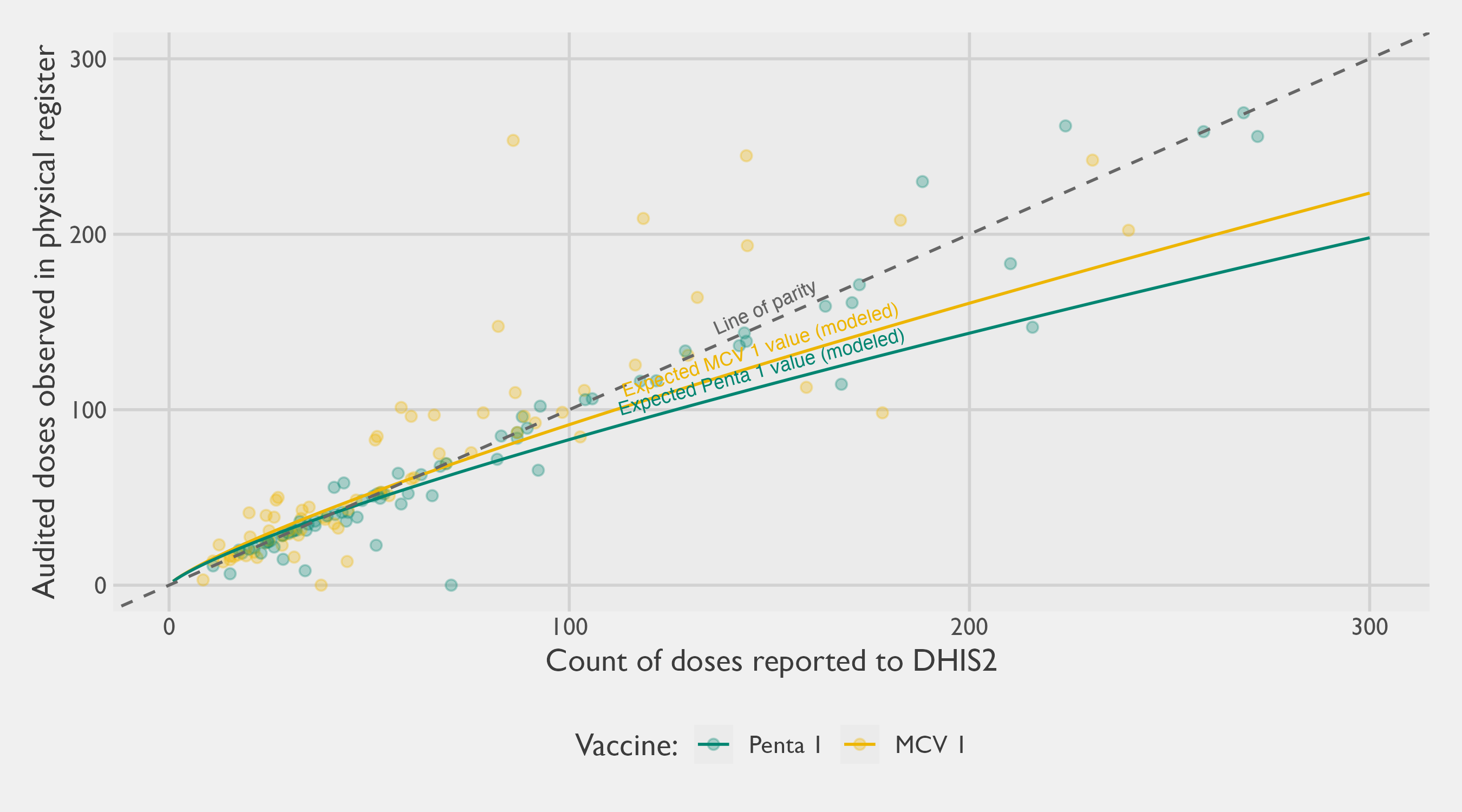
Several patterns stand out. First, there remains substantial divergence between reported counts and audited counts, even though the overall association is clearly positive. The scatter around the parity line is wide in both the low-volume and high-volume range, indicating that discrepancies are not confined to a narrow subset of facilities or vaccines. A minority of observations lie close to the parity line, suggesting that for some facility–vaccine combinations the routine reporting and the registers are broadly consistent, but many observations deviate materially in either direction.
Second, at lower volumes the discrepancies appear less directional. Among facilities reporting relatively few doses, points fall both above and below the parity line, consistent with a mixture of over- and under-reporting (or differences in timing, transcription, and reconciliation) rather than a single systematic pattern. In practical terms, this means that for smaller sites the difference between DHIS2 and the registers often looks like noise with no clear sign, even when the absolute difference is meaningful relative to the small totals.
The most consequential feature is that a directional bias becomes more evident as volumes increase. As the number of doses reported to DHIS2 grows, a larger share of points fall below the parity line, implying that DHIS2 totals are frequently higher than what is ascertained in the registers for higher-volume settings. The fitted trendline reinforces this: it sits increasingly below the parity line at higher counts, implying a sublinear relationship in which audited register totals rise more slowly than reported DHIS2 totals. Put plainly, the gap tends to widen with facility size. A small number of observations also show very large discrepancies, which matter because high-volume facilities, though fewer in number, can exert outsized influence on aggregate totals. This pattern also supports the intuition that probability proportional-to-size (PPS) sampling is an efficient design for audit work: when selection probabilities are tied to reported service volume, larger facilities, which both contribute more to totals and appear more prone to consequential discrepancies, are more likely to be included in the audit. In effect, PPS concentrates verification effort where potential error has the greatest leverage on system-wide estimates, improving the precision and practical value of any subsequent calibration.
In the modeling process, the research team explored whether richer facility characteristics from the 2025 Health Facility Census could explain additional variation in discrepancies, including immunization readiness scores and tracer indicators. In this dataset, these variables did not appear to add meaningful predictive power beyond the DHIS2 volume itself and the facility/LGA/month structure captured by random effects. This result is informative in its own right: it suggests that discrepancies are not easily reduced to a small set of observable readiness features, and that facility-specific reporting dynamics remain important.
These findings have direct implications for administrative approaches to estimating immunization coverage. If audited registers are treated as the best available reference (an important assumption, since registers can also be incomplete or imperfect), then simply summing DHIS2 counts is likely to yield a biased estimate of total doses delivered, with the bias driven disproportionately by higher-volume facilities.
Stratum | Numerator #1: DHIS2 Annualized Summation | Audited register doses from sampled PHCs (unweighted) | Numerator #2: Design-Weighted Estimate of Register Doses | Numerator #3: Regression-Adjusted Doses |
|---|---|---|---|---|
Gabasawa | 12,860 | 1,385 | 14,452 | 12,746 |
Gaya | 11,439 | 856 | 12,022 | 11,259 |
Nassarawa | 30,717 | 13,088 | 29,411 | 27,663 |
Non-Sentinel | 213,339 | 41,980 | 203,841 | 200,442 |
Bringing all these insights together, Table 3.24 summarizes three approaches to estimating the numerator for the administrative method. The first method sums the reported values on DHIS2 for the 12 months in 2025, only making annualization corrections for missing data.30 The second method estimates the register doses for an entire LGA on the basis of the sampling weights for the sampled PHCs. We call this second method a design-based numerator as it uses only the sampling design and sample data from the audit. The third method also estimates the total register doses by calibrating DHIS2 reported values, but by applying Equation 3.10 from the multilevel model. For reference, Table 3.24 also shows the unweighted sum of audited register doses from the sampled PHCs only – that is, the raw facility-level audit totals underlying the scatter plot above, before any sampling weights are applied to extrapolate to the full LGA.
The 2025 HFC showed that routine immunization service delivery is dominated by public facilities in Kano, and that DHIS2 reporting coverage for immunization is reasonably complete among the facilities that materially contribute to doses delivered. As a result, any concern that any of these numerators may under-estimate doses due to missing PHC is likely not a major source of error.
3.5.3.2 Geospatial Denominators
The preceding sections focused on improving the numerator by assessing and, where appropriate, calibrating administrative dose counts. The next step in the ARR framework is to construct a credible denominator: the total number of children aged 12–23 months in each analytic stratum. For this study, strata are often equivalent to the LGA level, since our coverage estimates and any subsequent adjustments are interpreted and reported at that granularity. Fine-scale population denominators are often unavailable, and in Nigeria the most recent population census was conducted in 2006. While the NPC produces intercensal projections, the accuracy of those estimates at subnational levels is difficult to verify, particularly in settings experiencing rapid urban growth, internal migration, or changing settlement patterns. During the planning phase of this study, the research team obtained LGA- and ward-level projection tables from state counterparts. These tables were constructed by applying a single statewide growth factor to 2006 census values across all sub-state units, so the relative population distribution across LGAs and wards mirrors the 2006 baseline rather than reflecting differential growth over the subsequent two decades. The analyses presented here therefore use spatially explicit geospatial products as the primary denominators at the LGA level. The official projections remain a useful benchmark for the state aggregate.
This motivates the use of open-source geospatial population products. These approaches use recent satellite imagery and related GIS layers to infer where people live, typically by identifying built-up structures and then redistributing population counts across space in proportion to settlement footprints, sometimes with additional growth models over time. In principle, this offers two advantages for administrative estimation. First, it can produce granular estimates aligned to current settlement patterns rather than relying solely on extrapolations from older censuses. Second, it can be aggregated consistently to any boundary system of interest, including LGAs. In this analysis we use two such sources: GRID3 and the GHSL. GRID3 has undergone more Nigeria-specific validation exercises and plausibility checks than many alternative products, which is appealing given the intended use in program monitoring and planning. GRID3 also provides age- and sex-disaggregated estimates; however, the documentation indicates these disaggregations are derived from fixed population ratios (for Kano State, here using 2022 ratios) rather than being estimated uniquely for each LGA. As a result, while the underlying spatial distribution may be updated using more recent settlement layers, the age and sex structure is effectively imposed uniformly across the state and does not reflect within-state heterogeneity or temporal change.
A further practical constraint is that GRID3 does not provide an estimate specifically for children aged 12–23 months. Instead, the available age groupings include Under the Age of 1 (U1) and 1–4 years cohorts. We therefore construct an approximation for the 12–23 month denominator by adjusting the U1 population to account for infant mortality, following an approach similar to Moturi et al. (2025). Specifically, we apply the 2024 NDHS estimate of the Infant Mortality Rate (IMR) for Kano (86 infant deaths per 1,000 live births), yielding an estimate of surviving infants:
\[ \begin{equation} \textrm{surviving infants} = \textrm{U1 infants} \times (1 - \textrm{IMR}) \end{equation} \tag{3.11}\]
These different denominators are presented in Table 3.25. A similar approach is taken to transform total population estimates from the GHSL using Equation 3.11.
Stratum | GRID3 U1 estimate | Denominator #1: GRID3 IMR-adjusted estimate (12-23mo) | Denominator #2: GHSL IMR-adjusted estimate (12-23mo) |
|---|---|---|---|
Gabasawa | 13,370 | 12,220 | 11,074 |
Gaya | 15,170 | 13,865 | 11,733 |
Nassarawa | 32,491 | 29,697 | 16,142 |
Non-Sentinel | 265,259 | 242,447 | 198,756 |
The denominators presented in Table 3.25 are necessarily approximate. The adjustments from Equation 3.11 assume that the IMR applies uniformly across LGAs and that the U1 estimates correspond closely to the relevant birth cohort that will contribute to the 12–23 month population, despite potential variation in fertility, mortality, and migration across space and time. Naturally, this is a strong assumption, as we would expect vaccinated children to have lower mortality rates. Combined with the broader limitations noted above, these steps inject meaningful uncertainty into the denominator.
3.5.3.3 Coverage Estimation
Having estimated both potential numerators and denominators in the previous sections, we can now combine the two to produce a Penta-1 coverage estimate. The complement proportion of this estimate represents the theoretical Penta-1 zero-dose prevalence (\(1-p\)). The results of the ARR approach are given in Figure 3.17 for the Penta-1 coverage. Four variants are presented.
- The first variant (in light green) uses a design-based numerator that estimates Penta-1 doses purely on the basis of the sampling probabilities from the sampling design. It uses numerator #2 from Table 3.24 and denominator #1 from Table 3.25.
- The second variant (in dark green) uses the annualized summation of DHIS2 doses as the numerator. It uses numerator #1 from Table 3.24 and denominator #1 from Table 3.25.
- The third variant (in grey) uses a predictive distribution of register doses based on a multilevel regression model trained on the collected PHC data. It uses numerator #3 from Table 3.24 and denominator #1 from Table 3.25.
- The fourth variant (in black) shows the regression-adjusted numerator of register doses with a denominator estimated from the GHSL instead of GRID3. It uses numerator #3 from Table 3.24 and denominator #2 from Table 3.25.
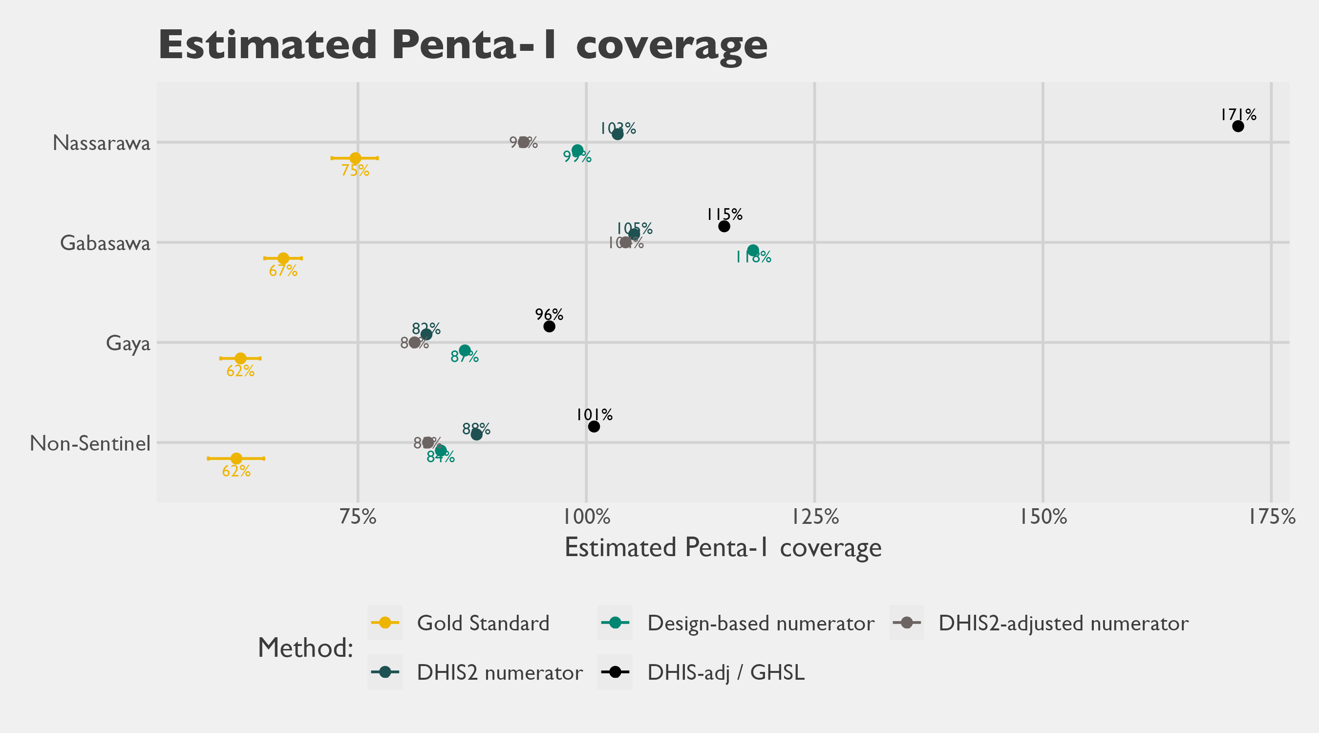
Stratum | Gold Standard | ARR variant #1 | ARR variant #2 | ARR variant #3 | ARR variant #4 |
|---|---|---|---|---|---|
Gabasawa | 66.8% | 118.3% | 105.2% | 104.3% | 115.1% |
Gaya | 62.1% | 86.7% | 82.5% | 81.2% | 96.0% |
Nassarawa | 74.7% | 99.0% | 103.4% | 93.2% | 171.4% |
Non-Sentinel | 61.7% | 84.1% | 88.0% | 82.7% | 100.8% |
All variants of the ARR approach overestimate Penta-1 coverage relative to the gold standard. Several estimates even exceed 100%, which is not meaningful for vaccine coverage but highlights a core limitation of the method: the numerator and denominator are constructed from different sources and can drift out of alignment. With only four strata it is difficult to assess whether the bias is systematic, although the discrepancy appears largest in Gabasawa. For zero-dose estimation, the implication is straightforward: an analogous administrative approach would likely understate zero-dose prevalence substantially, and in some cases could even yield implausible negative values.
Table 3.27 summarizes the agreement metrics for the ARR method when evaluated against the gold standard. It shows that the mean absolute difference between the gold standard and the ARR estimates range between 24 and 54 percentage points. On the whole, variant #3– which uses the regression based adjustment for the numerator along with a GRID3-based denominator– performs the best. However, the high magnitude of the differences between even the best method and the gold standard estimate call into question the utility of this method overall.
Administrative Method Variant | Number of estimates (strata) | Mean Signed Difference (Bias) | Mean Absolute Difference | Root Mean Square Error | Intraclass Correlation Coefficient (ICC) |
|---|---|---|---|---|---|
variant #1 | 4 | 30.7 | 30.7 | 32.9 | -0.49 |
variant #2 | 4 | 28.4 | 28.4 | 29.2 | -0.52 |
variant #3 | 4 | 24.0 | 24.0 | 25.2 | -0.48 |
variant #4 | 4 | 54.5 | 54.5 | 59.9 | -0.37 |
3.5.4 Discussion
Pinpointing the source of error is not straightforward because discrepancies can arise from the numerator, the denominator, or both. Over-reporting of Penta-1 doses in facility registers is one plausible contributor.
Several additional sources of error could also be at play:
Population denominators (GRID3): The GRID3 sex-age estimates likely introduce meaningful error because they apply state-level population ratios uniformly across LGAs. Our own analyses of LGA-specific birth dynamics show substantial variation in fertility across LGAs, implying that the number of children aged 12–23 months may be poorly estimated in some areas. In addition, the GRID3 estimates are based on 2022 data and carry the usual uncertainty from geospatial modeling.
Incomplete DHIS2 reporting: Not all facilities report to DHIS2, particularly private facilities. However, the 2025 Kano HFC suggests immunization is predominantly delivered through the public sector. While some immunizing facilities may still be missing from DHIS2, the scale of this gap for immunization appears limited. Note also that incomplete DHIS2 reporting would, if anything, shrink the numerator and so cannot explain over-estimation of coverage relative to the gold standard — it would only make the discrepancy larger if reporting were more complete.
Political and administrative incentives: Over-reporting in registers is possible, including in response to performance pressures. In constructing our numerator, we treated the register audit counts as the best available reference and assumed they reflected true doses delivered. That assumption may be too strong. With the data available in this study, we cannot independently verify whether what we observed in the registers is accurate, as opposed to being affected by recording practices or intentional inflation. Establishing the validity of register entries would require a different validation approach (for example, client-level verification or an independent tracing method). This was beyond the scope of this study.
Outreach and supplementary activities: Doses delivered to children in the facility’s catchment through outreach sessions or supplementary immunization activities may also be entered into routine facility registers without being clearly separated from routine, fixed-post service delivery. To the extent that the audit counts include these doses, the numerator captures a broader set of events than the routine Penta 1 deliveries the rate is intended to reflect. Other recording artifacts — for example, vials drawn from facility stocks for outreach or campaign use being counted as delivered even when some are not subsequently administered to a child — are unlikely to be major mechanisms in this study because a child-level immunization register was present and accessible at virtually every audited facility (Table 3.23). Inflation of the numerator through entries that do not correspond to a specific named child would therefore have to take the form of deliberate over-reporting, which is discussed under “Political and administrative incentives” above.
Cross-LGA vaccination: Some children may be vaccinated outside their LGA of residence. Long-distance travel is unlikely given the widespread availability of services, but cross-border use near LGA boundaries is plausible. For example, Nassarawa could attract clients from nearby densely populated areas.
The most plausible explanation is a combination of these factors rather than a single dominant failure point. Overall, these results are consistent with broader experience in the literature: ARR-based coverage estimates can be unstable. In our setting, the differences from the gold standard are large enough that the ARR approach is not suitable for decision-making.
3.5.5 Recommendations
Based on the evidence from this study, we recommend avoiding administrative-based coverage estimation as a standalone method, particularly for fine-grained reporting such as the LGA level.
That guidance reflects the current state of routine data systems rather than a permanent ceiling on the method. Two complementary steps would strengthen those systems and, over time, narrow the gap between administrative and survey-based estimates.
Follow up with facilities and LGA data officers on register–DHIS2 discrepancies. The numerator analyses in this chapter show meaningful differences between audited facility register counts and the DHIS2 totals reported for the same period. Those divergences can arise from incomplete monthly summary submissions, transcription error, aggregation rules applied at the LGA health office, or genuine gaps between what is delivered and what is reported up the chain. Targeted follow-up with the facilities and LGA data officers responsible for compiling and uploading these counts is the most direct way to learn which of these mechanisms dominate in a given setting and to design corrective action accordingly. Without that diagnostic step, the source of the divergence remains ambiguous and the same gap is likely to recur in the next reporting cycle.
Adopt routinized data audits to shift incentives toward accurate reporting. With the data available in this study, we could not independently verify whether the register entries reflect doses actually delivered, as opposed to recording artifacts or inflation in response to performance pressures. Register audits are the natural starting point because they sit closest to the point of service delivery, but the same routine cycle can extend upward to monthly summary forms and DHIS2 entries to address the broader reporting pipeline. Building such audits into the routine supervisory cycle, rather than treating them as one-off research exercises, would help confirm dose counts against the children recorded in the register and surface systematic over- or under-reporting at higher reporting tiers. Over time, a credible expectation that entries will be checked is itself the mechanism by which audits improve data quality, and it is among the more direct levers available to programs that wish to use administrative data for decision-making.
3.5.6 Conclusions
In our analysis, ARR variants consistently overestimated Penta-1 coverage relative to the gold standard, and this pattern aligns with findings reported by other researchers. We also tested three refinements intended to address known failure points in administrative estimation: (i) down-calibrating the reported numerator to align with register audit findings, (ii) replacing traditional denominators with geospatial population estimates, and (iii) cross-checking and adjusting reported numerators using totals from the health facility census. None of these modifications materially improved performance. Even after these adjustments, ARR-based estimates remained substantially inflated and, in some strata, implausible. The magnitude of the discrepancies is large enough that ARR outputs should not be used for operational decisions without additional validation.
That said, there may be pathways to make administrative approaches more useful, but we have not evaluated them in depth. One option would be to apply a bias adjustment (for example, scaling ARR estimates by a multiplicative correction factor) if the bias were stable. However, stability is not guaranteed: bias can vary across geographies and over time as population dynamics shift and record quality improves or deteriorates with changing levels of scrutiny. Any credible correction would therefore require periodic re-estimation using recent reference data. This undermines the main appeal of administrative methods as a low-cost, rapid desk exercise, and the required validation effort may be prohibitively expensive.
A second option is to explore whether alternative DHIS2 metrics can provide a more reliable proxy for denominators. Measures such as infant outpatient counts, deliveries, or other service-utilization indicators could potentially be used to construct facility-level or LGA-level ratios that track coverage more closely than current ARR denominators. This would require empirical testing to identify robust correlates and to assess sensitivity to changes in service-seeking behavior and reporting completeness.
Third, even imperfect administrative ratios may still be valuable when used as auxiliary information to strengthen probability surveys, rather than as a replacement. For example, administrative indicators could be used to classify areas into coarse “high/medium/low” strata for sample design, improving precision if those rankings are approximately correct. More formally, such indicators can be incorporated through calibration or ratio estimation in a model-assisted framework, which can improve efficiency while preserving design-based properties even when auxiliary measures are noisy.
Finally, it may be worth revisiting ARR-style methods after Nigeria’s next population census. Many geospatial raster denominators are ultimately calibrated to government population totals. A new census would provide a stronger benchmark for those calibration steps and could materially improve the accuracy of modeled age-sex population surfaces. If denominator accuracy improves meaningfully, administrative approaches that currently perform poorly may become more viable, especially when combined with targeted validation.
3.5.7 Geospatial Estimation
The preceding analysis makes clear that ARR-based methods, even with refined numerators and geospatial denominators, fall short as tools for real-time estimation of current Penta-1 coverage. However, real-time prevalence estimation is not the only use case that motivates geospatial and administrative approaches. A distinct and practical need is small-area estimation: producing LGA-level coverage estimates where none exist in official sources. This challenge is not hypothetical — in designing the sampling frame for the present study, we had no reliable LGA-level estimate of zero-dose prevalence to draw on. Geospatial modelled surfaces offer one solution. Unlike ARR, which requires recent facility records as a numerator, a modelled prevalence raster derived from household survey data can be spatially aggregated to any sub-national boundary, yielding plausible small-area estimates for planning purposes even in the absence of administrative data. The central limitation is that such surfaces are fixed-time snapshots: the surface we use below reflects conditions as of 2018 and cannot capture trends since then.
3.5.7.1 NDHS modeled layer
The following analysis takes a different angle on the geospatial data introduced above. Instead of using population surfaces as denominators within an administrative framework, we ask whether a gridded modelled prevalence surface — spatially weighted by population — can produce credible LGA-level coverage estimates without relying on DHIS2 or facility registers at all.
We estimate LGA-level Penta-1 vaccination prevalence by combining two geospatial sources of data:
- A gridded NDHS 2018 modeled surface of DPT-1 prevalence (Spatial Data Repository and The Demographic and Health Surveys Program n.d.); and
- A gridded population surface.
The modeled surface is shown in Figure 3.18.
For this analysis, we are using the GRID3 estimate of the U1 population as a proxy for the 12-23 month population (Nnanatu et al. 2025). However, several other open-source population surfaces exist that could be used for this purpose, such as data from the GHSL. As described in the supporting GRID3 documentation, their U1 population within any State is estimated by applying a fixed population ratio from 2022 to the overall geospatial population estimate. This means we could have chosen to use a raster layer for the full population and achieved the same results, since the relative weighting scheme will be the same.
The NDHS surface provides an areal model-based estimate of prevalence for each raster cell, while the GRID3 raster provides a spatially detailed distribution of the population at risk. Because the population raster is substantially higher resolution than the NDHS surface, the GRID3 layer is used to weight the NDHS prevalence spatially within each LGA, yielding an LGA-level prevalence that reflects where children actually live within the LGA rather than treating the LGA as uniformly populated.
Before aggregation, the two rasters are made spatially compatible. In practice this means ensuring a consistent Coordinate Reference System (CRS), cell alignment, and extent over the area of interest. Since the NDHS modeled surface is coarser, the analysis is anchored to a common grid so that each location has both a prevalence value and a population weight. This can be implemented either by resampling one raster to the resolution of the other (often bringing the prevalence surface onto the finer GRID3 grid) or by projecting both to a shared intermediate grid. The key requirement is that, for each analysis cell, the modeled prevalence and the population weight refer to the same geographic footprint.
Let \(p(\mathbf{s}) \in [0,1]\) denote the modeled DPT-1 prevalence at location \(\mathbf{s}\), and let \(w(\mathbf{s}) \ge 0\) denote the population (children under 1) at the same location. For an LGA \(A\) (or any defined polygonal region), the population-weighted mean prevalence is defined as
\[ \hat{P}_A \;=\; \frac{\int_{A} p(\mathbf{s})\, w(\mathbf{s})\, d\mathbf{s}}{\int_{A} w(\mathbf{s})\, d\mathbf{s}} \]
Intuitively, \(\hat{P}_A\) averages the modeled prevalence surface over the LGA while giving more influence to locations with more children. On a geospatial raster grid, this becomes a discrete weighted mean. Index grid cells by \(i = 1,\dots,n_A\) that fall within LGA \(A\). Let \(p_i\) be the NDHS modeled prevalence in cell \(i\), and \(w_i\) the GRID3 population in cell \(i\). Then
\[ \hat{P}_A \;=\; \frac{\sum_{i \in A} p_i\, w_i}{\sum_{i \in A} w_i}. \]
Different approaches can be devised for handling cells that partially overlap the LGA boundary. With a sufficiently fine-grained raster, it can be reasonable to retain only those cells that have a majority of their surface area in the given LGA of interest. For coarser rasters, an area-fraction term could be included to avoid boundary bias.
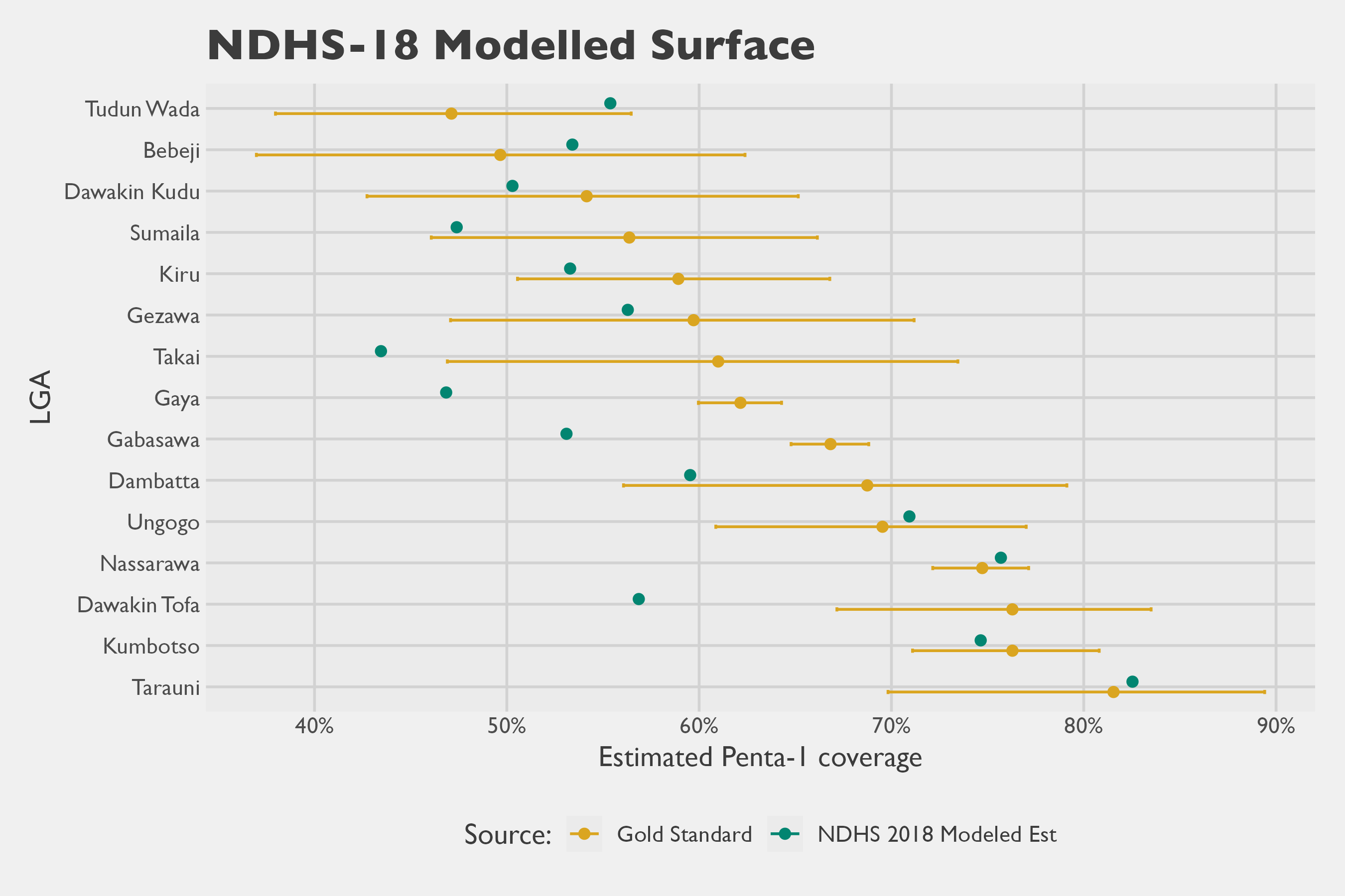
The modelers of the NDHS 2018 layers estimated that the DPT-1 estimates had 20% Mean Absolute Error (MAE), as assessed through four-fold cross validation. Using the 15 LGA data points and comparing them to our Gold Standard survey, we calculate an analogous Mean Absolute Difference (MAD) of 7.0% between the estimates.
Metric | Estimate | 95% CI |
|---|---|---|
Mean Signed Difference (Bias) | 0.046 | (0.046; 0.087) |
Mean Absolute Difference | 0.070 | (0.066; 0.1) |
Root Mean Square Error | 0.089 | (0.086; 0.124) |
Intraclass Correlation Coefficient (ICC) | 0.728 | (0.374; 0.899) |
3.6 Rapid Convenience Monitoring
3.6.1 Overview
RCM is a fast, field-based, non-probability sampling method traditionally used to assess mass vaccination campaign coverage and quality in real-time. Within campaign activities, it is designed to allow vaccination teams to quickly identify missing children and areas requiring follow-up or mop-up action, investigate causes and quickly correct them (World Health Organization 2024). Rather than a random sample, RCM collects information about children’s vaccination status by visiting a convenience sample of households or community spots (e.g., schools, health facilities), typically having enumerators follow a pseudo-random walk from one household to the next. Ordinarily, it also creates an opportunity to refer un-immunized and under-immunized children for vaccination, or immunize them directly on-site.
For this assessment, Mindset followed the RCM methodology as set out in the WHO guidance31 (World Health Organization 2024). Their template RCM survey instrument is designed to also investigate the reasons why children are not vaccinated or why they missed doses, capturing insights into how caregivers think and feel about vaccination, how social processes influence vaccination decisions, and the practical constraints that affect access and follow-through. Finally, it also collects information on the quality of vaccination records, drawing on what is available in households (e.g., vaccination cards, finger marks) and, where the household can be linked to a health facility, the corresponding vaccination registries.
The WHO guidance is explicit that RCM is a non-probability approach not intended to support statistical population inference, though it does include analysis templates and tools where the proportions of vaccinated and unvaccinated children are tabulated. While the guidance cautions against using RCM as a prevalence-estimation tool, implicit is a claim the data collected in RCM is still broadly informative and useful for decision-making. This creates a tension in interpretation: the guidance appropriately limits inferential claims, yet the standard outputs are naturally read as proportions that summarize conditions beyond the specific households visited. In this head-to-head comparison, we take a pragmatic position that RCM proportions can be treated as at least approximately informative about a defined target area, and we therefore use prevalence as the basis for comparison across methods. Indeed, vaccination prevalence is the primary shared quantity that anchors the entire head-to-head report, and it would be difficult to assess RCM against other methods without a focus on the proportions calculated with RCM data.
3.6.2 Implementation Details
3.6.2.1 RCM Site Selection
As part of the agreed study scope with the Gates Foundation (GF), resources were allocated for eight RCMs. Sites were selected by drawing a random sample of two health facility catchment areas in each of four strata: Gaya, Gabasawa, Nassarawa, and the non-sentinel stratum. The sampling frame was provided by government counterparts and was intended to reflect settlements believed to have higher numbers of zero-dose children. This focus is consistent with the WHO guidance (2024), which recommends conducting RCM in areas that are difficult to vaccinate due to supply-side barriers (e.g., geography, mobility, conflict, weak service delivery) and demand-side barriers (e.g., distrust, beliefs, low awareness, poverty, time constraints, gender-related barriers). This site-selection step was treated as distinct from the within-site household selection mechanism used during fieldwork.
Site selection drew on zero-dose settlement data from the 2023 LGA database — a state-curated list of settlements flagged by LGA immunization officers as having concentrations of zero-dose children based on routine programmatic monitoring — and a settlement-to-catchment linkage dataset provided with support from the Kano State Primary Health Care Management Board (SPHCMB). The workflow proceeded in four stages:
- Compile the list of zero-dose settlements across the four survey areas;
- Draw a stratified SRS of eight settlements (two per stratum);
- Reconcile selected settlement names to a dataset of catchment areas associated to health facilities, using fuzzy matching; and
- Identify the corresponding facilities, replacing any duplicates with the next randomly drawn settlement.
This produced a final sample of eight unique facilities within Kano State in areas considered likely to have higher zero-dose prevalence. Figure 3.20 shows the LGAs and wards targeted by RCM, and all the wards included in the multistage cluster survey. The final selection of RCMs included settlements in eight administrative wards (Joda, Zugachi, Balan, Kazurawa, Dakata, Hotoro South, Dansoshiya, and Chalawa) across five LGAs (Gabasawa, Gaya, Nassarawa, Kiru, and Kumbotso).
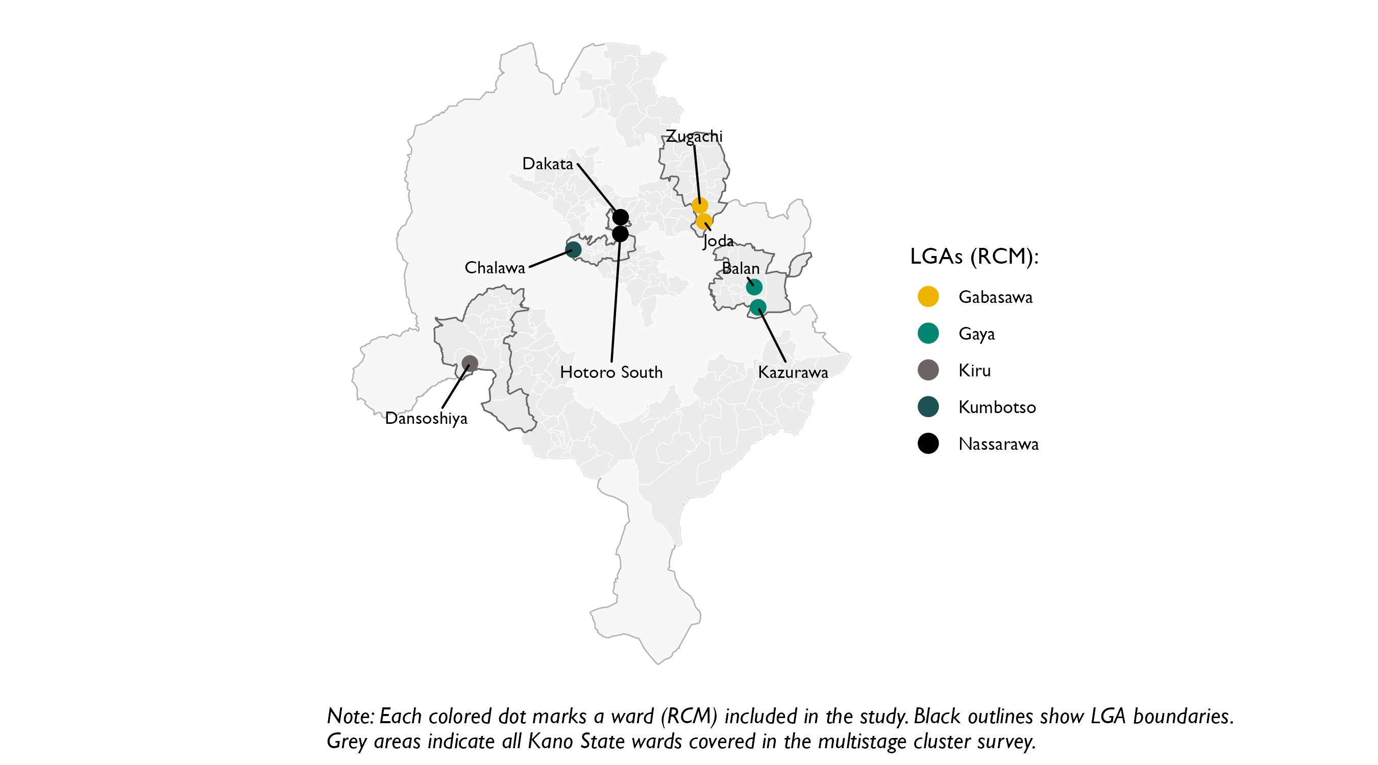
3.6.2.2 Household Selection
As for most other methods, the operational indicator used to monitor zero-dose children was coverage for the first dose of a Pentavalent (Penta)-1 vaccine (a DPT-containing vaccine). Field teams visited each selected facility to verify the catchment settlements identified as zero-dose. After verification, teams conducted household surveys within those settlements.
Following the WHO guidance recommendation of a 20-child target per RCM (2024), each RCM aimed to enroll 20 children. While the guidance recommends targeting children aged 6–23 months, we applied the same 20-child target to children aged 12–23 months to align with the age group used for indicator calculation in the other methods. This yielded a total sample of 160 children across the eight areas. Household selection was implemented as a pseudo-random systematic walk from a random start point, going house to house until the fixed target of eligible children was achieved. If a specific household was already included in another method, such as the main gold-standard sample, that household was skipped by the RCM field team (but included in the RCM analysis using the data collected from the gold-standard team). In practice, this method concentrated the RCM data along a single route through one contiguous segment of the selected settlement or catchment.
3.6.2.3 Geographic Boundary Definition
Although the WHO guidance encourages implementers to define the target population, it frames this primarily in terms of age eligibility, with little explicit guidance on the geographic bounds over which an RCM result should be interpreted (2024). Later, the document implicitly anchors implementation to geography by noting that at least one RCM should be conducted per health facility and that planning is typically organized around the facility catchment area. In our experience, however, catchment boundaries for health facilities are often fuzzy, overlapping, or simply undocumented, and the implied geographic footprint of an RCM is not necessarily a standard administrative unit such as a ward or LGA. This ambiguity matters for comparability: in a head-to-head evaluation, a central methodological question is how to define an apples-to-apples comparison area for RCM against gold-standard estimates when the intended geographic footprint of inference is not clearly specified.
Even if the guidance does not specify geographic bounds, we can define an explicit comparison boundary for this study to support a meaningful head-to-head assessment. The gold-standard survey used a multistage probability design that–for most LGAs–distributed interviews broadly across ward geography. This coverage allows us to subset the gold-standard data to match a chosen comparison boundary, whether at the LGA level, ward level, or another defined area. In the maps below, we show how the RCM household locations (in green) compared to the gold standard’s household locations (in yellow) for each of the eight wards visited (ward boundaries in blue). The maps show that the area visited by the RCM generally represented a much smaller area than the entire ward. By comparison, the gold standard data collection generally canvassed the entire administrative area. The exception is for non-sentinel LGAs, where the smaller the gold standard method allocated a small sample size of EAs, resulting in a map that clearly shows area within the ward never visited by the field teams. To reduce the risk of identifying specific households, the point locations shown below are randomly displaced by roughly 100 meters for display only.
From the maps, we can see that direct comparison of ward-level estimates is probably not appropriate. The RCM walk typically traverses a localized segment of a ward along one contiguous path, whereas the gold standard is calculated over the full ward (see Table 3.1 for the precision achievable under probability survey designs at ward and LGA level). Another boundary definition is therefore needed– one that is more suited to the intended catchment area covered by the RCM data collection.
To make the comparison as defensible as possible given these constraints, we therefore backed into an operational definition of the area covered by RCM. Specifically, we compared RCM results to gold-standard data drawn from within a 1.75 km buffer32 of the observed pseudo-random walk, rather than treating RCM as representative of the full administrative ward. This buffered comparison area is shown with red lines in the maps above. The approach assumes that the catchment is reasonably approximated by the area covered by the RCM pseudo-random walk, an assumption we revisit later.
In the sentinel LGAs, the buffer approach manages to select between 166 and 652 children per area. Because the gold-standard fieldwork achieved near-complete spatial coverage in those LGAs, we generally had sufficient observations to compare outcomes within almost any plausible RCM area of inference, including the specific neighborhoods traversed by the walk. In the non-sentinel areas, however, the sampling fraction was much smaller and the clustered sample resulted in much patchier spatial coverage. As a result, Figure 3.27 and Figure 3.28 show that RCM walks in those areas often occurred in locations that did not overlap with the gold-standard clusters, meaning the two methods were frequently sampling different parts of the ward. When selecting a gold-standard comparison group for those areas, instead of using the same 1.75 km buffer approach, we took the two nearest available EAs. This resulted in comparison cases further than 1.75 km apart. For this reason, for non-sentinel LGA, discrepancies in methods may simply reflect geographic differences in vaccination patterns as much as they reflect methodological differences.
RCM | Diameter | Path Distance | Date of First | Date of Final | Number of Days |
|---|---|---|---|---|---|
Balan | 7,191 [m] | 11,964 [m] | 2025-06-25 | 2025-07-04 | 4 |
Chalawa | 3,262 [m] | 7,927 [m] | 2025-06-25 | 2025-06-28 | 3 |
Dakata | 1,083 [m] | 1,616 [m] | 2025-06-25 | 2025-06-28 | 4 |
Dansoshiya | 1,006 [m] | 3,224 [m] | 2025-06-25 | 2025-06-28 | 3 |
Hotoro South | 1,780 [m] | 3,594 [m] | 2025-06-25 | 2025-06-29 | 4 |
Joda | 720 [m] | 1,951 [m] | 2025-06-25 | 2025-07-04 | 4 |
Kazurawa | 984 [m] | 2,636 [m] | 2025-06-25 | 2025-06-28 | 3 |
Zugachi | 1,046 [m] | 3,566 [m] | 2025-06-25 | 2025-06-28 | 3 |
Table 3.29 summarizes the spatial scale of each RCM walk. The walk’s diameter captures how far apart the two most distant visited households were, and indicates that the typical (median) walk covered a footprint with an end-to-end span of 1065 meters. The path distance is the cumulative geodesic distance between successive visited households and serves as an approximation of the total distance travelled; the median path length was 3395 meters. Balan and Chalawa are notable outliers, reflecting longer movements between distinct housing clusters. Finally, the timing columns show that none of the eight RCMs were completed in a single day: fieldwork for each walk spanned 3–4 days.
3.6.3 Results
3.6.3.1 Zero-Dose Prevalence
Figure 3.29 presents the zero-dose prevalence results obtained across the eight locations under the RCM method, compared against the analogous results for buffered comparison area from the gold standard survey. The plot shows that while the estimates are generally close for most areas, there are some stark differences. Dansoshiya is the most extreme example: RCM recorded all sampled children as zero-dose while the gold-standard estimate in the same ward is substantially lower (33%). In Kazurawa, the difference is less pronounced but still apparent: 5% (RCM) vs 27.9% (gold standard).
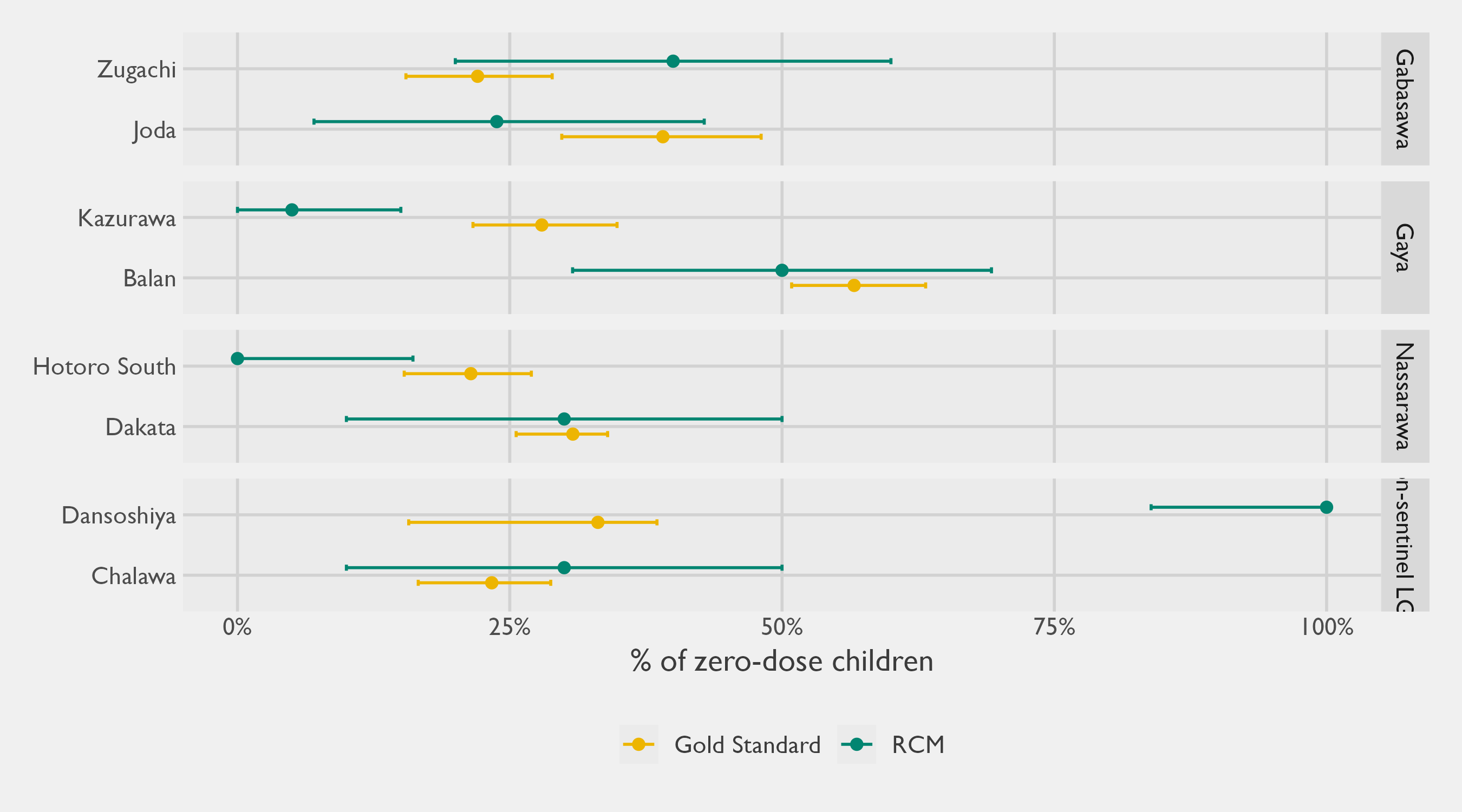
Table 3.30 presents the same information in tabular format, along with additional statistical information such as sample sizes, CIs, and statistical tests. By design, sample sizes were fixed at 20 children under RCM (with some variability), whereas gold standard sample sizes were determined by the size of the comparison zones, typically ranging from 78 to 652 children. Due to these sample size differences between methods, whereas the gold-standard CIs are modest, we would expect the uncertainty around the RCM estimates to be very wide.
Stratum | RCM | ZDC | # | RCM sample percent zero-dose (95% CI)a | # | Gold standard sample percent zero-dose (95% CI)b | Absolute difference in percent zero-dose (95% CI) | P-value for difference | Adjusted p-valuec |
|---|---|---|---|---|---|---|---|---|---|
Gabasawa | Zugachi | 8 | 20 | 40.0% (20.0; 60.0) | 217 | 22.0% (15.5; 28.9) | 18.5% (1.3; 39.0) | p=0.046 | p=0.092 |
Joda | 5 | 21 | 23.8% (7.0; 42.9) | 166 | 39.1% (29.8; 48.1) | 15.7% (0.8; 34.8) | p=0.104 | p=0.166 | |
Gaya | Balan | 13 | 26 | 50.0% (30.8; 69.2) | 335 | 56.6% (50.9; 63.2) | 10.2% (0.6; 28.2) | p=0.232 | p=0.309 |
Kazurawa | 1 | 20 | 5.0% (0.0; 15.0) | 177 | 27.9% (21.6; 34.9) | 23.4% (9.8; 33.9) | p=0.004 | p=0.011 | |
Nassarawa | Dakata | 6 | 20 | 30.0% (10.0; 50.0) | 410 | 30.8% (25.6; 34.0) | 8.3% (0.3; 23.7) | p=0.480 | p=0.480 |
Hotoro South | 0 | 20 | 0.0% (0.0; 16.1) | 652 | 21.4% (15.3; 27.0) | 21.6% (15.3; 27.0) | p<0.001 | p<0.001 | |
Non-sentinel LGAs | Dansoshiya | 20 | 20 | 100.0% (83.9; 100.0) | 78 | 33.1% (15.7; 38.5) | 69.8% (61.5; 84.3) | p<0.001 | p<0.001 |
Chalawa | 6 | 20 | 30.0% (10.0; 50.0) | 87 | 23.3% (16.6; 28.8) | 10.4% (0.7; 28.9) | p=0.272 | p=0.311 | |
aProportion of Penta-1 unvaccinated children out of all eligible infants found in the RCM study. 95% CIs are calculated using bootstrap percentiles, with the exception of Dansoshiya (20/20) and Hotoro South (0/20), where Wilson Score intervals are presented instead (due to the lack of variability in the data). | |||||||||
bProportion of Penta-1 unvaccinated children out of all eligible infants found in the gold-standard study. 95% CIs are calculated based on the multistage random cluster survey, which adjusts standard errors based on the cluster design. | |||||||||
cThe adjusted p-value makes an adjustment to control the False Discovery Rate (FDR) that can arise from repeated testing. | |||||||||
Abbreviations: CI = Confidence Interval; RCM = Rapid Convenience Monitoring; ZDC = Zero-dose children | |||||||||
Although RCM is billed as non-probabilistic, we present approximate 95% CIs in Table 3.30 by treating the RCM data as though it was a SRS. While this assumption is unlikely to hold in practice and may be generous, it provides a rough benchmark for the sampling variability that would be expected under an idealized best-case scenario for RCM. This simplifying assumption also allows us to statistically test for differences between the gold standard results and the RCM, the results of which are presented in the adjusted \(p\)-value column of Table 3.30. This represents the probability of observing a difference in proportions between the methods at least as large in magnitude as that observed in the data, if indeed these methods are independently measuring the same quantity. By convention, values below 0.05 signal that something other than random chance is at play, and we can narrow-in on locations where the adjusted \(p\)-value is below 0.05 as areas that merit closer attention. This approach singles out Dansoshiya, Hotoro South, and Kazurawa.
In Hotoro South, the RCM walk found no zero-dose children at all (0 out of 20), whereas the gold-standard estimate for the buffered comparison area was 21%. Because the RCM walk covers only a narrow corridor, the most likely explanation is that the walk happened to traverse a pocket with uniformly high vaccination uptake, while the broader comparison area—which extends well beyond the walked path—includes pockets with lower coverage. This is consistent with the spatial heterogeneity observed in other walks and underscores how sensitive RCM results are to the specific route taken.
In the case of Dansoshiya, Figure 3.28 already revealed to us that the areas canvassed under each method were non-overlapping and modestly distant from one another. Whereas the gold standard randomly picked only an EA in the urban municipality of Dansoshiya itself, the Dansoshiya RCM concentrated the walk in the rural, Easternmost part of the ward. Consistent with statewide patterns in Kano, where vaccination coverage is generally higher in urban areas, the gold-standard estimate from the urban municipality would be expected to show a lower zero-dose prevalence than the RCM estimate drawn from a more rural part of the ward. In the case of Dansoshiya, therefore, the difference appears to be largely explained by the fact that the areas compared are physically separated and capture different urban/rural dynamics.
Our probe into Kazurawa must go deeper. By plotting our RCM results against a geospatial estimate33 of the (Penta-1) zero dose prevalence, we can visually compare how the actual path traveled for RCM compares to the wider comparison area. For Kazurawa, it is evident from Figure 3.33 that the pseudo-random RCM walk concentrated heavily in an area with a high zero-dose prevalence, and that surrounding areas–even close ones included within the 1.75 km buffer zone– had lower zero-dose rates. As in the earlier maps, the plotted point locations and apparent walk path are jittered slightly for privacy, so the path may appear somewhat more haphazard than the field teams’ actual movement.
These findings show that even when we back-into a fairly narrow comparison area in the sentinel LGAs, some areas still may not match closely, and that this is not only explained by random chance alone. It suggests that RCMs are quite sensitive to starting point and direction enumerators walk, as zero-dose dynamics can change significantly even at the scale of the distances walked within an RCM. If the catchment areas encapsulate larger areas than those in this study, this problem would likely be even more pronounced, as the distances traveled by an RCM walk would represent an even smaller fraction of the total area.
Table 3.31 summarizes the head-to-head error metrics for RCM. Across the eight RCMs, the mean absolute difference between RCM and the gold standard was 20 percentage points. Because this comparison is based on only eight paired estimates, results should be interpreted cautiously, especially given that two non-sentinel RCMs relied on comparison areas that were geographically separated from the walked corridors. More generally, these metrics are likely to be optimistic relative to typical operational deployments, where the implicit catchment of interest often spans a much larger area than the route covered by a single RCM walk.
Method | Number of estimates (RCMs) | Mean Signed Difference (Bias) | Mean Absolute Difference | Root Mean Square Error | Intraclass Correlation Coefficient (ICC) | ICC p-value |
|---|---|---|---|---|---|---|
RCM | 8 | -0.03 | 0.20 | 0.28 | 0.28 | 0.221 |
3.6.3.2 Reasons for Non-Vaccination
A stated benefit of RCM is its ability to capture demand-side barriers alongside coverage data: the WHO guidance specifically positions it as a tool for investigating why children are not vaccinated or why they missed doses (World Health Organization 2024). Because the RCM instrument uses the same reasons-for-non-vaccination questionnaire as the gold standard, the barrier profiles from each walk can be examined alongside the survey-weighted estimates from the corresponding buffered comparison zone.
Table 3.32 presents this comparison for each walk, with responses aggregated to the four domains of the WHO BeSD framework — the coarsest grouping at which a comparison is feasible given the sample sizes involved. Results are shown per walk because RCM is applied and interpreted at that level — walks are not designed to be aggregated across areas, and doing so would mask local variation. Two walks — Kazurawa (Gaya) and Hotoro South (Nassarawa) — are absent because every child encountered was vaccinated,34 so the reasons questions were never asked. That two entire walks yielded no unvaccinated children underscores how readily a single walk can miss unvaccinated pockets, leaving the team with no barrier data at all.
Domain | RCM (%) | RCM (counts) | Gold Standard (%) | Gold Standard (counts) | Difference | p-value for difference | |
|---|---|---|---|---|---|---|---|
Unadjusted | Adjusted | ||||||
Joda (Gabasawa) | |||||||
Access | 0.0% | 0 / 4 | 24.0% | 12 / 58 | -24.0% | .300 | .549 |
Beliefs | 0.0% | 0 / 4 | 17.4% | 13 / 58 | -17.4% | .412 | .549 |
Health center | 0.0% | 0 / 4 | 5.0% | 2 / 58 | -5.0% | .888 | .888 |
Social processes | 0.0% | 0 / 4 | 48.9% | 27 / 58 | -48.9% | .036 | .144 |
Zugachi (Gabasawa) | |||||||
Access | 0.0% | 0 / 8 | 18.1% | 6 / 34 | -18.1% | .152 | .320 |
Beliefs | 12.5% | 1 / 8 | 37.1% | 12 / 34 | -24.6% | .160 | .320 |
Health center | 0.0% | 0 / 8 | 9.9% | 4 / 34 | -9.9% | .516 | .516 |
Social processes | 12.5% | 1 / 8 | 28.5% | 9 / 34 | -16.0% | .348 | .464 |
Balan (Gaya) | |||||||
Access | 0.0% | 0 / 12 | 20.2% | 36 / 193 | -20.2% | .044 | .176 |
Beliefs | 41.7% | 5 / 12 | 22.5% | 41 / 193 | 19.1% | .172 | .344 |
Health center | 0.0% | 0 / 12 | 6.4% | 12 / 193 | -6.4% | .456 | .456 |
Social processes | 50.0% | 6 / 12 | 38.1% | 81 / 193 | 11.9% | .400 | .456 |
Dansoshiya (Kiru) | |||||||
Access | 0.0% | 0 / 3 | 5.3% | 1 / 15 | -5.3% | .724 | .856 |
Beliefs | 33.3% | 1 / 3 | 10.5% | 2 / 15 | 22.8% | .164 | .656 |
Health center | 0.0% | 0 / 3 | 0.0% | 0 / 15 | 0.0% | .572 | .856 |
Social processes | 100.0% | 3 / 3 | 84.2% | 12 / 15 | 15.8% | .856 | .856 |
Chalawa (Kumbotso) | |||||||
Access | 0.0% | 0 / 5 | 20.5% | 3 / 15 | -20.5% | .472 | .472 |
Beliefs | 80.0% | 4 / 5 | 50.6% | 8 / 15 | 29.4% | .272 | .472 |
Health center | 20.0% | 1 / 5 | 0.0% | 0 / 15 | 20.0% | .120 | .472 |
Social processes | 40.0% | 2 / 5 | 22.5% | 3 / 15 | 17.5% | .440 | .472 |
Dakata (Nassarawa) | |||||||
Access | 33.3% | 1 / 3 | 14.4% | 15 / 83 | 19.0% | .412 | .619 |
Beliefs | 66.7% | 2 / 3 | 33.2% | 27 / 83 | 33.5% | .216 | .619 |
Health center | 0.0% | 0 / 3 | 3.1% | 5 / 83 | -3.1% | .704 | .704 |
Social processes | 0.0% | 0 / 3 | 20.6% | 26 / 83 | -20.6% | .464 | .619 |
Percentage of unvaccinated children whose caregivers reported at least one reason in each BeSD domain. RCM proportions are unweighted. Gold standard proportions are survey-weighted estimates restricted to the buffered comparison zone around each walk. p-values from a paired bootstrap (500 replicates): Beta posterior draws (Jeffreys prior) for RCM, survey replicate weights for gold standard (with Beta posterior substitution at effective sample size for degenerate 0%/100% cases); adjusted p-values control the false discovery rate across domains within each walk. This is a select-multiple question, so domain proportions do not sum to 100%. | |||||||
With only 3 to 12 unvaccinated children per walk contributing the data on reasons for non-vaccination, testing for differences between the RCM and gold-standard barrier profiles is not statistically defensible — the comparison is severely underpowered at these sample sizes. The \(p\)-values in Table 3.32 are included to illustrate this point;35 a non-significant result should not be read as evidence of agreement, only of insufficient power. Indeed, even setting aside the comparison with the gold standard, the per-walk samples are too small to support any generalisable inference about barrier prevalence in the catchment area: even under the best-case assumption that the children encountered behave as a simple random sample, domain-specific counts of 3 to 12 unvaccinated children yield margins of error too wide to be informative.
The value of collecting such data during RCM walks is therefore limited to the specific children assessed: it tells the research team what barriers prevented those specific children from getting vaccinated, which can directly inform mop-up and referral decisions. Vis-a-vis the wider catchment area, the small number of unvaccinated children per domain are far too few to characterize patterns, even under the generous assumption that the walk behaves as a SRS, and are unlikely to add to what experienced immunisation staff already anticipate.
3.6.4 Discussion
One of the implementation characteristics of RCM is that it collects observations sequentially along a walk-based route via consecutive interviews of adjacent households. While this allows RCM data collection to occur rapidly, it entails that observations are unlikely to be independent: households close to one another often share access barriers, service exposure, and social norms, so vaccination status can be similar for nearby children. Consequently, results can be strongly shaped by the particular segment of the settlement the walk happens to traverse.
This aspect is borne out by the data. By using a regression model, we can test for serial autocorrelation in Penta 1 status along each ward’s RCM walk (Table 3.33). When we add the previous household’s vaccination status as a predictor for the next household (lag1), we find a statistically significant odds ratio of 2.35 (\(p = .037\)). On the probability scale (with the ward random effect set to its mean), the fitted model implies that if the immediately preceding child was unvaccinated, the next child has an expected 57% probability of being unvaccinated; if the preceding child was vaccinated, the next child has an expected 36% probability of being unvaccinated. In other words, Penta 1 status tended to cluster along the walk, consistent with spatially concentrated sampling. The practical consequence is twofold: the walk may not be representative of the catchment, and the observed serial dependence further reduces the effective sample size, so treating the data as an SRS will overstate precision and can distort inference.
Term | OR | 95% CI | p-value | |
|---|---|---|---|---|
Fixed Effects | Intercept | 0.76 | 0.31–1.86 | 0.551 |
lag1 [Vaccinated] | 2.35 | 1.05–5.25 | 0.037 | |
Random Effects | σ² (residual) | 3.29 | ||
τ₀₀ ward | 1.03 | |||
ICC | 0.24 | |||
N ward | 8 | |||
Observations | 159 | |||
Marg. R² / Cond. R² | 0.041 / 0.269 | |||
OR = odds ratio; CI = confidence interval. Bold rows: p < 0.05. | ||||
Several additional conclusions follow from the regression output, but the most practical one is about variability across RCM comparison areas. The random-effects structure indicates that baseline Penta 1 coverage differs meaningfully from one RCM comparison area to another, consistent with substantial heterogeneity in local vaccination conditions. This matters because the eight RCMs were drawn from a sampling frame intended to represent areas suspected to have high zero-dose prevalence; under that premise, one might expect the resulting RCM samples to look uniformly high zero-dose. Instead, the observed spread across RCM comparison areas suggests that the risk classification used to prioritize RCM locations does not, at least in these data, reliably produce a set of sites with consistently elevated zero-dose prevalence. The hotspot maps reinforce this interpretation: in several wards, the RCMs walk paths do not intersect the most pronounced zero-dose prevalence hotspots (the deepest purple areas). This calls into question the practical reliability of RCM as a mechanism for consistently identifying the highest-prevalence pockets of zero-dose children.
This heterogeneity also sharpens the interpretive challenge for a head-to-head comparison. When outcomes vary substantially over short distances, any method that concentrates measurement along a single walk corridor becomes highly sensitive to where that corridor falls. That is one reason a key concern is that this backed-in buffer comparison may be too generous to RCM. In effect, an RCM walk that proceeds house-to-house along a contiguous path is closer to a localized enumeration of that neighborhood than to a probability sample from a broader catchment. For the corridor visited, the design-based sampling error is, in principle, small because the walk is attempting to enumerate all eligible households encountered (subject to non-response and eligibility). If the gold-standard comparison area is then defined by tracing that same path and drawing a buffer around it, the comparison is anchored to a population that closely resembles the one observed by RCM, which makes close agreement more likely by construction.
This is not exact in our implementation. Some households were not interviewed, and our 1.75 km buffer intentionally captures an area larger than the literal walk. Even so, the general point remains: by defining the comparison area around what is functionally a localized enumeration, large discrepancies driven by sampling error alone are unlikely. Under this setup, any divergence is more plausibly attributable to measurement differences, non-response patterns, or genuine micro-geographic heterogeneity, rather than to the kind of sampling variability that would matter if RCM were intended to support inference to a clearly defined, wider catchment.
For these reasons, RCM requires cautious interpretation. In the narrow set of circumstances where the area to which conclusions are meant to apply closely aligns with the area actually canvassed by the walk, RCM proportions may be broadly informative, albeit noisy. However, in typical operational use, the implicit catchment of interest is often much larger than the surface area covered before reaching a 20-household quota, even when that catchment is not explicitly defined. In those settings, the risk of misinterpretation increases because the walk represents only a small, potentially unrepresentative slice of a heterogeneous area. The practical concern is that RCM may appear to offer catchment-level insight when it is, in fact, primarily describing conditions along a particular route.
Importantly, this limitation should not be attributed to the quota alone; the more fundamental issue is how the 20 observations are selected in space. A useful observation is that RCM sits much closer in sample size to designs like LQAS that are explicitly probabilistic and come with clearer inferential guarantees. A sample size of 20 children, by itself, need not be dismissed as unscientific or intrinsically inadequate: small samples can still support disciplined decision rules when the sampling mechanism is well defined and the resulting uncertainty is made explicit. The challenge for RCM is not primarily the number 20, but the combination of a small sample with a route-based, convenience mechanism whose error properties are opaque. Rather than billing RCM as an opportunistic walk, a more disciplined protocol could move it closer to roughly representative measurement, even if imperfect. This direction also aligns with the WHO guidance (2024), which already encourages practices meant to reduce bias (for example, standardizing starting procedures, walking clockwise, etc.). Because the main limitations arise from route choice and interpretability rather than the quota itself, the most promising refinements are procedural and reporting-focused. The next section sets out recommendations to strengthen RCM while preserving its intended speed and feasibility.
3.6.5 Recommendations
Based on these findings, and consistent with prior work (Dietz et al. 2004; Luman et al. 2007), we advise against using RCM to produce statistically valid estimates of vaccination coverage. The exception is the narrow case where the catchment area of interest is small enough that the pseudo-random walk can reasonably be expected to canvass most or all of it. Instead, RCM should be treated as a rapid, hyper-localized post-campaign follow-up activity that pairs immediate mop-up action with a structured snapshot of the specific corridor traversed by enumerators. Its value lies in identifying and reaching missed children (Rainey et al. 2013; Teixeira et al. 2011) and in characterizing conditions along the walked route, not in supporting general claims about coverage across the wider catchment area.
That said, small design adjustments could make RCM outputs less sensitive to any single walked path while keeping field workload broadly unchanged. These include:
Defining catchment area boundaries: This is the most important recommendation. The core risk with RCM is that results describe conditions along one walked corridor but are implicitly interpreted as representing a broader catchment area. That risk cannot be mitigated—by multiple walks, interval sampling, or any other protocol adjustment—unless the intended catchment area is explicitly defined at the outset. A clearly defined boundary serves two purposes: it anchors the scope of inference (what area do these results represent?), and it constrains the walk itself (are teams staying within the intended area?). Without it, any statement about the catchment is an extrapolation from a localized corridor, and the scale of that extrapolation is unknown. In practice, catchment boundaries should be specified in advance using map-based polygon definitions, GPS geofencing, or explicit physical landmarks, and field teams should be required to remain within them throughout data collection. Any approach that systematizes movement through space—whether multiple walks or interval sampling—should include this boundary control as a prerequisite.
Conducting multiple walks per RCM: Instead of relying only on a single walk to reach a pre-determined quota, field-work teams could instead perform three shorter walks of seven households (or four walks of five households), each targeting distinct neighborhoods within the same catchment, while keeping roughly the same total quota between all the walks combined. This is essentially the protocol described by Luman et al. (2007) for rapid house-to-house monitoring. This protocol increases spatial coverage and mitigates serial clustering from consecutive household-to-household interviewing. Because Table 3.29 shows that RCMs typically took 3–4 days to complete, implementing multiple shorter walks would be unlikely to add meaningful operational burden, since teams already make repeated visits to the catchment area.
Implementing a cascading protocol: Another option is to adopt a cascading RCM protocol, drawing on the system outlined in Luman et al. (2007) for rapid house-to-house monitoring. In this approach, teams begin with a standard first wave of data collection in which they conduct an RCM walk until a fixed initial target is reached (for example, 20 eligible children). At this stage, field teams would tally the number of unvaccinated children, and if the number falls within a pre-specified range, the team would continue their random walk to hit a larger sample size (for example, 30 households in total). The motivation for this is to use a small first wave as a triage step: if results are clearly low-risk or clearly high-risk, teams can stop early and conserve time and resources, but if results fall near a programmatically important threshold (or are otherwise ambiguous), teams can expand the sample to improve precision before drawing conclusions. Put differently, the cascading design concentrates effort where it is most valuable, because a sample of 20 children often yields uncertainty large enough that borderline findings can easily flip with a handful of additional observations. A pre-specified escalation rule also makes the protocol more transparent and defensible, since it acknowledges uncertainty up front and reduces the temptation to treat a small, localized quotient as a stable estimate for decision-making.
Assessing every \(n\)th house along the walk: As a complementary technique aimed at increasing spatial spread within a walk, teams could implement a systematic interval rule, visiting, for example, every other house rather than sampling adjacent households. This interval would ideally be set to so as to have field teams canvass the entire catchment area. For example, if it is estimated that the catchment area comprises of 100 households, a rule could be set to approach every fifth house in order to reach 20 children across the entire area. Based on our regression modeling, even an interval of two (every other house) would strip a lot of the serial autocorrelation out of the data. While not a perfect solution, this approach could reduce bias from localized clustering and extend the face validity of the data by extending coverage across a broader swath of the targeted catchment area.
Reporting an approximate uncertainty bound: Even if RCM is described as non-probabilistic, sampling theory can still provide useful context for interpretation. We recommend that if implementers report a vaccination quotient (as suggested in the WHO guidance (2024)), they also report an approximate MOE36 or an approximate CI, and label it explicitly as approximate. This should be presented as an idealized, best-case benchmark, derived by treating the 20-child sample as if it were a simple random sample. In practice, localized walking and serial autocorrelation likely reduce the effective sample size below 20, so true uncertainty will typically be larger than this approximate benchmark. Framed this way, the approximate MOE/CI functions as a lower bound on the uncertainty readers should expect, not as a design-based interval for RCM. Providing this benchmark would prevent readers from implicitly treating the reported quotient as more precise than it is.
A practical way to make RCM route selection more disciplined, without turning it into a full survey operation, would be for the international development community to create an online, open-source RCM planning tool that would standardize route definition and documentation. In such a tool, users would define (or draw) the intended catchment boundary in a simple web interface and export that boundary as a map figure for inclusion in field reports, creating a transparent record of the target area. The same tool could then retrieve building footprints within the boundary (for example, from Google’s Open Buildings dataset (Sirko et al. 2021)) and generate an explicit visitation route using a Travelling Salesperson Problem (TSP) style optimization. With a user-specified sampling increment, the tool would place approach points along the route to guide teams on which locations to visit, replacing discretionary walking decisions with a reproducible, auditable path. Such a tool would be equally useful to LQAS implementations, which typically also seek to sample random households within pre-selected EAs.
This approach would be more rigorous than relying on convenience-driven choices about starting location and direction, and it would make the spatial scope of inference clearer. It is also consistent with the practical reality that many field teams will not have specialist geospatial or data-science capacity, and that RCM is positioned as rapid and low-complexity. The purpose of an online tool would be to keep the user workflow simple while embedding the technical steps in the software. With an interface that supports boundary drawing, route generation, increment selection, and export of a map and route file, the method could remain accessible to non-specialists while materially reducing route-selection bias and improving the transparency and defensibility of RCM findings.
3.6.6 Conclusions
Endorsing RCM as suitable for decision-making implies a claim of reliability. The non-probabilistic label can obscure this point: it discourages attention to inferential error while results are still presented as actionable. Proponents may intend RCM results to be broadly informative, yet without a theoretical foundation, that implicit claim remains an assumption, not a demonstrated property. Even under a best-case interpretation in which a 20-child walk is treated as approximately unbiased SRS, sampling variability is large enough that estimates may frequently mislead.
In this head-to-head study, most RCM estimates could be brought into close agreement with the gold standard, but much of that agreement depended on defining comparison areas that closely tracked the walked corridor. When the compared areas did not overlap, the discrepancy was immediate and readily explained. The core operational conclusion is that RCM outputs are hyper-local and highly sensitive to the start point and direction of the walk. If the area decision-makers have in mind is materially larger than the area covered before reaching the quota, representativeness is unlikely, and the risk of confident misinterpretation increases. Some of these limitations can likely be mitigated, at least in part, by adopting more disciplined route and boundary protocols of the kind recommended in this report.
RCM is also often framed as a way to identify localized pockets of missed children. In our experience, however, the walk paths frequently did not intersect the strongest zero-dose hotspots indicated by the gold-standard surfaces, and the largest hotspots were missed altogether. This could reflect limitations of the candidate-site sampling frame rather than an inherent limitation of RCM itself, but it is still operationally relevant: in this implementation, the method did not consistently achieve one of its stated aims. Likewise, the small number of unvaccinated children per walk — a median of 4.5 — made any generalisation of the reasons-for-non-vaccination data beyond the specific children assessed unfeasible.
Overall, RCM can be broadly informative only under a narrow set of conditions where the intended area of inference closely aligns with the area actually canvassed by teams. One such condition is when the objective is simply to learn about the children actually assessed — for example, to mop up missed cases and understand why those children were not reached by an intervention, whether through non-contact or non-conversion — without generalising to the wider catchment area. When the goal extends beyond those children to the wider catchment area, however, RCM should not be interpreted as a catchment-level prevalence estimate unless the walk has been designed to spread observations well across the catchment space. For this reason, proponents should either (i) treat prevalence estimation as an explicit objective and adopt more disciplined protocols and reporting that make uncertainty and geographic scope transparent, or (ii) clearly restrict interpretation to the walked corridor and avoid implied generalization.
This applies most directly to adaptive sampling and the administrative methods (District Health Information System (DHIS2) audit), which are designed to estimate individual-level zero-dose prevalence. Network Scale-Up Method estimates the proportion of households with a zero-dose child rather than individual prevalence. Rapid Convenience Monitoring does not purport to estimate coverage, though it sometimes calculates the percentage of unvaccinated children observed. Lot Quality Assurance Sampling is primarily designed for classification relative to a threshold rather than prevalence estimation, though weighted estimates can be derived under certain circumstances.↩︎
The analogous weighted ratio estimator equivalent is defined as follows. Let \(w_j\) denote the final survey weight for respondent \(j\) (typically the inverse inclusion probability, with any nonresponse and calibration adjustments). The weighted prevalence estimator is \[ \widehat{q}_w = \frac{\sum_{j=1}^n w_j m_j}{\sum_{j=1}^n w_j c_j}, \tag{3.4}\] and the weighted population-of-interest total is obtained by scaling with an estimate of the total population size \[ \widehat{h}_w = \widehat{t}\cdot \widehat{q}_w = \widehat{t}\cdot \frac{\sum_{j=1}^n w_j m_j}{\sum_{j=1}^n w_j c_j}. \tag{3.5}\] When \(t\) is not treated as known externally, a design-based estimator \(\widehat{t}\) can be constructed using the same weights. In the simplest person-level setting, the Horvitz–Thompson estimator is \[ \widehat{t} = \sum_{j=1}^n w_j, \tag{3.6}\] with the understanding that in household-based designs or eligibility-restricted surveys, \(\widehat{t}\) may instead target the relevant total (for example, total households or total eligible individuals) via the appropriate weighted expansion.↩︎
This sample-size calculation treats the NSUM prevalence estimator \(\hat q = \sum_i y_i \big/ \sum_i d_i\) as an alter-level binomial proportion, under the simplifying basic scale-up assumptions that (i) conditional on respondent degree \(d_i\), the reported count \(y_i\) follows a binomial model \(y_i \mid d_i \sim \mathrm{Binomial}(d_i, q)\) with a common hidden-group prevalence \(q\); (ii) respondents are independent and degrees \(d_i\) are treated as known (or well-approximated by their sample mean), so that the total \(Y=\sum_i y_i\) is approximately \(\mathrm{Binomial}(D, q)\) with \(D=\sum_i d_i\); and (iii) a normal (Wald) approximation is used to map \(\mathrm{Var}(\hat q)\approx q(1-q)/D\) to a margin of error. In practice, these assumptions are optimistic: non-random mixing (barrier effects), transmission error, differential visibility, and other violations of the basic model can introduce overdispersion and bias, and our applications additionally rely on complex survey designs where clustering, unequal weights, and other design features inflate variance. These calculations are therefore idealized and intended primarily to illustrate the theoretical efficiency gains NSUM can offer, relative to direct estimation of proportions, under the basic model.↩︎
Within the small share of multi-child households that do appear in the gold-standard child interview sample, the gap is further compressed by strong within-household concordance of vaccination status: about 80% have all sampled children sharing the same Penta-1 zero-dose status (roughly 55% all vaccinated, 25% all unvaccinated) and only 20% are mixed, so even for these households the household-level estimand stays close to the child-level prevalence. The re-expressions described below hold both definitions to a common scale for head-to-head comparisons.↩︎
This phrasing reflected an assumption about what respondents could plausibly report about children in their personal networks. We expected that, at best, respondents might be aware in general terms of whether a contact’s child had been vaccinated, rather than being able to report on a specific antigen such as Penta-1. The general phrasing was therefore chosen to align the NSUM instrument with what respondents could observe of their alters. A consequence is that in settings where campaign vaccines (for example, polio or measles) reach many children who nonetheless miss their routine series, the general phrasing can produce reports that drift from antigen-specific zero-dose definitions used elsewhere in the report; the re-expressions noted in the main text hold both targets to a common scale at the estimand level for head-to-head comparisons, but some definitional slippage at the level of individual network reports remains.↩︎
This package does not appear to have the ability to account for unequal probability sampling and so may only be applicable for cases where approximately equal selection probabilities are made.↩︎
Confidence intervals are logit-transformed intervals following Korn and Graubard (1998), with a Clopper–Pearson fallback when the estimated proportion is exactly zero or one.↩︎
As a rule of thumb for interpretation, Koo and Li (2016) propose that ICC values below 0.50 indicate poor reliability, 0.50 to 0.75 moderate, 0.75 to 0.90 good, and above 0.90 excellent; an earlier and similarly widely cited scheme from Cicchetti (1994) uses slightly different breakpoints (<0.40 poor, 0.40–0.59 fair, 0.60–0.74 good, 0.75–1.00 excellent). Both authors emphasize that these are general rules of thumb. What counts as an acceptable threshold is ultimately domain-specific: it depends on the intended use (test-retest reliability vs. ranking or classification of geographic units), on how variable the underlying quantity is across units, and on the consequences of misclassification. Readers should treat the verbal labels here as orienting rather than definitive.↩︎
Adaptive cluster sampling (Thompson 1990) is the older and better-known design, but it does not control the final sample size in the same way. The adaptive web design used here keeps the final number of PSUs bounded, which matters for survey budgets.↩︎
An unselected PSU bordering one preliminary PSU received that neighbor’s estimated zero-dose count as its new size measure. An unselected PSU bordering more than one preliminary PSU received the largest neighboring count. PSUs that did not border a preliminary PSU, and PSUs already selected in the preliminary phase, received a small positive size measure.↩︎
The preliminary adaptive-sampling estimate uses the same design-based estimator as the gold-standard analysis but applies two simplifications relative to it: the downstream nonresponse, multiplicity, and post-stratification adjustments are omitted, and the first-stage variance is computed under PPS-with-replacement rather than without-replacement. Both simplifications apply symmetrically to the preliminary and adaptive sampling estimates, so the within-chapter comparison is unaffected.↩︎
For example, if PSUs 1, 2, and 3 are selected in the preliminary component and PSUs 4 and 5 in the adaptive component, one valid reordering would place 1, 2, and 4 in the preliminary component and 3 and 5 in the adaptive component. In that five-PSU example, 10 reorderings are evaluated.↩︎
Rao-Blackwellization averages over reordered preliminary/adaptive partitions of the observed final sample, so each reordering has its own set of PSU-specific inclusion probabilities. Preserving that per-PSU alignment across reorderings is what keeps the Rao-Blackwell adaptive-sampling point estimates correct.↩︎
The non-sentinel gold-standard design is a three-stage PPS cluster sample (gridded enumeration area \(\rightarrow\) building \(\rightarrow\) child). The child-level inclusion probabilities determine the Horvitz-Thompson point estimates, but the dominant variance component comes from differences between PSUs. The sentinel fixed-universe simulation in Section 3.3.4.2 uses the same cluster-correct PSU-level variance principle.↩︎
Lower \(\phi\) values were explored in pilot runs but excluded because they left too few preliminary PSUs to guide the adaptive step and created unstable prevalence variance estimates.↩︎
Each grid cell is repeated \(100\) times. The \(30\)-child cap rarely binds in these data, so the simulation is mostly testing PSU selection rather than intensive within-PSU sub-sampling.↩︎
The simulated universe is the sentinel sample treated as fixed, not the full Kano population. The model-based SE can understate uncertainty in the smallest cells, so the replicate-to-replicate empirical SD is the preferred operational check. One hundred replicates per cell leaves some Monte Carlo noise, so narrow differences between neighboring cells should not be read too strongly.↩︎
The word “potentially” underscores that a lot classified as “potentially unacceptable” was not necessarily below the 50 percent threshold. Rather, the research team could not confidently conclude that at least half of the children in the ward were vaccinated. It is likely that many wards labeled as “potentially unacceptable” actually had acceptable coverage but lacked sufficient evidence to confirm it statistically. Indeed, later comparison of LQAS results to the gold standard estimates supports this interpretation.↩︎
In a one-sided test, the null is typically written as \(H_0: P_d = 0.5\) rather than \(H_0: P_d \leq 0.5\). The reason is that statistical tests are calibrated against a single boundary value—the sharp null. If the test controls the Type I error rate at \(p=0.5\), then it will also control it for all other values within the broader null region (\(p \leq 0.5\)). In other words, the hardest case to distinguish from \(p > 0.5\) is the boundary itself (\(p=0.5\)), which is why the null in Equation 3.9 is defined at that point.↩︎
It must be noted that the chosen values for \(\alpha\) and \(\beta\) represent upper bounds. Under our current design, and assuming that finite population effects are negligible, the actual rates are \(\alpha =\) 0.084 and \(\beta =\) 0.068.↩︎
The interpretation of Type II error in LQAS studies comes with a caveat. In typical sample size planning applications, power is calculated using the researcher’s best estimate of the true coverage rate. In contrast, in LQAS, it is more common to calculate power assuming that the coverage rate is at the upper threshold (for this study, 80 percent). This assumption is a slight fiction: the research team typically knows that most wards fall below this aspirational target, and the Type II error will likely be higher than the nominal rate in practice. Therefore, in LQAS planning, the Type II error should be interpreted as the theoretical probability of falsely rejecting lots whose true coverage rate is at 80 percent, rather than the probability of falsely rejecting lots given our current knowledge of the actual coverage rates.↩︎
In the LQAS sample, 90.6 percent of eligible households contained exactly one child aged 12-23 months, while 9.4 percent contained two or more (48 with two, four with three, and one with four; mean 1.1 per eligible household). The share was fairly stable across the three sentinel LGAs, ranging from 8.8 percent in Nassarawa (the most urban LGA) to 10.2 percent in Gabasawa (the most rural); what varies much more sharply across the urban-rural gradient is the probability of encountering any eligible household in the first place, as documented in the demographic chapter of the baseline report (Mindset 2025). For the on-tablet portion of a visit specifically, the core survey’s time audit shows that households where two or more children were assessed averaged roughly 21 minutes longer per visit than single-child households (67 versus 46 minutes; see Figure 4.7), so across the LQAS sample the incremental time is a small addition to what is already the smallest component of per-visit LQAS cost and does not materially alter the per-household or per-child estimates reported in Chapter 4.↩︎
For the present study, software produced non-symmetric bounds based on a logit transform.↩︎
For the \(j\)th ward, the probability of rejection is Bernoulli-distributed as \(r_j = \Pr(X_j < d^{*}_j)\), where \(X_j \sim \text{Binomial}(n_j, \hat{p}_j)\). Here \(\hat{p}_j\) is the gold-standard Penta-1 coverage rate for ward \(j\), \(n_j\) is its sample size, and \(d^{*}_j\) is its LQAS decision threshold. The sum of independent Bernoulli trials follows a Poisson-binomial distribution (Daskalakis, Diakonikolas, and Servedio 2013). The probability mass function of this distribution can be evaluated directly with available software in R (Hong and R Core Team 2024).↩︎
The distinction here is between the true variance of the estimator — which exists as a function of population parameters, including each cluster’s internal variability — and a sample-based estimator of that variance. With a single interview per cluster, the within-cluster component cannot be separately estimated from the data, since a within-stratum sample variance requires at least two observations per stratum. Standard survey-software variance estimators sidestep this with the ultimate-cluster (with-replacement) approximation, which treats all observed between-cluster variation as the total variance, absorbing the within-cluster component and yielding a slightly conservative estimate under without-replacement cluster sampling.↩︎
The estimated coverage-task DEFFs above may be understated, as the sampling design does not fully account for non-response and presumes—for simplicity—that the interviewed individual was the first and only sampled household in a GEA. In reality, as described above, enumerators conducted a random walk in the neighborhood until a successful interview was achieved. If we were to integrate any corrections for differential non-response, differential eligibility, or enumerator effects, we would expect the design effect to increase as such adjustments tend to increase weight variability.↩︎
At the time the sample was being finalized, Mindset was in talks to add two non-zero-dose LGAs to the study: Kano Municipal and Makoda. These two LGAs were subsequently withdrawn from the study, but not before data collection had begun. These two additional LGAs are therefore included in the data collected. Where possible and appropriate, they have been included in data modeling, but are used for comparison as they do not have an equivalent estimate from the gold standard data.↩︎
This technique is known in the literature as “multilevel regression and poststratification” (Gelman and Little 1997).↩︎
The regression model is given by: \[ \log(\mathrm{register\_doses}_i) = \beta_0 + \beta_1 \log(\mathrm{dhis2\_doses}_i) + \boldsymbol{\gamma}^\top \mathbf{M}_{t(i)} + u_{v(i)} + w_{g(i)} + a_{f(i)} + b_{f(i)} \log(\mathrm{dhis2\_doses}_i) + \varepsilon_i , \] \[ u_v \sim \mathcal{N}(0,\sigma^2_{\text{vaccine}}), \qquad w_g \sim \mathcal{N}(0,\sigma^2_{\text{lga}}), \] \[ \begin{pmatrix} a_f\\ b_f \end{pmatrix} \sim \mathcal{N}\!\left( \begin{pmatrix} 0\\ 0 \end{pmatrix}, \begin{pmatrix} \sigma^2_{a} & \sigma_{ab}\\ \sigma_{ab} & \sigma^2_{b} \end{pmatrix} \right), \qquad \varepsilon_i \sim \mathcal{N}(0,\sigma^2). \]↩︎
For example, if a given PHC has reported all but one month on DHIS2, the annualized figure would be average monthly doses for the 11 reported months, multiplied by 12.↩︎
The RCM implementation in this study followed an earlier unreleased version of this guidance document branded by United States Agency for International Development (USAID) and MOMENTUM (MOMENTUM 2024) and marked as “Version: July 31, 2024”. The core implementation in that earlier version is substantially the same as the de-branded version available on the WHO website.↩︎
The choice of 1.75 kilometers reflects an ad hoc choice by the research team. It was intended to balance the competing aims of capturing enough data points to reduce sampling error while also not casting such a wide net that the comparison data no longer represented the neighborhood visited by each RCM. The arbitrary nature of this underscores the need for explicit boundary definitions of catchment areas in RCM implementations.↩︎
The geospatial estimate uses indicator kriging methods to smoothly estimate zero-dose prevalence across physical space. These geospatial methods were only supported in the three sentinel LGAs where the sample size was sufficiently large that the entire LGA was canvassed.↩︎
One child on the Kazurawa walk appears as zero-dose in Table 3.30 because all antigen-specific fields are missing from the dataset, despite the caregiver reporting that the child had been vaccinated and the enumerator confirming that a vaccination card was seen. The survey instrument correctly classified this child as vaccinated and skipped the reasons-for-non-vaccination battery. The apparent zero-dose classification is therefore a data-completeness artefact rather than a genuinely unvaccinated child.↩︎
\(p\)-values are derived from a paired bootstrap that uses Beta posterior draws (Jeffreys prior) for the RCM arm and survey replicate weights for the gold-standard arm, with a Beta posterior at the design-effect-adjusted effective sample size substituted where the observed proportion is exactly 0% or 100%.↩︎
If the quotient is calculated as \(q = \frac{\textrm{unvaccinated children}}{\textrm{total children}}\) with sample size \(n=20\), then an approximate margin of error could be expressed as \(e = \pm 1.96 \times \sqrt{(q(1-q)) / n}\).↩︎